HOME | DD
 1NNU3NDO — Disco de los Muertes 78

Published: 2007-07-01 20:07:27 +0000 UTC; Views: 6359; Favourites: 117; Downloads: 225
Redirect to original
Description
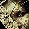
Ay Gringo!Remix of *RA909
Been in the making for a good 5 months by now.
[link]
Related content


Comments: 48

")

Dit vind ik vet. Niet dat ik je stijl wil biten, maar hoe de fuk doe je dit?
Misschien ooit een colabje?
👍: 0 ⏩: 0

nice compilation, i really enjoy the toned down colors
👍: 0 ⏩: 0


 (Wink)")


Good work mate, always love the style you do!
👍: 0 ⏩: 0

slick.. but needs something to focus on. lot of the elements have the same visual strength. loving the style though
👍: 0 ⏩: 1

Yeah I was going for the lips with the text "balloon" but it was tough. Only worked with the jpg from RA's original, even though I could have asked him for the psd. Wanted to set myself a challenge... bastardpop/bootleg style
👍: 0 ⏩: 0


wooo this rocks man..
ro real one of the first things I'll do when back from vacation is make a promo piece for dagroove  (Smile)")
👍: 0 ⏩: 0


look at you rockin it man...flippin' sweet work!
👍: 0 ⏩: 0


nice remix.
gave it a new taste!
colors work well
some sharpening would be cool though...
double identity ftw!
👍: 0 ⏩: 0

yeah a new color theme
tasty, messy yet low-fi and funky!
some sharpening would have been cool.
👍: 0 ⏩: 0


Thanks man! We should finish up that collab sometime
👍: 0 ⏩: 1

Interesting, very interesting. Fucking cool piece bro! Nice remix!
👍: 0 ⏩: 0

nice work eddie.
as one of the guys commented before, i would have given the pieces a bit more contrast so they stand out.
👍: 0 ⏩: 0


haha, finally get that fresh collab going and we'll psd it out
Thanks dude
👍: 0 ⏩: 0

if you dont like it then dont waste your time criticising it. It's a good remix of 2 artist's awesome styles.
👍: 0 ⏩: 1

wow dude, just giving my opinion. how can people get better if they only hear good things. thats how you progress as an artist, by hearing other people's opinion.
seriously chill out.
👍: 0 ⏩: 1
You obviously aren't a fan of his work. I've seen him progress over the years and he's at a good stage right now. Maybe some constructive crit would help him instead of "too messy for me", which would leave anyone not knowing how/why to make changes so that they can be progressive.
👍: 0 ⏩: 1
first of all, you can ask him, i talk to him a lot, and we actually collabed smart ass. look in our galleries. second of all, "too messy" means to maybe make your designs a little cleaner and simple.
so why don't you stop now before you continue to embarrass yourself???
👍: 0 ⏩: 1

lol yah thats right. realize your an idiot, than post a smiley.
👍: 0 ⏩: 1


nice, I would had given it abit more contrast tho. So it is easier to see the different parts, but it is mostly my personal taste.
👍: 0 ⏩: 0