HOME | DD
 a-p-b — Inverse VS
Published: 2007-08-23 18:27:20 +0000 UTC; Views: 16041; Favourites: 21; Downloads: 3920
Redirect to original
Description
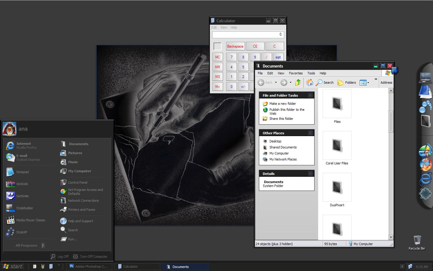
Sketch Visual Style, inverted.ObjectDock background is Vector Cell: Black
Related content


Comments: 25

After years of using your AB1 VS theme i switched to this one.
Buttons turn out little big in firefox settings window but i
love the minimalistic look from Inverse VS, its colors and window buttons that shine out.
Your work is much appreciated <3
👍: 0 ⏩: 1

Your comment is also appreciated.

👍: 0 ⏩: 0

No word on the white text on black for the context menus?
👍: 0 ⏩: 2
You're one busy person - but the creative juices are surely flowing. Good luck.
👍: 0 ⏩: 0
Not yet. 
👍: 0 ⏩: 1
no, skins for WinCustomize  (Smile)")
 (Wink)")
👍: 0 ⏩: 0


Hit the nail on the head. My favorite vs ever. Is there any chance of an icon/cursor set? I want more of this!
👍: 0 ⏩: 0


Thanks
Two ways:
1. Using the program StyleXP, visit tgtsoft.com
2. With a patch that can be found at neowin.net
👍: 0 ⏩: 0

i like areas of this very original style, but it feels to flat for me but i know thats just the style of it anyways , so yea gj
👍: 0 ⏩: 0

Man i really love it, still, that windows flag on the start button is really off the concept in my opinion.. if you just could change it into anything ...
👍: 0 ⏩: 0


Excelente como siempre. Ahora me doy cuenta de que con este vs el walpaper cobra mas sentido (por lo de invertido). Cada vez me asombro mas de tu destreza y aprendo de tu estilo. Gracias por compartir.
👍: 0 ⏩: 0
Almost flawless but to make it completely flawless, you need to have the menu highlights and context menu selections be white text on black instead of black text on light blue. That will match the rest of the theme perfectly.
👍: 0 ⏩: 0


