HOME | DD
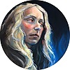
 AramShadow — Elf portrait

Published: 2011-07-14 20:10:20 +0000 UTC; Views: 843; Favourites: 24; Downloads: 3
Redirect to original
Description
†Elf portrait†live on space†_________________________________________________
This is a digital painting I did in photoshop CS3
The painting is a fantasy, I didn't use any photos as a model, I just painting was, this is the result...
I hope you like it!


♠ thanks for see...


_________________________________________________
Stock used: background by [link]
_________________________________________________
♠ ♠ ♠ IMPORTANT ♠ ♠ ♠
Don´t modify, reproduce, copy or
edit my own works without my written permission. Please! Thanks!
_________________________________________________
Related content
Comments: 19

Nice job! I like her hair
It is not a good idea to use one solid colour for her skin or lips, try to vary hues for shadows and highlights, for right and left part. Front lighting is not very impressive unless you want some specific effect.
👍: 0 ⏩: 1

thank you so much! 
And thanks for the suggestions. I really need people like you
This was my first digital painting, I was much more concerned to make all details. And honestly I have a few problems in creating shadows ... but I'm trying to perfect my technique ...
if you want take a look at my other paintings and to leave me your opinion, it will be a great help... [link]
👍: 0 ⏩: 1

I'm glad that there are people that do not ignore criticism!)
Actually in all your paintings I see the same mistakes. Fist point is that your paintings are too blurry. You're trying to avoid sharp edges, but you get not softness, but rather a dirty look. Try to observe the live objects and analyse where the border is sharp and where it is less distinct. The second problem involves colour. Highlights are not normally white and shadows black. They are yellow, green, red, blue and any other colour that matches the environment. First and foremost you need to do is to observe. Only observation makes you paintings individual and alive. Natural skin for example is never of a solid colour. Besides, there is a great comprehensive tutorial written by Navate: part I [link] part II [link] and [link]
I hope it is useful.
Good luck!
👍: 0 ⏩: 1

Thank you! 
I never ignore a critique or opinion, quite the contrary, I greatly value others opinions, it helps me to improve...
Your opinion was a great help to me. In fact I had already noticed some of the details that you speak, I've been watching some tutorials to try to improve these aspects.
And thanks for these tutorials, it is very useful
👍: 0 ⏩: 0


