HOME | DD
 arpad — Silverback Apparel
by-nc-nd
arpad — Silverback Apparel
by-nc-nd

Published: 2007-09-23 02:51:14 +0000 UTC; Views: 38690; Favourites: 291; Downloads: 1011
Redirect to original
Description
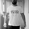
Men's Premium Clothing Brand Logo and Stationery Design: Silverback ApparelBriefing:
Sharp and attractive logo. It will need to be simple enough to be used for embroidery, screen printing and so on. It has to look professional, expensive, trendy, and eye catching.
Description:
High end men apparel company with a focus on a 25-40 year old fashion conscious demographic. We are catering mostly to a more conservative corporate world, but want something that will appeal to trend setters.
Keywords: proud, sophistication, strength, confidence, command, success, expensive.
Demographic:
General demographic are men between the ages of 25-40 with a higher than average disposable income. They are employed or frequent a field that requires them to be image conscious and like to follow conservative trends.
Ideal Consumer:
Corporate manager/worker who is regularly exposed to the stresses of social interaction, meetings, gatherings, and seminars. The environment that he spends his days in requires him to maintain a certain personal image standard and so they are fashion conscience. Additionally frequents night clubs, lounges and upscale restaurants.
Conceptual approach:
My idea from the starting point of this project was to create something with the initials, SB. After some quick sketches that were ment to find possible connections between both characters, I thought of a pattern that could work and at the same time, would look fantastic if it was to be embroided. I got inspiration from a few scanned images from an old book I found, with heraldic crests and medieval symbols which stood up for power and manhood. The swashes around the SB were a tough battle, I couldn’t make it match – the S is so different from the B in terms of visual weigth - and being symmetrical didn’t work out so I went for an elliptical shape to “contain” the type. Trajan – modified - was the typeface chosen because I think it marries consistently with the subject intended.
__
This was a very interesting project for me, I’ve learned a lot. Hope you all like it.
I humbly thank you very much for your support, it really means a lot to me.
Related content


Comments: 81

Good work,,,,,,
You Can Download Free PSD Logo Templates From: FreeLogoPSD.Blogspot.com
It's Exclusive, Check it.
👍: 0 ⏩: 0


Very nice design ... Good choice of typo for clothes ... and the whole design work looks great ")
👍: 0 ⏩: 0


I like this. It's very clean, classy, and certainly has the upscale look to it.
👍: 0 ⏩: 1
 (Smile)")

Here i just realized you're on 99designs...i quit
Awesome job on this man. I remember seeing this and it really stuck with me.
 (Wink)")
👍: 0 ⏩: 1

Thanks! About 99designs, I'm not really there lately. I got tired of the contests and specially the lack of professional attitude by most of the designers. Most of them just want to make a quick buck, so they will do anything, copy, use clipart, etc. And the contest holders, not all but some, go along with that..
👍: 0 ⏩: 1
I feel the exact same way. i left it about 2 weeks ago. The majority of contest holders aren't looking for quality, which is sad.
I think it's a great place to practice though. Take the briefs and come up with some designs from that (without submitting anything).
👍: 0 ⏩: 1
True, I do it for fun sometimes. If we win, the better then.
👍: 0 ⏩: 1


Hello Galil30, its a custom font but its an adaptation from Trajan
👍: 0 ⏩: 0


Are the business papers at the bottom simply digital comps executed so wonderfully that my eyes are deceived? Or is that a photograph? If it is digital, what kind of blurring technique did you use?
I absolutely love this presentation.
👍: 0 ⏩: 1


I really love your presentations and logos and this one looks great! That what you wrote in "description" and "briefing" is exactly what I thought about the logo before reading the text.

👍: 0 ⏩: 0


")

luv the presentation. luv the design.
Did you know that a silverback is a gorilla?
👍: 0 ⏩: 0

sick sick sick work man. I love your work and your presentation sets the bar not only visually but descriptively.
👍: 0 ⏩: 0


Muito Bom Arpad! Para quando o tal tutorial?
👍: 0 ⏩: 0

Its excellent man. Very clean and nice.
It would be nice to see the sketches.
Sorry for my poor english.
👍: 0 ⏩: 0


| Next =>