HOME | DD
 artbyelm —
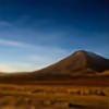
Sunset
artbyelm —
Sunset

Published: 2004-07-23 23:55:37 +0000 UTC; Views: 12523; Favourites: 229; Downloads: 2277
Redirect to original
Description
12x16" oil on canvasRelated content


Comments: 148


I could've sworn I favorited and commented before, but... *shrugs* Great piece. There's so little, but so much to be interpreted. 
👍: 0 ⏩: 0
I love this type of work!
You're invited to join Gnarly Sunset! It's free to join & takes just a few minutes to upload photos.
We spend money to drive you sales, so you make commission. Make sure to upload your biggest files, so your images will be available in larger print sizes. You make more commission on sales of larger prints. We need more original art... most focus has been on photos up til now.
Hope you join soon.
www.gnarlysunset.com
👍: 0 ⏩: 0


i have lost a lot of data from my hard disk and this painting of yours is my favorite desktop wallpaper.
I hope you see that as a compliment.
👍: 0 ⏩: 1

This is so great! It is simply amazing. And the shifts between values are wonderful.
👍: 0 ⏩: 1

Thanks! I'm glad you like it.
👍: 0 ⏩: 1
")

Thanks! I'm glad you like it.
👍: 0 ⏩: 0

OOH, I like this!! I wanna make one of my own walls like this...looks like it could give so much creativity

👍: 0 ⏩: 1
Thanks! And this one was a lot of fun to make too!
👍: 0 ⏩: 0

My eyes light up when I saw this. What can say, it's breathtakingly beautiful!
👍: 0 ⏩: 1
Thank you very much for the wonderful comment!
👍: 0 ⏩: 0


that makes me feel so good when i look at it....ahhhhhh....soothing
👍: 0 ⏩: 0


i'm very impressed with oil painters, especially how you've got very straight lines with this piece - any particular reason for the colours you've chosen - would love to know why
👍: 0 ⏩: 1
I liked the idea of having opposites...nice cool blues...warm reds and oranges. Seems to me like the world is balanced by opposites and I wanted to have that balance of opposites in this piece.
👍: 0 ⏩: 1
ha - opposites - yeah - black and white for me but also beyond that into the reason why i invert all my artwork - the coloured ones completely change
👍: 0 ⏩: 0

I love your simplicity at your work...
nice like all said before me


👍: 0 ⏩: 1
Thank you very much. Oh, and thanks for the devWatch too!
👍: 0 ⏩: 1
i must thank you too for all of it

👍: 0 ⏩: 0

This is hotter than a fish on a doorknob. Lovely work. Perfect for my desktop background (or my wall, had I the original).
👍: 0 ⏩: 1
Thank you for the great comments!  (Smile)")
👍: 0 ⏩: 0
Thank you. I'm glad you like it.
👍: 0 ⏩: 0
i love everything about this
the lines are so clean and sharp and the colors are simply beautiful
i love the fading in the bottom section the fading of colors from strong to lighter
very very lovely work
👍: 0 ⏩: 1


i love this, its a great idea, its so simple but its made so beautiful. the use of colour is amazing. well done
👍: 0 ⏩: 1
Thank you very much for your comments! I'm glad you like it.
👍: 0 ⏩: 0

It's so wunderful, I want the print for my wall  (Wink)")
👍: 0 ⏩: 1
Thanks! I'm glad you like it.
👍: 0 ⏩: 0

wow...this is really cool. I love the colors. Simple, but really elegant and beautiful.
👍: 0 ⏩: 1
Thanks for the comment and the
👍: 0 ⏩: 0

Wow. That's awesome!
Nice job. I wish I could paint like that.

👍: 0 ⏩: 1
Thanks, i'm glad you like it.
👍: 0 ⏩: 0
and now talk about landscapes, this one is perfect one!!!!
maibe wrong submition, it is apstract, but maibe more,, ahh there is no submition field for supramatism shit! this is how it turns me!
canvas looks matematicaly redistributed,, did u counted it or got by feeling
u got a golden cut in 3/4format , or near, what is realy strange thisng to see!
👍: 0 ⏩: 2
| Next =>