HOME | DD
 Autaux — JOE MAD Colours 3

Published: 2004-08-05 14:51:16 +0000 UTC; Views: 3465; Favourites: 17; Downloads: 283
Redirect to original
Description
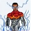
A NEW interior Joe Mad page with colours by me. Also see a 4 step Tutorial of this image as well as other coloured Joe Mad art in my gallery.Comments welcome, enjoy...
Related content


Comments: 50


A-FUCKING-MAZING!
Damn you dude...you blow my mind...we must , I insist collab somemore, i'll have plenty of more art for you whenst my cpu is properly fixed...
You are my favourite colorist.
much love,
N8B!
👍: 0 ⏩: 1

hey dija see the redone ghost rider?!?! thats jumped to the top of my personal favorite images list... so we gotta do some more like that... i need to practice my painting style more and it always worked well on your lines ;D
cant wait till i upgrade too, just a matter of time now ;D
👍: 0 ⏩: 0

Hey do u do the actual colouring for battle chasers?
Sweet work man!
👍: 0 ⏩: 1
yeah me and my monkeys have been working on the chasers for... weeks now... hahahaha I WISH... nar this was just an old sequential practice i fixed up but i SURE WOULD love to work with joe oneday... that would go off... or get an sort of work would go off haha ;D
👍: 0 ⏩: 1
good job anyways man, keep it up, oh and same to ur monkeys!!!!
👍: 0 ⏩: 1
hehe i really must draw up my monkey coloring mascots... puilt and qillow hahaha ;D
👍: 0 ⏩: 0

i love the reddish background color so as the characters too, but not for the yellowish or greenish glow tho mm probably coz its too widely glow but its good overall
👍: 0 ⏩: 1
yeah the red works but its all a bit omnitonal hehe very samey... but its an oldie i just fixed up for folio... not the best sequential in the world ;D
👍: 0 ⏩: 0


thanx, its an oldie but with some touching up looks alot nicer...
👍: 0 ⏩: 1
")

i can't get over the beautiful coloring 
👍: 0 ⏩: 0
i wouldnt go that far haha but the top and bottom panels has some dynamic power...
👍: 0 ⏩: 0
interesting , i like those fogs/smoke floating ard . colors are good
👍: 0 ⏩: 1

Danimation pretty much covered me.
Basicly...there's a lot of good stuff going on here and a few things that need some work. But if you keep at it, you're DEFINITELY going places.
👍: 0 ⏩: 1
thanx dude, yeah im pretty unhappy with alot of things on this... but ive got hardly any time to do much thesedays with uni, so what i do post is usually a bit rushed and isnt as good as it should be
thanx for he comment ;D
👍: 0 ⏩: 1
no worries. if I had enough time, I'd do a properly long and helpful crit and commentary for you, but I feel your pain. I've got ecams coming up, a deadline on 300 pages of code for a website and a few posters to make in the next few days.
")
👍: 0 ⏩: 1
eek ;\ crap... ive got a redesign of a vacuum cleaner and manufacturing report both due tuesday... damn
👍: 0 ⏩: 0

Woah! Very cool. But, im just wondering, what are those 4 balls he has in his hand? Grenades or something?
👍: 0 ⏩: 1

This is awesome.. the colouring is cool! really looks like a published comic
 (Smile)")
👍: 0 ⏩: 1
thanx hey, need alot more practice to consider myself good enough to compare to the pros, but its just a matter of time i think... time and hard work ;\ eeekk
👍: 0 ⏩: 0

all i gotta' say is: talented people like you shouldn't be let out of their art studios!! Dammn.
I can almost taste those obsessive da users on your page now...
did you use photoshop? ^^
👍: 0 ⏩: 1
pfft alphonse mucha was what you call talented, im not even working ;O like a true artist hehe
nar no obsessive compulsive people yet... i dont think im good enough for that though...
yeah ps7 all the way! im gonna learn painter in 2 months ;D
👍: 0 ⏩: 1


awsome, your coloring is wicked, i especially like the first panel, his cape looks great :3
👍: 0 ⏩: 1
many thanx!@
yeah the capes the only part im REALLY happy with... im seriously thinking of REsubmitting a new updated version... hmm may do that now actually... *kill some time*
thanx for the inspiration ;D
👍: 0 ⏩: 0

The cape looks really good on the first panel there. and I dig the glowing effect of the explosive devices.
For the critique: On the fifth panel the guy infront is much younger looking in the penciled version alone. I don't think it was a good idea to put in those cheek creases in the skin. Makes him look older. Garison's eyes don't really glow. he is human after all. But if you're thinking about when he absorbed that blue monkish looking guy into his sword, then I can see why you did it, otherwise, I'm not to sure about it. On the last panel you have a near white highlight that runs straight down from the top of the monster to the bottom. It's usually best to make highlights lessen either going up an object or down an object from where the lightsource is the strongest. One more thing on the last panel, I think you just forgot to color in the teeth.
in anycase I think that you're on your way, and if you keep at it you'll be doing work in the industry in no time. It shows. :]
👍: 0 ⏩: 1
awesome dude, thanx for the crit! its something alot of people dont do... would love to get some work in comics soon, esp with uni ending in under 2 months ;\
oh yeah forgot teeth lol ah well
thanx again
👍: 0 ⏩: 0


wow that's great i love the action and the coloring great job! XD
👍: 0 ⏩: 1
thanx yeah i tried to making it look as actioned packed as possible with the smoke and the blur and everything...
👍: 0 ⏩: 1
well you really did a great job! you're welcome

👍: 0 ⏩: 0
thanx, just got one more to do, im thinking a travis charest one, something totally different so i can mix up the colours and style and maybe try a realist approach...
👍: 0 ⏩: 1
i couldnt find any decent scans of travis' work.. but i did find a dave finch spiderman page which rocks, so im working on that now... its looking alot better then this one i think... or maybe its just im getting back into the swing of things...
👍: 0 ⏩: 1

yeh.. your comic style colours are hot... simple as that... ad prolly will get even hotter as you continue
👍: 0 ⏩: 0

Cool..
I think you should have put links to the tutorial/other works you mentioned
👍: 0 ⏩: 1
good idea, I think I will...
thanx ;D
👍: 0 ⏩: 0

Grrrrrr!! Very Cool!! I Like this pic. very Much!!

👍: 0 ⏩: 1
thanx, i wasnt too sure about it myself, but maybe thats cos i just spent far too long doing it... im sick of it hehe
👍: 0 ⏩: 0
