HOME | DD
 bearcavestudios — Predator Colors

Published: 2004-05-26 21:14:32 +0000 UTC; Views: 5367; Favourites: 85; Downloads: 792
Redirect to original
Description
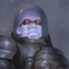
Well 3500 visits - so time to post some predator colorshere you got chronoaliens freshes creation - a predator fanart - finished and colored up by the great vegas mike
here is what he said:
I was invited to color up a piece from their gallery and this was their most recent work. I colored it with prismacolor markers and scanned it and colored it some more in PS @5-6 hrs.
So-- enjoy
Pencils - Chronoalien
Coloring - Vegas Mike
Related content


Comments: 96


holy crap that's cool. like very much ")
👍: 0 ⏩: 1

Well Done, WEll Done  (Smile)")
👍: 0 ⏩: 1

thanks for the fav and the nice comment
👍: 0 ⏩: 1

Er det bare meg, eller har Vegas Mike glemt å farge den ene skulderbeskytteren?
Uansett, veldig stilig bilde!
👍: 0 ⏩: 1
Hehe, ok. Det er bare det at en strek som går over den andre skulderen virker veldig som om det er en del av en skulderbeskytter.  (Wink)")
👍: 0 ⏩: 0

yum - his right leg looks a tad uncomfortable, but maybe those double-jointed hips are part of what gives them that bad temper...
👍: 0 ⏩: 1

really good, but the pose suggests that he is posing for a bikini contest
👍: 0 ⏩: 1

I think the coloring is really solid, might be a little dark or it's my screen.
On the drawing end of it is quite well done too although I feel the pose is a little off, I mean, why would he rest his foot on something that makes his knee higher than his hip...not to comfy. The pose is also a tad static given the character.
Details in the inks and coloring is very nice.
👍: 0 ⏩: 1
you are apsolutely right, but it still looks good.. dont it.. hah
thanks for the nice words
👍: 0 ⏩: 1

Wow. That's so very cool.
I really love the style you used for coloring (and the inks/pencils look really great too!). Awesome job, all around!
👍: 0 ⏩: 1

no problwm hope you guys keep up the good work
👍: 0 ⏩: 1


Predator rules ^_^
I like your take on the colors in this. My only catch was that the outlines tend to make it look out of place in the background, but I guess thats part of the whole style
👍: 0 ⏩: 1
indeed it is, thanks for liking it
👍: 0 ⏩: 0

Excellent job! This is awesome! I especially like the color work you did for the metal parts. Keep up the good work!
👍: 0 ⏩: 1
hehe thanks, yea vegasmike the colorist of this image really know how to make the different colors look great and work together perfectly
👍: 0 ⏩: 0

This is really, really, awesome.... severly great 
👍: 0 ⏩: 1


yea he is apsolutely one of my fav artists
👍: 0 ⏩: 0

thanks alot
👍: 0 ⏩: 0

Nice, his stance really makes the picture, where do you come up with wepon idea's? they're wickedly shaped
👍: 0 ⏩: 1
well these once are prob a combination of watching the movie and having some inmagination
👍: 0 ⏩: 1
lol damn good imagination, I'm jealious
")
👍: 0 ⏩: 1


absolutely amazing predator drawing and coloring! i love the predator and this really makes him look as badass as he is 
👍: 0 ⏩: 0

Awesome, awesome work. ^^ Great colours and shading.
👍: 0 ⏩: 0
| Next =>