HOME | DD
 bensen-daniel — V-frog
by-nc-nd
bensen-daniel — V-frog
by-nc-nd

Published: 2009-12-27 13:26:51 +0000 UTC; Views: 3905; Favourites: 85; Downloads: 62
Redirect to original
Description
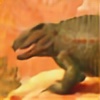
Merry Christmas from Bulgaria, everyoneIn between eating and hanging out, I found some time to make this little Venusian frog for the Venus project. I like the shape and creature design, but I'm not as happy about the shadows. So any criticism would be very much appreciated. Here's the description of the animal:
V-frog (Asimov): "It was a little creature, perhaps eight inches long, with a triangular head into which two bulging black eyes were set. It rested on six little padded feet drawn close to its body. Each foot had three long toes in front and one behind. Its skin was green and froglike, and there were frilly fins, which vibrated rapidly, running down the center line of its back. In place of a mouth it had a beak, strong, curved, and parrotlike. ... Its feet remained on the floor of the aquarium, but its legs stretchedout like extendible stilts, as its numerous leg joints straightened." [lives entirely underwater on the ocean floor, sometimes swimming]
And in my estimation: This animal is another stoibozoan (or stack-animal), a relative of the Tongzan ([link] ). Like the tongzan, its body is composed of two boney boxes connected at an inflexible neck (its chamelon-like eyes make up for this immobility). The legs are homologous to the four segmented tentacles that sprouted from the six body segments of the ancestral stoibozoan, now fused together. They have the same number of joints (7) as the legs of the Tongzan, but the space between the joints is longer.
Once again, I'd appreciate anything anyone has to say about this thing.
EDIT: made the high res version. DAMN stupid amphibion and its stupid shadows!
I tried two new things here. One was making the borders of the shadows stippled, to give the skin some texture. The other thing I did was put a blue mask over the parts of the frog that are farther away. Does it work? Or should I use a white mask to make them fade?
Done while listening to: Under the Dome
Related content


Comments: 23
")

Thanks. This is an old one.
 (Smile)")
👍: 0 ⏩: 1

Doesn't matter, still great!
👍: 0 ⏩: 0
I love how you're interconnecting the Venusian animals from all the different authors together, it makes it even more believable.
No comment on the shadows, they look good to me, but I'm no expert on Photoshop and won't proffer any advice that won't be given by more qualified individuals *coughMoaicough*
A lot of animals seem to be subtly hinted at here, whether intentionally or not. Besides the obvious frog, it's got some grasshopper, parrot, chameleon, and stegosaur; it even looks slightly like an Orz! And, oddly enough, it's rather close to the Lensman series' Venerian (the main difference being that the Venerian is a pallid, bloated cave-dweller).
👍: 0 ⏩: 1
The interconnection thing is not something I can take credit for. That's my client's idea. But yeah, it is cool, isn't it?
Well, I mean, do the shadows look GOOD to you?
Cool about the Lensman thing. I'll tell that to the client.
👍: 0 ⏩: 1
It is Awesome.
Why, yes, they do. And they have a nice watercolor look to them, which is also sweet.
👍: 0 ⏩: 0

I've had this in my Deviations since you've posted it, meaning to comment on it. Now that you've updated it (and improved it significantly) I have no choice but to post a comment.
First of all, nice job, once again. Cool design (I like the chameleon eyes and the stegosaur-esque fins), and strong job on the coloration. The shadows are looking pretty nice too, though I agree with whale's critique on the eye shadow (hehe, eye shadow). You did the right thing by stippling the shadow borders to create texture, because the border between light and shadow is where textures are usually the most apparent. I have just a few critiques.
One, the foreshortening on the middle limb on the side facing us feels just a little off. The shadow on the body doesn't seem right either, judging from the shadows on the rest of the body. I think that most of that area would be in light, still. The blue in the cast ground shadow is slightly too saturated, I think, and those darker shadow cores underneath the toes should be made to fade into the lighter shadow tone more smoothly.
Finally, I'd like you to get a little braver with higher contrast. In short, make shadows darker (but not too dark, though!). Even on light-colored forms like this, shadows are surprisingly dark. One a ten step value scale (black on one end, white on the other, with eight different grays in between), the light side of an object and the dark side are often ten value steps apart. This is perhaps the most common mistake that beginning painters make. I think the shadows here can work okay as they are, but darkening them slightly might be an improvement.
👍: 0 ⏩: 1
Yes, I'm much too timid with dark shadows. That was something I was consciously working to correct in this picture. So I still have some ways to go.
The other thing I need to do (as I told whale above) is not merge the shadow layers too early, so I can go back and fix them without redoing everything.
I had a terrible time with the shadows in this picture. I changed the light source three times, then went back to the original light source at the last minute. Finally I was just sick of fiddling with the damn thing.
👍: 0 ⏩: 1
Well, like I said, you took a huge step in the right direction with the shadows on this one. The shadows could be slightly darker, but the level of contrast works well enough as it is.
Deciding on the light source at the beginning can be difficult, that's for sure.
By the way, I'll get to your Tongzan soon, I promise!
👍: 0 ⏩: 1
Thanks. I'm working on the next one right now, and I'm going to make the light source from yet another angle.
Don't worry about the tongzan. After I finish these things, I have no desire to go back and fiddle with them, at least not right away. I have a list of things I want to do to the tongzan (giving it Nemo Ramjet's hour-glass pupils is at the top), and I'll add whatever you discover to that list.
👍: 0 ⏩: 1
Well, what I can say from looking at your PSD is that I was very surprised that you used the "normal" blending mode for your shadow layers. Try switching it to "multiply" mode (which makes whatever's underneath it darker), and see how that effects the colors.
👍: 0 ⏩: 1
I'm sorry I forgot to thank you for this advice
👍: 0 ⏩: 0

I've got to say, man, i love the texturing & shadows.I don't normally condone white atmospheric fading willy-nilly, but think that with the light source it will seem only too natural. The only things i can criticize about this: conform the shadow on the eye more to the contour (the front eye is flattened unlike the back eye), for the hard shadow on the side of the body, alow some light source to penetrate it where it's not being blocked by the fin ridge (though it looks damn good the way it is already), and lastly ... I know you're gonna hate this, haha, but add a shiny dot to the eye. Don;t question it, just do it. you can delete it afterward, but do it and see how it looks at least, to humor me
👍: 0 ⏩: 1
Ugh. Those god damned shadows. I was a horrible spaz about them throughout the entire procss. I would make a bunch of shadows in different layers, merge the layers (because I'm an idiot), then decide I wanted to modify the shadows. Oops! Now that they're merged they are no longer solid colors set to low opacity, they are transparent colors at 100 opacity. That means I can't change them without it looking stupid!
So yes, you spotted an artifact of the fact that, at the last minute, I decided to change the light source, but didn't want to redraw all the shadows everywhere, so only changed them on the body, and not the legs or the more distant eye.
It was a huge waste of time. I am never merging layers every again.
")
👍: 0 ⏩: 1
Heh heh, this is why I always end up with 10 copies of the file saved in steps. The 'trouble' areas look like easy paint fixes though! I'm saying that, though, not having been the one who spent all the time making this!
👍: 0 ⏩: 1
At some point I'll go back and fix it, I hope. But for now, I'm done. As Pavlina says, "when it's 95% finished, stop working on it."
👍: 0 ⏩: 0
I'd say taper the body more extremely, giving it a severe teardrop shape with hard edges on the frog body, a head like this: [link]
If it helps, remember that this is an underwater creature. Make the whole body conform to a uniform streamline.
Other than that, I love what you've done with the colors and fins!
👍: 0 ⏩: 1
Except how does it propel itself? I imagined it walking on the sea floor (or lake bed, or wherever) and then swimming when it had to by vibrating its caudal fins like a seahorse.
Thanks a lot for the reference photo, though. I like the color scheme of that turtle, too. And I may use that in the final version.
👍: 0 ⏩: 1
Ah, I hadn't thought of swimming ala seahorse ... it's a good idea!
I always find that I communicate better through pictures than through words! trying to work on this
👍: 0 ⏩: 1
Well, I really appreciate the pictures, so don't work on this too hard
👍: 0 ⏩: 0
