HOME | DD
 BluntieDK — .: Shadowplay 3 - Monestary :.

Published: 2004-01-10 21:07:36 +0000 UTC; Views: 2102; Favourites: 26; Downloads: 506
Redirect to original
Description
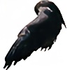
Pic 3 of 3 - fullview recommended---------------------------------------
I recently paged through a book by lovely ol' Burne Hogarth and was inspired by some of his pictures using nothing but
silhouettes in both black and white, overlapping. Sat down and made a few tests using the same technique. It's great
fun actually...and (at least in my opinion) makes some very powerful images. I'd really like to know if these pics
make any sense to you, or if you're having trouble seeing whats going on.
Related content


Comments: 40

This is great black and white layering. I love stuff like this...
")
👍: 0 ⏩: 0

oh man, am I ever a sucker for this BnW stuff, I'm gonna have to check out the rest. Killer job, I love the subtle detail.
👍: 0 ⏩: 0

cool b&w deviation
must be hard to give life to something using only those 2 colors
good work
 (Smile)")
👍: 0 ⏩: 0

Yowsa!!! I love the contrast in this! Very well done; I can feel the depth in this!
👍: 0 ⏩: 0

Very very nice. I agree that this sort of composition can be a lot more powerful than many other methods. +fav, because I'm such a sucker for b&w work.
👍: 0 ⏩: 1

Thanks man, appreciate it.
👍: 0 ⏩: 0


i am glad you cleaned up you re older picture. Still awesome!
👍: 0 ⏩: 0


nope, that's clear as day and you executed the technique extremely well. yay.
👍: 0 ⏩: 0

Just awesome... It really says a lot.
"Once a remote hallowed bastion, now only dark things dwell within..."
Not sure if that was the intent, but it gives the feeling of a huge monster gazing down at me. >.>;
👍: 0 ⏩: 0


Not in this one, it's very clear and quite stunning. Much good job, sir.
👍: 0 ⏩: 0


Mmm... I love Japanese roofs.
I agree wih scion-of-light about smoothing out the black so its all black and has less visible brush-(or pen or whatever)strokes in it (I think that's what they meant), but you should leave in the way way the outline of the moon(sun?) seems to carry on through the roof of the temple...not that I'm telling you how to to your job or anything
👍: 0 ⏩: 1
Hehehe...took me a while to figure out what he meant. It turned out the reason I couldn't see the problem, was the brightness of my monitor was set down so low I couldn't SEE the tonal differences! Lol!
👍: 0 ⏩: 0
Its almost an art in it self to make pictures like this...
👍: 0 ⏩: 1


This is by far my favourite for different reasons but mainly because of the clarity of each layer. I also love the really detailled texture you managed to apply to just a silhouette and the way you put it together so powerfully with the tower against the giant moon.

👍: 0 ⏩: 0

this is really cool, simple affect but beautifully done!
👍: 0 ⏩: 0

Jesus that's awesome! I love silhouettes. I especially like how it looks like a haunted house you'd never want to go near.
👍: 0 ⏩: 0

gorgous. to the favs this wonderful contrast piece goes
👍: 0 ⏩: 1
*takes a bow* Thankew, thankew!
👍: 0 ⏩: 0

i love black and white, and this is my favorite of the three pieces.
👍: 0 ⏩: 0
i love black and white, and this is my favorite of the three pieces.
👍: 0 ⏩: 0

damn dude
all 3 of these are aces!
b&w can be a very powerful medium, and i think youve done it great justice here
👍: 0 ⏩: 0

WHOA!! That is pretty trippy actually! Very creative though! Awesome job with all the detail you gave in this piece..was it very time consuming? Seem like you had to plan a lot with this eh?
👍: 0 ⏩: 1
Well, actually not that time consuming. What took the most time was actually just filling in the blacks. Otherwise it was mostly just defining some silhouettes. And thanks.
👍: 0 ⏩: 0


neato. i can see this as a really cool and really big lithograph series, or blockprint or something.
👍: 0 ⏩: 0


I somehow don't find this one as powerful as the other two, but it's nicely done just the same. Excellent work!
👍: 0 ⏩: 0

Gorgeous; that technique is really powerful and you used it well. I love how you managed so much detail in what is essentially an outline. The white border is really nice, too. If you have an image editing software, you may want to smooth out the dark sky a bit, though.
👍: 0 ⏩: 1
Thanks alot.
Smooth out the sky? How so? Put a blur on it or a gradient or what? I'm not sure what you mean, sorry.
👍: 0 ⏩: 1
I would go with blur or maybe just the smudge tool over the areas that have lines in them.
👍: 0 ⏩: 1
Hehehe, I didn't understand what you meant at first, but I do now...the problem was that the brightness of my monitor was turned down so low I couldn't see the tonal differences! It should be fixed now, thanks!
👍: 0 ⏩: 0