HOME | DD
 borda — Fool's Move - Digital

Published: 2011-02-23 11:14:46 +0000 UTC; Views: 15173; Favourites: 496; Downloads: 0
Redirect to original
Description
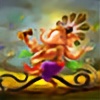
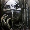
I did a photoshop repaint over a old oil painting, Fool's Move borda.deviantart.com/art/Fool-… as it was requested for a CD coverStill need to work on small details, any suggestions so far?
Related content


Comments: 50


Originality

I don't know where to begin, so I'll begin with texture. The hands, though pallid, are wondrously veined. The wood of the lyre is so much like polished cherrywood that it looks real. The thighs are mottled such as to resemble a map. By way of contrast there are super smooth areas, like the fsace and upper garments.
The figure is distintc from, yet seems born out of the red background. Frivolity as idea emerges from the lyre, the facial expression, the falling chess pieces.
The draftsmasnship is that of a highly talented artist. This piece should join the world's collection of great harlequins.
👍: 0 ⏩: 0


didn't know there was two versions of this that was the mixup keep up good work
👍: 0 ⏩: 0


second view and it twas me being delusional lol left hand fine keep up the great work
👍: 0 ⏩: 0


It's gorgeous.
The only suggestion I might have is that if you'd like a bit more in the white space area on the left side would be perhaps some juggling balls - maybe 3 of them. If you like or need the white space for typography, then nothing needs to be added. Beautiful moon surface style texture on the hip.
👍: 0 ⏩: 1
oh and perhaps just a touch more texture on the face. The hand is so beautifully textured that the face looks just a touch too smooth.
👍: 0 ⏩: 0

Wah, very great deviation, it would be good for the tarot card The Fool! *0*
👍: 0 ⏩: 0
This amazing deviation was featured in my Daethly Deviant XIX News Article . Please remember to support the article (with a 
SisstreDaethe
👍: 0 ⏩: 0


I have featured this beautyful picture in my "RED mixed media"- collection![link]
I hope you will agree and enjoy!
👍: 0 ⏩: 0
unbelievable 

👍: 0 ⏩: 0


")


the left hand needs work apart from that its gud
👍: 0 ⏩: 0

would make a great playing card stand-in for a joker
👍: 0 ⏩: 0


Fantastic work love the expressions and emotions.Excellent
 (Wink)")
👍: 0 ⏩: 0

VERY pretty I must say! I love the bold colors  (Smile)")
👍: 0 ⏩: 0


Nice, paint over a paiting piece? and u call it photomanipulation?... I think it worth painting category
👍: 0 ⏩: 0


Ok i adore both pictures... but the very first thing that came into my head when i saw this was the fool asking "does my bum look big in this???" 
Ahem. So the points i noticed are that one corner looks much darker then the rest of the picture, i don't know if that is intentional. It is a little hard to make out the harp strings. And the skin on the face looks very different to the hand - although the face could have makeup i guess.
But the jester looks very happy for someone with an arse like the moon

👍: 0 ⏩: 0


It has more volume and generally it looks great, but I have two notes:
1) Maybe the shading at the bottom-right corner is too deep. I understand you needed to obscure those sketchy chess figures from the original, but this part looks too textureless, compared to the rest of the background. But if it's reserved for some sort of a logo, then it's perfectly fine.
2) The wooden texture on the harp is great, but that huge knot is somewhat distracting. You should avoid such things when painting musical instruments -- unlike barrels, they rarely have knots on them.
👍: 0 ⏩: 1

thanks, good points, indeed the knot was too disturbing, need to fix that corner as well...

👍: 0 ⏩: 1


OMG, you're amazing!
About details....mh, what about a transparent texture of a chess board on the background? Maybe with some erased part...and with a cold color (a dark green or a purple shade), just to let the figure to pop up from the picture.

👍: 0 ⏩: 1
thanks, yes a chess board would be great but need to put some text and would be too loaded
👍: 0 ⏩: 1
it's your artwork so, you're the only one who can really choose for it!

👍: 0 ⏩: 0

Wow, I love the lighting and richer colors . . . the only thing I might want to do is incorporate some of the pink coloring of the face into the hand a bit more, maybe bring out the background 'sunburst' more

👍: 0 ⏩: 1
thanks, I'll play with the colors a little bit more to see how can improve it

👍: 0 ⏩: 0