HOME | DD
 Born-from-pain — Zero Gravety...

Published: 2009-05-27 13:05:29 +0000 UTC; Views: 882; Favourites: 16; Downloads: 0
Redirect to original
Description
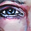
Zero Gravetyfinished or not?
A ghost horse that's sinking in the sea, mmm I think I had no inspiration at all.
ref: [link]
critique wanted!
Related content


Comments: 5

One thing to remember about critiques is that personal tastes vary from person to person, so don't be surprised if you get inconsistent or contradictory feedback from different people.
That said, the only thing that I think needs any sort of improvement at all is the bright red mane and tail. The specific shade of red doesn't gel well with the rest of the image, and it becomes distracting. There are two ways this can be remedied- bring some of the nice blues, purples, and yellows that you used in the rest of the piece into the red; or take that bright flame red and distribute it out into the rest of the image. The contrast *is* interesting, I'll admit, but a painting still needs to have visual harmony. It wouldn't take much in order to achieve that harmony. I'd suggest maybe adding a few reddish tones into the shading of the horse as well as in the (clouds? sand?) above the water, as well as perhaps overlaying a subtle purple or blue tone on the mane and tail. You would still have that high contrast, but the red won't be as eye poppingly out there.
The overall composition of the image is fair. I have a personal preference for more dynamic, off-center compositions myself, so when I see an image wherein the subject is dead center I'm not as attracted to it. But, as I said, that is a personal preference, and there's nothing wrong with centering the subject, as long as you've designed it that way for a reason. The long neck sweeping out to the right finishes out a nice curve which you started with the tail, and that gives the image just enough movement.
Your details are beautiful, however. The way you've rendered the horse's corpse are exquisite. I'd like to see a little bit more of that brought into the rest of the image. Again, not very much, but subtle hints at what's behind the horse would add a lot of depth and a sense of place. Push your dark areas a little bit more, and the paleness of the corpse will pop.
Wow, that ended up being a lot longer than I intended. I hope you don't get the feeling that I don't like it- because I do. You've done a superb job, and I look forward to your future works!
👍: 0 ⏩: 1

no, I really like critique like this, I need it, it helps me a lot more.
As long as you mix positive with negative and that you tell me why you think it, I'm really pleased with it
thanks!
 (Smile)")
👍: 0 ⏩: 1
I always try to mix positive with negative (I won't lie, that's the way I like to get it, too!), I just always worry that maybe the negative is coming off too strong, or something. The last thing I ever want to do is discourage another artist. Also, I tend to make a lot of suggestions when I crit people, but please remember that they are *only* suggestions, just to get your mind thinking about different ways to solve any "problem" areas that might be pointed out to you.
I guess I just want to make it perfectly clear that my intention isn't to tell you how to express yourself or revoke your artistic license or anything like that. I really do enjoy your artwork, and I love the direction that you've been going with your latest works. I know that sometimes it's hard to tell when you're moving in a good direction, or even where to go next, and critique is essential to that decision making process, but I didn't want to come off too strong or something. Hehe.
Also, you're welcome. ^_^

👍: 0 ⏩: 0

OMG! Poor horse, but amazing piece, I loveeee 
👍: 0 ⏩: 0
Wow, I love the contrast of colors. This is very well done, the expression of the horse is...eerie, And the fish is such a nice touch, really adds a lot. Plus I love light reflections that come from water, something so dreamy about them.
8D
👍: 0 ⏩: 0