HOME | DD
 catarinasbm — Jyn Erso
by-nc-nd
catarinasbm — Jyn Erso
by-nc-nd

#markers #orange #rogueone #jynerso #rogueoneastarwarsstory #rogueonefanart #jyn_erso #jynersostarwars
Published: 2017-03-30 19:36:47 +0000 UTC; Views: 889; Favourites: 58; Downloads: 0
Redirect to original
Description
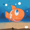
A one attempt sketch I did the other day (Smile)") I've been seeing some youtube videos with the "One marker challenge" and decided to challenge myself to draw this amazing character from "Rogue One". Hope you like the outcome as much as I do ^^
I've been seeing some youtube videos with the "One marker challenge" and decided to challenge myself to draw this amazing character from "Rogue One". Hope you like the outcome as much as I do ^^
Related content


Comments: 12

I really love the red lineart in this piece! You did a great job.
👍: 0 ⏩: 1

Thank you! It's actually orange but I understand that the lighting might make it look like it is red ^^
👍: 0 ⏩: 0

Here from
First off, I'm not very familiar with this character do sorry if this critique is any inaccurate 
I like this expression on her face and her nose and eyebrows are very nicely shaped. Also, it's very interesting and unique that the color isn't black as in most lineart pieces.
Somehow, her head doesn't exactly seem to connect to her neck just right....I don't know if that's just me, the angle, or what but it just seems a bit off. :shrugs:
I like it how there's a thicker outline for the boarder and the line variation is really good but some of the outline is a bit choppy. 
Anyway, there's something about her right eye that isn't quite center properly and her lower lip is funny to me. Her hair could also use a bit more detail. I like the her collar though ^^ And the letter are cool o!
Overall, this is very nice! I hope I haven't been too critical and that this helps. Have a good day\night and keep up the good work! 
👍: 0 ⏩: 1
Hello
As I said before on the other Project Comment feedback that was given to this piece, this was a one time sketch so there was no pre-sketch with pencil, it was directly with the marker. That is something I don't usually do so given that it's normal that there are all the flaws you mentioned
👍: 0 ⏩: 0
I like the lineweight you did. Did you use a pin for the thinner lines and a marker for the thicker outlines?
👍: 0 ⏩: 1
Thank you! I'm glad ^^ Nope, I used only the pen on the picture  (Wink)")
👍: 0 ⏩: 0

Hello, just another friendly critique from and I want to start off with how I like the art and why.
Your line art is very well done, broad and thick lines to highlight her outer features and thin, clean lines for the hair. The shadings are well placed and don't cover a lot of the art, looks neat and clean especially the shadings on the collar. It shows that each pen stroke is done with a lot of concentration and effort. And no faults in the anatomy, the fact that you drew out the chin give it a realistic feel but still following a comical look like how you draw her eyes. The fact that you used the colour orange for the whole art gives it energy, I mostly draw using only black which gives it a stale and solid feel to the whole art which is why this piece drawn my attention in the first place.
Now I would point out somethings that disturb me, the two thin lines on her hair and cheek looks misplaced. I'm not sure its a mistake or it is in purpose but it just bugs me when I see it. And lastly, I prefer more detailed hair lines. The outline for her hair looks too thick and the lines at the back look choppy, but the hair details is just a personal opinion.
Conclusion, I love it! I'd give it an 8/10 for the proper facial features and keeping the work looking neat.
👍: 0 ⏩: 1
Hello! First of all, thank you so much for taking time to comment on my piece and for the kind compliments you made ^^
I'm very glad you like this drawing ")
I gotta say I did this sketch out of impulse so it wasn't a very planned one. Most of the things you say you thought that were a bit off were mistakes XD The color I chose was because I got this new pen (Artline 220) and I really felt like trying it out. I do agree it makes the drawing pop out instead of just using same old black ink. Regarding the outline of the hair, that you say you prefer it lighter I actually just wanted to do a thicker line on the outside so I tried doing it with the same thickness all around.
This work was quite challenging for me because I just drew it without a before hand sketch. Besides, it was the first time drawing Jyn so that's why I thought It wouldn't look as good as it looks XD
Thank you for the score! Ahah ^^
👍: 0 ⏩: 1
Looks good to me for a first time!
Welcome!
👍: 0 ⏩: 1
Ahah, thank you very much! ^^
👍: 0 ⏩: 0

Well done on the shadows, love the portrait. Keep it up!
👍: 0 ⏩: 1
Thank you ^^ I'm glad you like it
👍: 0 ⏩: 0