HOME | DD
 cheeks-74 — Kid concept for my book

Published: 2003-10-23 22:01:10 +0000 UTC; Views: 4251; Favourites: 3; Downloads: 1053
Redirect to original
Description
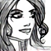
I am putting a book together. This is one of the charcters. I am not sure if I'll keep with this style. I wanna go simpler. What do you think?Art: Cheeks
Related content


Comments: 30


he reminds me of andy richter from conan o' brien
👍: 0 ⏩: 0

With the rest of the body he wouldnt look too old - i think the style is perfect as is.
👍: 0 ⏩: 0

I'm late replying!!! Go me!!! I think simpler wouldn't be such a bad idea. I have some ideas about making him as people put it less older looking. I'm just gonna give example since I suck as explanations!
[link]
Here are a bunch of different things you could to with him!
Play with them as you please!
👍: 0 ⏩: 1

Shannon, you're a blessing! Wowsers wowsers wowsers! Those are fantastic! Thank you. Those sketches you did are awesome. I will definitely use them for guidance.
👍: 0 ⏩: 1
Your very welcome! ")
👍: 0 ⏩: 0

It really depends on the overall look you're going for.  (Smile)")
")
👍: 0 ⏩: 0

No need to go anymore simpler. I think it is quite simple enough
And it's great. Why to change perfect?
👍: 0 ⏩: 0

Looks pretty animated. I don't think that you want to go any simpler than that.
👍: 0 ⏩: 0


Looks like he's going to be a mischevious brat. LOL..Truthfully, I really like that style. I wouldn't go any more simple. You'd loose a lot of detail that could really add to the characters personality. From my experience you wanna add as much ..oomph..to the character without becoming confusing in the detail..I think this is perfect!
👍: 0 ⏩: 0

I thought the kid was an adult..when I see kids I think not so proportional..bigger ears bigger eyes..I love the style you have though.
👍: 0 ⏩: 0

That's pretty damn simple as it is. It's great! I think it's fine the way it is.
-John
👍: 0 ⏩: 0

More simple..and hair do makes him look more like a chubby teenager than a kid.
👍: 0 ⏩: 0

How much simpler can you go? Very cool, man. I like the expressions!!
👍: 0 ⏩: 0

i'd like to how much simpler you go if you try it.
unless he's a chunky kid, which is entirely possible, i'd say with the chin and the hair, he does look older... like junior high age... rather than a young child.
👍: 0 ⏩: 0

Well i guess everything has been said in the other comments,
seriously are you going to be in the next disney movie?
greetings Soulrailer
ps Ill be watching you
👍: 0 ⏩: 0


I can picture him in a cartoon clip. -laughs-
👍: 0 ⏩: 0

i like it! it's got a different feeling than your other work... good to see you working with a rounder, softer character design!
but as a few other people have pointed out, the face does look too old for a kid.
the chin in the first two is too pronounced. making anything larger or more angular on the face is a really quick way to age a person... unfortunately that can also work against you  (Cool)")
 (Wink)")
also, the hair. parting it on the side gives the impression of a receding hairline. maybe it's a genetic condition in the kids family, i dunno
but the style's good! it's pretty simple already, and looks really classic... going any simpler would give it more of a neo-graphic feel, which isn't a bad thing in-and-of itself, but you've got such a good expressive character here already

👍: 0 ⏩: 0

One of the things that really makes him look like an adult as opposed to a kid is the chin. Not sure how to explain it really... but the chin just looks very adult is... and the haircut looks kinda mature for someone that should be a child too ")
All in all it is a good style for a character, anything more simple would just be kinda... bleh...
So what is this kids book gonna be about?
~Talon
👍: 0 ⏩: 0

When you say "simpler" what do you mean?
If you mean not as "Bluth-esque"? You might be right. For some reason you're one of those lucky bastards who's "STYLE is very visible...Y'know? When you see a cheeks picture it's like "Duh! Cheeks drew that!"
Try thinking about his characteristics and motivations....alot of times that will tell you what a character will look like.
I like it. I think people think he looks like an old man because of the hairline (an easy fix) it's a little widows peaky
What's the book gonna be about?!?!?!?
Ya need any help?? Dialogue or what have you??
👍: 0 ⏩: 0

I love it! Very lively and cute! His face is very expressive and I like that. I think this is good enough; I think if you go even simpler, you'll lose some appeal and style that you have right now.
👍: 0 ⏩: 0

I love them! seems very disney- animated and "full of life" ^_^ and cute! How old is he supposed to be? people mentioned that he doesn't really look like a kid- he could be an older kid, like early teens... ^^' pwah. I still like. ^_^
👍: 0 ⏩: 0

i like it, it's pretty simle already and looks nice
👍: 0 ⏩: 0

It's good, but it really doesn't look like a kid...He needs to have that kind of glint in his eye a little kid does or pudgy cheeks or something...no pun intended. Maybe add like a bib or one of those hats that have the propeller on top. That would make the difference. Hm...just some ideas. Can't wait to see the design you decide on. :hm:
👍: 0 ⏩: 0

its cool, but diferent. i dont like this style much.
👍: 0 ⏩: 0

seems pretty simple as is. But SuccessfulLiving does have a oint that he looks a nit older than a child....last one looks good though.
👍: 0 ⏩: 0

This is so awesome! I love it! He sort of looks like, an older man in the first two shots...not OLD man, but just...older than a child, as he does in the third. Great job, nontheless!
👍: 0 ⏩: 0