HOME | DD
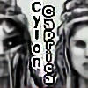
 Chrishankhah — The Impudent One

Published: 2012-06-17 23:17:44 +0000 UTC; Views: 1827; Favourites: 19; Downloads: 26
Redirect to original
Description
Luchina Corvusala was born pre-mature when her mother died unexpectedly. As a result, she spent her few, living years in a sickly state, emaciated and weak. Lurien, her father, became very protective of Luchina, and so when the ancient priest, Ptahrosaten, gave him the gift of immortality, he did not want to carry on without using it to save his own daughter. She was only fourteen.But Luchina was also a spoiled girl. Having power and energy for the first time in her life, she used it mercilessly to take back from humanity all of the life of which she felt she was depraved as a mortal. Angry and vengeful, she became unstoppable. Ptahrosaten saught to rectify this, but Lurien (feeling there was yet redemption for his daughter) would not have it. The two dueled, but Lurien lost. When Luchina discovered this, she avenged her father's death with her father's blade, forged by Ptahrosaten himself. The blade was all that remained when Chrishankhah sought out the priest of Ptah. It was too late for him, and now Luchina was at large. Thus, when a cult bearing the name "Corvusala" began to emerge throughout the Roman underground, it was only too clear who was responsible.
---
My work on this began as a contest prerequisite for #TwistedFates-series . As with the Osiris piece, I made this "vanilla" version as her normal, vampiric self, for comparison and as a future reference of Luchina. I actually like this version more because her eyes really emphasize her selfish, sneering personality. Anyway, the cross-over version (with Luchina as "Patient Zero") can be found here: [link]
Related content


Comments: 31


you're very welcome.
 (Smile)")
👍: 0 ⏩: 0

Oh, I've waited for it
Colores are really cool, and the background, and rain....
Oooooooh! Cant describe it, just faint of awesomenes of your art)
 (Wink)")
👍: 0 ⏩: 1

I'm glad you like it! ")
I'll try to get the sketch for your trade done within a few days. I've had so much work I've been neglecting and trying to finish. XD
👍: 0 ⏩: 1
Oh, you dont have to harry!
Just I am now in africa as I've said before, and I cant make my part till I come home(
👍: 0 ⏩: 0
Yeah, you usually have to wait for it.
👍: 0 ⏩: 0
I swear I just added a nice comment and it isn't here anywhere!
👍: 0 ⏩: 0
Wow...this could spawn a separate novel as powerful as Dracula. Love this picture because the emotions cut right through. The rain and the water are a nice touch.
👍: 0 ⏩: 1
It's all related to the main story I write though
👍: 0 ⏩: 0

Oh snap! this is really good. I especially like the angle and the puddle below.
I don't know If you want critique or not so I'll hold off on that for the moment.
👍: 0 ⏩: 1
lol, thank you.
As for critique, I'm kind of two-fold on it. (You'll learn right now why I don't use the "critique" option on dA
I spent a lot of time staring at this and fixing errors, as I often do. I usually duplicate a merged layer for postwork, find an error, and have to go back, fix it, and re-do all of the postwork; I drive myself mad! After all of that, I know there are plenty more errors that I just can't get around to fixing. But if I spent any more time fixing them, I just wouldn't have gotten it done. (There are a lot of works sitting unfinished on my computer for that very reason.)
So, for instance (and just off the top of my head,) I know the lighting source looks wrong, but it's actually meant to be coming from above rather than the side. I just didn't get the angle down well enough to show that right. >< It's how the shadow actually fell when I tested the angle with a few pictures for reference. I can't logically explain it. There's a lot of things like this that I understand and just don't properly execute as well as I'd like. Most critiques just point out to me what's wrong, and it's kind of frustrating because they're things I recognize and just need to know how to do correctly -- which will come with practice, if nothing else. (It's gotten me this far!)
That said... (lol) ...I'm never too proud to hear advice that's well-meant, and if you can be gentle and overall positive, I'll hear you out! Especially if you have tips on technique!
👍: 0 ⏩: 1
I was mainly gonna talk about posing and anatomical quirks.
I can't really talk about technique since I don't have the best grasp of the capabilities of Photoshop.

👍: 0 ⏩: 2
(Also, [link] is the initial sketch if it helps discern what's what. It's why I say some of it is just in technique and coloring.)
👍: 0 ⏩: 0
Sure.
Her anatomy is meant to be extremely thin, though, so keep that in mind.
👍: 0 ⏩: 1
The main two things I notice are closest arm and her leg posing.
Concerning the arm, even with the most skinny/boney people, there is still outward curvature. Even if it's slight, the presence of muscles on the forearm prevent the skin from making a straight shot to the wrist. The leftmost outside edge of her forearm should very slightly curve away from the bone where it connects to the elbow, before curving back in about halfway down the bone.
The forearm also looks a little bit too long, but that's very minor.
Her far leg is not visible. I realize the intent is that her torso is blocking the sight of her left leg, but the way her left foot is positioned, I feel like I should see at least part of it. If she's half-kneeling instead of squatting, which might hide the leg, the position of the torso starts to look off, and you'd probably still see her knee from that angle.
The trick I use to see if a pose makes sense (And it comes in handy very, very often) is to try the pose myself. If I can't do it without great discomfort, or simply can't do it at all, I re-work the pose.
I hope I didn't sound like a jerk. Cause it really is awesomely done, and shows improvement over past works in your gallery. I think you probably have a better understanding about things like lighting than me, as well as realistic human faces, hair and textures.
👍: 0 ⏩: 1
I think the forearm was a coloring oversight (look at the original sketch and you'll see what I mean.) It looked right back then, but yeah, I see what you mean, it looks weirdly elongated, now. I can never tell if limbs just look long when they're this thin or what. 
The far leg is visible, actually, and both knees are visible --- not obscured by the torso at all -- but the skirt is narrow. (The bigger issue is how I painted the fabric, I think.) Only left calf is obscured by the right leg and the fabric. Take a look at the sketch I linked above, you should see what i mean. It's why I say a lot of things that were technically right to begin with got obscured in the coloring process. The leg positioning should have been obvious, but I kind of turned the whole area into a blob.
You make some good points, though! Would it be much to ask for a quick red-line thing, maybe submitted to stash and link me to it? You don't have to, but a visual idea might help me more. just keep the original sketch in mind, because I think it shows more accurately what I was trying to do here.
👍: 0 ⏩: 1
Oh jeez. I didn't see it when I looked at the sketch the first several times. I had to have them side by side to see it. [link]
👍: 0 ⏩: 1
Yeah, and on my part that shouldn't be -- I should have them colored so the shape is more distinguishable.
If you overlay one with the other you'll see what I was trying to do, by using the highlight to indicate both knee caps. I spent a long time on that area because I just couldn't figure out what to do.
The redline is very helpful, thank you!
👍: 0 ⏩: 1
No problem. Glad I was able to offer something.
👍: 0 ⏩: 0

Awesome. You're really improving. I like the rain effect and the perspective.
👍: 0 ⏩: 1
Thank you! I love the rain, Always fun to incorporate somewhere.
👍: 0 ⏩: 0

Looks great! I love her expression and you did a nice job with her hands/claws. I also like the point of view and you did a wonderful job with the rain!
👍: 0 ⏩: 1
Thank you so much! I forgot to write about getting this all together, but yeah, I really wanted to do something different and creative with the perspective. I tried offsetting the horizon to not be perfectly horizontal and I think it worked out. I'll have to try this more in the future.
It was raining when I was working on this at one point, so that might explain why it rained in the picture.

👍: 0 ⏩: 1
You did a great job with it, so yes, do more! It is interesting how our surrounding/weather has an effect on our works.
👍: 0 ⏩: 0

Impudent characterizes her down to a T, I think. She is bold and full of hate, thinking of no one but herself.
👍: 0 ⏩: 0

Wow... this is... good.
The story and drawing.
Outstanding <3
👍: 0 ⏩: 1
Thank you, I appreciate that much!
I may have to write something of the story out, one day, when I'm feeling inspired.
👍: 0 ⏩: 0