HOME | DD
 cuteychao — Knuckles

Published: 2004-02-01 14:04:11 +0000 UTC; Views: 4125; Favourites: 154; Downloads: 184
Redirect to original
Description
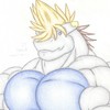
Hope this will work this time.It's Knuckles being hot, leaning on a wall I forgot to draw (blargh!). I'm mad at this site and at my art at the mo so I'll be quiet.
I need to improve.
Related content
Comments: 20

I bet it’s a quick sketch you did, at least I guess it because I see some double lines when you’ve made his shorts, but let’s not focus our analysis on this pointless fact…
This portrait of Knuckles is very nice for our eyes, thanks to two points: firstly, Knux looks handsome and styled with his mature and serious face, and his hair blown by the wind that prevents an eventual static position. And secondly, the magenta shades are, to my mind, the main reason of the success of this work: so many variations, from the light color for the lighting reflects, to the saturated color for the darker parts, have created important and pleasant effects of volume on the character and the background. I especially like the top part of Knux’s body, where the volume effects are more worked.
As a conclusion, it’s amazing how you can turn a sketch of a character (that would look plain with only the pencil lines) to a beautiful work we enjoy ^^ I also love your style of creating reflects and volumes on characters, and I know I’ll quote this quality more than once in my future comments
👍: 0 ⏩: 0

AWESOME! Even though it looks... odd... without the wall, its still awesome.
👍: 0 ⏩: 0

Uhmm..... ele tah mto sexy....... O_O
Acho q vou tentar sequestra-lo...... X DDDD
Mto lindo !!! : 3
👍: 0 ⏩: 0

Whoa..you just drew Knuckles...then you drew him as..just....THE MAN O.O;;;
I mean, he's got these Levi...Calvin Klein something somethings on and looks like he's just.. . THE MAN O.O;
And look at how you colored him!!! It's like he's standing in a modeling agency, there because he feels like it. Not even because he was hired. He just walked in and people started taking pictures of him anyway.
And the pose..I mean it's like he's saying. "I'm here. Now I DARE somebody to say something..." kind of positions. [He looks kind of angry but it still makes him seem so freaking cool. ^ ^]
Oh this is just...freaking..beautiful..yes......tha t's right... I'm getting fat off the eye candy here...
👍: 0 ⏩: 0

Whoo Whoo! Knuckles=Hottie ^__^
Awesome Art Sis ^_^
👍: 0 ⏩: 0

Thanks everyone who commented on the previous uploads of this, even if you could see only half of the pic!
👍: 0 ⏩: 0


