HOME | DD
 Dajhira-Jo — Design Part

Published: 2011-08-13 18:21:58 +0000 UTC; Views: 913; Favourites: 40; Downloads: 14
Redirect to original
Description
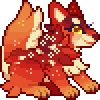
Long overdue part for =IceKrystal . Chance hit me.I just got this done today 8D I like the BG |||DDDDD
Top is Jarodin and Bottom is Ryryk. You can switch them, change them, I don't mind. Download for a waayyyy better view. Way better. hahahaha they are very... sketchy >>; Lack of time, wasn't aiming for accuracy, exactly. I feel bad for the actual quality of this.
Designs (c) *Dajhira-Jo
Obviously for =IceKrystal 's use and his use only.
Related content
Comments: 14

Awesome! I love it when wolf artists just stick with brown.
👍: 0 ⏩: 1

HA, AWESOME! I love those. I was a bit worried you forgot about it, or got no time anymore, because I really wanted you to help me. And I was right to ask you, they are incredibly awesome. I love the bottom one, because I like the lighter shade of beige, and the top one fits Jarodin with the dark reddish accent. They look natural yet with a much more detailed design. And I love the lineart. I like sketchy linearts, like drawing them too.
Yoy also nailed the anatomy on Ryryk. He is supposed to be more slender and a bit scruffy. I tend to draw them much more bulky.
I totally love them. Thanks again. 8D And if you need more help, I am happy to help out again. It was fun.
And maybe those new awesome designs will give me a bit more motivation back to work on AKitD (got a heavy artblock right now :C)
👍: 0 ⏩: 1

I never forgot, actually. How could I ever? XD You should see the scrap pieces of paper covered in Jarodin and Ryryk/Cailen concepts and sketches |D It's more than I've done before, even with my own characters. I was worried you've made designs that you were happy with before I could get them up! CX
Thanks! I tried to incorporate color into personality into disposition. Some colors stand for things. And the funny thing is, you said that Ryryk's anatomy was nailed... ehhh, it's the same lineart CCXXX I guess that proves what colors can do :3 I think you draw them more bulky because you like to put muscles in your wolves XD
Another design swap'd be fun! (you're right!) It was totally worth it!
Heavy artblock? Daanngggg. Those suck! My answer is usually music, and not thinking too hard about whatever you're trying to draw-- just go for it.
Thanks again man!
👍: 0 ⏩: 1

Hell no, I got totally stuck with these two. Couldn't think of anything that fit them. And finally having these two designs down I can work a bit more on the story. They really fit. And Ryryk is an important character, so I wanted to have a good design for him.
I know it's the same lineart, bit yeah, colors can do alot. Also, what I meant was mostly that Ryryk is supposed to be a tad more slender than Jarodin (although again in my sketch of Ryrsk you cannot really see that :/). I guess you're right. I tend to draw my wolves with a lot of muscle details. I maybe should work on different anatomy as well.
Yeah, it was. 8D
Normally music helps, but not this time. Maybe it helps me get through it to have finally these designs. Have made a few sketches for possible illustrations for the story yesterday. So I was more productive than I was in weeks.
👍: 0 ⏩: 1

Dang. That's a lot of stuck CX Well YEAH-- Ryryk looks like an important character from lookin' at your ref! ;D
Yep. Well, when you do draw them you make them look legit
Well that's always a great thing |D WOOOO what a pace! |||DDD
👍: 0 ⏩: 0

These designs are great! I like the top one better though.
👍: 0 ⏩: 1

WOAH!!!
Your designsssssss!!
I love them so much! <3333
8DD
👍: 0 ⏩: 1

thanks Middy 
They've always been that way~
👍: 0 ⏩: 0

These are so awesomesauce 8D
Is this a Design commission? Your designs are really nice ^^ Love the use of Neutral colours 8D
👍: 0 ⏩: 1

No, it was more of an accidental trade X'D but thanks! ;D
👍: 0 ⏩: 1

haha okay XD
You're very welcome ^^
👍: 0 ⏩: 1


