HOME | DD
 davidyardin — X-Factor 41 Cover Lineart

Published: 2008-12-15 23:08:44 +0000 UTC; Views: 3598; Favourites: 84; Downloads: 259
Redirect to original
Description
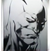
X-Factor vs Sentinels!") Pencils and inks by me.
Pencils and inks by me.X-FACTOR #41
Written by PETER DAVID
Penciled by VALENTINE DE LANDRO
Cover by DAVID YARDIN
Maru. Mr. Tryp. X-Cell. The Isolationist. Madrox has gone against his fair share of unseemly and unfamiliar
antagonists of late, but some villains never go out of style. Like Sentinels. Big, honking Sentinels. Oh yes, this is going to be fun!
32 PGS./Rated T+ …$2.99
Related content


Comments: 32

 (Smile)")


Super impressive !
It's my point of view but I prefere this version (the black 'n W) : The sentinel is more terrifying like that.
Cheers !
👍: 0 ⏩: 0


dude! umm... cowabunga! haha that looks insane, really loving your inks and your use of lighting its so dramatic! keep it up
👍: 0 ⏩: 1

Cowabunga... haven't heard that in a while.
Thanks.
👍: 0 ⏩: 0


I wish I was drawing Astonishing X-Men too.
 (Wink)")
👍: 0 ⏩: 0

Beautiful contrast David!
Now that you've mentioned you used yourself as the model, i think they look a little too much like each other...hehehehe
But that hardly will be noticed! Great cover!
👍: 0 ⏩: 1
Oh I don't look like Jamie 
👍: 0 ⏩: 1
I see! hahahaa
So you let the chance of get yourself in the cover go away like that? hahahhah
just kidding! Great cover!
👍: 0 ⏩: 0

That's just lovely. Reminds me of Dillon's best 2000AD work. Are you dry brushing, splattering or air-brushing white for the light glare in the middle? Very nicely handled.
The only quibble I could have is in the way the 2nd from left figure's arm disappears into the middle guy's elbow. . . and I had to look for something to crit after seeing the "Advanced Critique Encouraged" thing.
👍: 0 ⏩: 1
Yeah that's the part I hate too. In my original lay out I had him closer to the foreground, and of course his hand was in front of the other Jamie's elbow. I did his head a little smaller in the final though and it looked weird having his hand in front of the elbow. It also looked weird with his fingers popping out behind on the other side, so I figured the colourist would flare out the light and obscure it anyway.
With the light flare in the middle, first I inked the blacks in lightly with one thin layer of ink, then worked back into it with an ink eraser. If you put too much ink on to start with, it's a pain to erase, and you end up eating up most of the surface trying to get rid of the black, and get a speckled grey paper fibre look instead (then you have to try and clean that up in Photoshop

👍: 0 ⏩: 1
Thanks for sharing the technique -- I'm still so used to thinking purely in terms of getting the darkest, sharpest blacks that the grey tone madness overtaking comics nowadays still catches me a little flatfooted sometimes. I really love how much things are opening up with the advances in imaging and printing technology.
~R
👍: 0 ⏩: 0


awesome stuff dave - how did you achieve that lighting on the sentinels brow?
👍: 0 ⏩: 1
Thanks Darren. That's just a split hair dry brush technique, as is most of the rest of the shading Sentinel.
👍: 0 ⏩: 1
Any time.
P E A C E
G R o D Z !
👍: 0 ⏩: 0

Thanks Joe; lots of self portrait photos in front of my desk lamp.
👍: 0 ⏩: 0


