HOME | DD

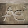
denull — Creative Colour

Published: 2009-05-01 11:09:05 +0000 UTC; Views: 12856; Favourites: 141; Downloads: 361
Redirect to original
Description Photography Studio
Related content
Comments: 39

AplusE2 [2013-04-22 14:06:23 +0000 UTC]

Hiya.

We need an urgent logo design.

Can you help?

We are a new iPhone case company and are not 100% happy with our current logo and are wondering if you can help.

Our website is www.AplusE-squared.com

Read the about us page and let us know if you could do us a new, fresh, simple and clever logo to represent our brand and name across our new and upcoming products.

Thank-you, we hope to hear from you ASAP.

Brains and Brawn

👍: 0 ⏩: 0

limitlesscreativity [2011-11-25 13:40:06 +0000 UTC]

WOW! Awesomesauce!

👍: 0 ⏩: 0

LovelyShrew [2011-08-29 00:52:32 +0000 UTC]

ok... thats just genius.

👍: 0 ⏩: 0

smarko [2011-02-18 16:21:31 +0000 UTC]

bold, clever, great to look at. congrats

👍: 0 ⏩: 0

Gab1 [2010-11-12 03:07:20 +0000 UTC]

pretty interesting

👍: 0 ⏩: 0

tamer98 [2009-11-25 11:54:35 +0000 UTC]

awesome..

👍: 0 ⏩: 0

soulatech [2009-10-15 15:50:19 +0000 UTC]

This is stunning bro!

👍: 0 ⏩: 0

imposiz [2009-05-25 15:32:46 +0000 UTC]

Very nice, I like the shapes here!
Maybe you could have aded some bright colours? sinds the name is Creative Colour, it would have been nice to see those creative colours...

👍: 0 ⏩: 0

fokuz [2009-05-21 14:16:21 +0000 UTC]

very effective, i think the lighter c makes it more interesting. They should be very happy!

👍: 0 ⏩: 0

stylecase [2009-05-10 17:46:35 +0000 UTC]

Very clean and great!!!

👍: 0 ⏩: 0

fioO [2009-05-06 20:10:52 +0000 UTC]

wow! real nice man ! good work

👍: 0 ⏩: 0

infu5ion [2009-05-03 13:25:07 +0000 UTC]

yeh. real nice logo, agree with woweek,unreadabel)

👍: 0 ⏩: 0

JaxeNL [2009-05-03 12:54:00 +0000 UTC]

very nice man! I think its readable enough, very clean

👍: 0 ⏩: 0

justSPITonIt [2009-05-03 11:35:27 +0000 UTC]

colour li trqbva da pishe? lninur?

👍: 0 ⏩: 1

denull In reply to justSPITonIt [2009-05-10 00:09:53 +0000 UTC]

miii zavisi kak gledash na n-to i o-to cutnal sym o-to na polovina ako go gledash ot taq tochka nqma da e "n" ako besh "n" shteshe da ima malyk chengel

kvo staa inache ninjah oshte malko ostana i shte se vijdame po-chesto ) nadqvam se do sredata na juni da sym se premestil veche sofiataa

👍: 0 ⏩: 1

justSPITonIt In reply to denull [2009-05-13 20:03:04 +0000 UTC]

sam znaesh, che tam ne pishe colour, no haide da ne stavam gaden. inache areeeeeee braaaaaat idvai u sofeto da se vilnee!!!

👍: 0 ⏩: 0

woweek [2009-05-03 09:38:55 +0000 UTC]

Unreadable as Hell, but i kinda like those logos, yo!

👍: 0 ⏩: 0

denkyo [2009-05-02 08:39:15 +0000 UTC]

s.t.y.l.i.s.h.!

did you use a font or is it just "hand-made" vectors?

👍: 0 ⏩: 1

denull In reply to denkyo [2009-05-10 00:03:10 +0000 UTC]

handmade Thanks

👍: 0 ⏩: 1

denkyo In reply to denull [2009-05-10 17:09:05 +0000 UTC]

then it truly is a masterpiece!

👍: 0 ⏩: 0

Kozlovacki [2009-05-01 21:47:19 +0000 UTC]

Yeah. This looks awsome.

👍: 0 ⏩: 0

muriloVM [2009-05-01 16:50:13 +0000 UTC]

realy cool!

👍: 0 ⏩: 0

MCMXCIV [2009-05-01 14:52:51 +0000 UTC]

awesome.

👍: 0 ⏩: 0

DeeZeL86 [2009-05-01 14:49:10 +0000 UTC]

why is the stroke for the C thinner? why didn't you just flip the r? its the only thing I dont really like the logo.

Other than that superb work man

👍: 0 ⏩: 2

denull In reply to DeeZeL86 [2009-05-10 00:02:48 +0000 UTC]

i use it for a capital or something

👍: 0 ⏩: 0

Addal In reply to DeeZeL86 [2009-05-02 23:17:19 +0000 UTC]

I think it would be that a C is not as strong of a sound or just because it is the first letter.

👍: 0 ⏩: 0

Msch [2009-05-01 14:05:51 +0000 UTC]

clean Logo man, I like.

👍: 0 ⏩: 0

k4po [2009-05-01 12:16:19 +0000 UTC]

Damned! That's so great!

👍: 0 ⏩: 0

squiggletitledate [2009-05-01 12:11:53 +0000 UTC]

Very nice, the texture on the right hand one is cool too

👍: 0 ⏩: 0

punkt11 [2009-05-01 12:11:02 +0000 UTC]

purvoto zasto taka po-tunichko? ne mojah da go razcheta, chak kato vidiah imeto, ama e goteno inache ama sloji purvoto da si e debelichko, sa malko razbalansirano stava

👍: 0 ⏩: 1

denull In reply to punkt11 [2009-05-01 13:04:47 +0000 UTC]

pf mani moita bolna fantaziq i az neznam kvo pravq hahha

👍: 0 ⏩: 2

BObul In reply to denull [2009-05-02 20:19:26 +0000 UTC]

Bolen mozuk

👍: 0 ⏩: 0

mzkmzk In reply to denull [2009-05-01 17:50:42 +0000 UTC]

haha da i az da popitam tva ahhahaha S debelo pak sh e sushtiq efekta. kool e perkeft e za studio

👍: 0 ⏩: 0

detruk [2009-05-01 12:05:42 +0000 UTC]

very good work !

👍: 0 ⏩: 0

jk9o [2009-05-01 11:59:52 +0000 UTC]

awesome awesome awesome !!!

👍: 0 ⏩: 0

k0zz [2009-05-01 11:52:00 +0000 UTC]

cool logo... Is this for your own or client work ?

👍: 0 ⏩: 0

Husam-Elfaki [2009-05-01 11:17:24 +0000 UTC]

Interesting identity for sure.

👍: 0 ⏩: 0

Eliasklingen [2009-05-01 11:13:07 +0000 UTC]

I like it

👍: 0 ⏩: 0

diiem [2009-05-01 11:11:37 +0000 UTC]

awesome ~

👍: 0 ⏩: 0