HOME | DD
 Der-Reiko — Faces-compilation

#characterconcept #characterdesign #charactersheet #concept #designs #digitalpainting #faces #illustrations #painting #photoshop #reiko #art
Published: 2016-02-06 17:53:13 +0000 UTC; Views: 4849; Favourites: 183; Downloads: 53
Redirect to original
Description
Got time to upload stuff, yeah!")
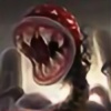
This is a sheet of some loose idea sketches; each one took something between 15 and 45 minutes. I started with the one in the top left to get a color scheme (My goal was to come up with some designs, so I reused the same colors and values over and over again. This way, I had some space to explore, and not to concentrate too much on values). The others are in order of creation
 (Smile)")
24, 5 and 10 are my favourits; 1, 20 and 16 the least likable ones I guess;
which ones do you prefer? Which one do you like the least?
Let me know what you think!
Related content


Comments: 25

Hi,
concerning the character-design I like 1, 6 and 15 (reason: least 'generic') the most and dislike 21, 18 and 10 (somehow 'unfinished looks'). Concerning the character itself I suppose my answer would be, like: 6, 11, 16 & 24, they all seem to be warm and friendly; I dislike: 1, 2, 5 & 22. Combine all four and you have a pretty nice group of bad guys
Anyhow they are all awesome and I would print out everyone of them to visualize NPCs to my RPG-Gaming Group. Thanks for showing these to us!
Regards, Axel
👍: 0 ⏩: 0

What a fun exercise! I can't help but like 14 with its voldemortish influence, but i really like 20, 22 and 23. 19 is oddly intriguing, 12 needs drool, 17 is just fun. but overall, I like 23 the best. What is really neat, is watching you improve over these. By the end it is really apparent. Especially in tones, you start off kind of shaky, but by the end you know what you're doing and you've simplified it and optimized it. Your strongest ones are the ones with chiseled proportions (e.g., 14, 17, 19, 23, 25).
👍: 0 ⏩: 1

Thanks for your reply! I left the shaky ones in to show exactly that; there is always progress
👍: 0 ⏩: 0

14 and 15 are my favorites. Honestly think they're amazing.
👍: 0 ⏩: 1


They are all amazingly well done, I especially like nr. 14 and 17! Waoh! O^O
👍: 0 ⏩: 0


Oh my goooood, faces 15, 17 and 21 are so cuteeeeeee!!!
And, umm... I like all of them, but I guess the least likables are 24 and 1.
👍: 0 ⏩: 1
24? the viking? surprising, cause thats my favourite
👍: 0 ⏩: 1
Yeah, I find it funny how the same thing looks different for each person, and how something transmits different feelings depending on who looks at it XD!! I think 24 is my least favourite because it looks too sweet maybe?? I prefer other kind of "cuteness"... a little bit creepy, like number 17!!
And also, you said that one of your least likable is 20, and that's one of the most interesting designs for me!!
👍: 0 ⏩: 1
I think you always connect some other influences- like how you felt while painting- with the end result. Thats why I like to specifically ask people what they don't like. Sometimes my own perception is way off anyone elses^^
👍: 0 ⏩: 0


I think 15 once gave me nightmares haha, pretty cool complication!
👍: 0 ⏩: 2
But I love my nightmares
And yeah he's a cool guy!
👍: 0 ⏩: 0
Ahw c'mon man, he's a nice guy! It's not always about the looks
")
👍: 0 ⏩: 0

really hard
👍: 0 ⏩: 0

incredible values and palette, I love all of them! Cheers
👍: 0 ⏩: 1

Ooh this is hard lol, I really like 23, 14, 24 and 25, maybe because of having a little more vibrant colors?
👍: 0 ⏩: 0
