HOME | DD
 Devilpig — Unknown Soldier cover no.7

Published: 2008-12-29 19:54:15 +0000 UTC; Views: 9681; Favourites: 316; Downloads: 539
Redirect to original
Description
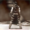
I just became the new cover artist on Unknown Soldier starting with issue 7. Here's the first result. After including the titles on the Punisher covers I realized how much I liked the integration of type into the design. It will be interesting to see where that takes me.Related content


Comments: 122


")

oh my I just LOVE how you integrated the type into the design. lovelove
👍: 0 ⏩: 0

Fucking BRILLIANT. Your work makes me either want to step up my own work.....or quit.
👍: 0 ⏩: 1

NEver quit and never surrender.
👍: 0 ⏩: 0

Ah Dave, your designs are getting too damn good. You're inspiring me to push my own stuff more and more.
👍: 0 ⏩: 0


Me? I'd rather you did the pages too
Sick cover


👍: 0 ⏩: 0


man great cover! I really love the fact that your covers incorporate (text) ie the title, and not just a glory shot of the character. You have a tremendous sense of color as well as design rock on man!
👍: 0 ⏩: 0

Cool cover as always! Looking forward to seeing where integrating type takes you!
👍: 0 ⏩: 0

Great work, love the graphic design of the whole thing.
👍: 0 ⏩: 0

The layouts...the titles...the bizness.
Simply awesome. I foresee this technique popping up in the next Sin City movie...or at the very least some cool commercial!
👍: 0 ⏩: 0

cool...
Unknown Soldier is a fabulous comic!
lookin' forward to peeping those SWEET covers...
👍: 0 ⏩: 0

we need more interesting covers like this (and not just in comics). i like this approach in your work. I always thought Will Eisner's incorporation of lettering into the art was the coolest part of his work - and this aspect of your work feels like that.
👍: 0 ⏩: 0


your covers are startig to have their own style, they all look like you (maybe not such a great idea). Your making great layouts with this type/drawing technique.
👍: 0 ⏩: 1
Shit, I'll change that immediately, hah.
👍: 0 ⏩: 0

nice work dude. That book is really strong. Probably Josh Dysarts best work. Good to see you on board
👍: 0 ⏩: 1
Yeah, I'm enjoying it too.
👍: 0 ⏩: 0

This is a great cover and really catches the eye
👍: 0 ⏩: 0
That's bad because I'm getting older and fatter and it's getting harder and harder to jump that high.
👍: 0 ⏩: 1

hmmmmn.......i hadn't thought of that.
well...all the more reason for you start lowering that bar right now!
👍: 0 ⏩: 1
I thought I had!?! Back to the drawing board.
👍: 0 ⏩: 0

the way you're incorporating these titles/logos into your work is great. it reminds me of the old horror and suspense films of the late 40's and into the 50's.
👍: 0 ⏩: 0

that is just so very very very very very very very very very very very very very very very very very .......very AMAZING!!!!!!!!!!!!!!!!!!!!!!!!!!!!!!!!!!!!!!!!!!!!!!!!!!
👍: 0 ⏩: 0

You're one of my favorite people on the internets.
👍: 0 ⏩: 1
You're one of my favorite people who left this comment that I just read.
👍: 0 ⏩: 1
I feel like I need to retire this layout. I have done stuff like this before. Not exactly, but the overall feel. Don't want to get too popular by doing the same stuff over and over like other artists. haha
👍: 0 ⏩: 1

yeah, artists tend to become lazy in style research
Anyway, big fan of your work, sir.
")
👍: 0 ⏩: 0

Awesome layout. I mean, so is the rest, but this composition is amazing.
👍: 0 ⏩: 1

Man, your layouts are always so kickass. Not to mention the great style...!
👍: 0 ⏩: 1

I like the 'B' movie style of this, like horror movies of old. Love the typography too.
👍: 0 ⏩: 1


 (Smile)")

awesome work man...u'v gotta fantastic style...real ly cool stuff
👍: 0 ⏩: 0

Text is not really my forte but this turned out OK. Thanks.
👍: 0 ⏩: 1

| Next =>