HOME | DD
 digitalshock — duke

Published: 2005-12-21 18:15:43 +0000 UTC; Views: 977; Favourites: 27; Downloads: 489
Redirect to original
Description
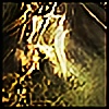
Well, I haven't done abstract 3d in a really long time, and wanted to try to refine my brush technique, as it totally sucked nuts.anyways, was gonna be for dC, but i felt it wasn't too good.
Related content


Comments: 35

love the backdrop, nice and smooth and awesome flow, but the model doesn't seem to fit well with it. I like the color scheme and the dC logo though.
👍: 0 ⏩: 0


Love the way you worked the emblem in there, but not feeling the piece as a whole.
👍: 0 ⏩: 0

 (Wink)")

I like that it gives the impression of something reaching out, but I'm not sure I like the almost chrome look to the rectangular peice in the centre
👍: 0 ⏩: 0

Smoooooth! I love the placement of the logo and its adaption into the 3d. The brushing is fine as is and suits the style perfectly.

👍: 0 ⏩: 0

hmm ... i dont like this one, u did better things before.
👍: 0 ⏩: 0

the logo is cool, the sparkle brushing is cool
but the rest could use some more work
 (Smile)")
👍: 0 ⏩: 0
awesome light and brushing and great use of logo in 3d
👍: 0 ⏩: 0


Brushing looks great, the redner could use a little more incorperation. Btw, what gave you the title?
👍: 0 ⏩: 0

The render is a bit "out there" without blending with the bg. I love the colors and those little particles 
I dunnoe tough, not your best

👍: 0 ⏩: 0


Little bit more brushing and I reckon it'd well on it's way to being good enough for DepthCORE.
On a side note, the logo looks fucking amazing!
👍: 0 ⏩: 0

I like it...it's different to your recent stuff. Looks like tendrals comming out of a nebula.
👍: 0 ⏩: 0

It reminds me of a spaceship.... @.@ Kinda like world domination in a piece of artwork... coolness!
👍: 0 ⏩: 0


meh. i don't know much about abstract, but i do love the sharpness and contrast of it! x)
👍: 0 ⏩: 0


indeed brushes could be better like maybey adding a low oppicity texture ? it will make it a bit more detailed
👍: 0 ⏩: 0

it is not too good
but i like it there is something that tell me"add it to your favs" 
")
👍: 0 ⏩: 0

the logo works very well with the rest of teh renders, interestingly thin render too, but it works

👍: 0 ⏩: 0

Great colours and brushes.
I think the contrast may be too high between the stringy 3d and the dc logo.
Perhaps some fat straight lines to even things up?
know nothing about 3d i guess my 2c actually worth -.02
Sweet use of space.
👍: 0 ⏩: 0


i like it. an i like the dc logo also, im not sure if i like the logo design or what it reps though, both i think

👍: 0 ⏩: 0


idk, its got good perspective and depth to it
and how u put the logo in there is nice
id say its not bad as you think
👍: 0 ⏩: 0


