HOME | DD
 digitalshock — sinisUNDEFINED

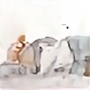
Published: 2005-04-12 02:20:55 +0000 UTC; Views: 1573; Favourites: 55; Downloads: 849
Redirect to original
Description
Actually this is one of my favorite pieces even more than [link] worked hard on this one, took me around 30 minutes or so, but it was still fun.used: ill'
Related content


Comments: 43


Wow. I really love this piece. It has a lot of emotion behind it, and I especially like the way you made it abstract with recognizable elements blended in. I also like your color choice, it works really well. Awesome work.
👍: 0 ⏩: 0

Can understand why you love this so much. If someone would say "what is shirya's style" i'd say this.
👍: 0 ⏩: 0


 (Smile)")

Great work. Reminds me of Vincent from FF7 as well as something you'd see in an anime. Love the all around darkness of the piece.
👍: 0 ⏩: 0

I don't like this one too much. SIN is much better. It has a lot more identification and form. This one is a lot shapes randomly craped onto eachother.
Oh and while I'm here, just like to add that you gotta stop using the butterfly brush so much, lol. xD
👍: 0 ⏩: 1

eh? i dont use the butterfly brush... its a shape, and i rarely use it.
👍: 0 ⏩: 1
Oh, nvm... you only used it on of your d
👍: 0 ⏩: 2
Damn computer... meant to say on only 3 of your devs. Less than I thought. You use a lot of these 'shapes' (leaves, circles, all that junk) so I thought it was more.
👍: 0 ⏩: 0

reminds me a lot of Shirya's work, too much like it in fact to be a coincidence.
The authorities will be round yours in 11 seconds mr imitator-man!
I like it, but prefer the softer elements in your Sin piece. Both combined would look awesome, just displaying them together with a common backdrop.
👍: 0 ⏩: 0

Nice work, i was really liking the in the pack when i was lookin though it.
👍: 0 ⏩: 0

I've had way too much trigonometry for the day, because i read that as 'sine' and not 'sin'
but still, great artwork
")
👍: 0 ⏩: 0

wow thats pretty awesome, where did you get the program to make that ?
👍: 0 ⏩: 0

evil
nice, but i liked the other sin things more ^^
anyway well done
")
👍: 0 ⏩: 0

I'm really liking the dark cazrtoon-ish feel in this one.
👍: 0 ⏩: 0

Nice work, but I think the same scheme of colour turn the piece a little bit confuse, I like the kill bill style
👍: 0 ⏩: 0

30 mins?! crazy - spend atleast 4 hours on each of mine and never get that gd!
")
👍: 0 ⏩: 0

nice and brutall... hahahahaa... keep it real... respect
👍: 0 ⏩: 0

this is vincent valentine from FF7 dude
haha
right...
👍: 0 ⏩: 0


looks very nice...I like the colours..first I didn't see there was a person in there, but after I looked at it a while I noticed...that looks sweet
👍: 0 ⏩: 0

I just love the red background colour, brilliant vector work. I hardly ever favourite work by people I have on watch, I'll make an exception this time though!
👍: 0 ⏩: 0

Awesome abstract. I love this vector style. Really great work.
👍: 0 ⏩: 0


awesome vectors, reminds me of some of digishocks work. But yea i love the colours. Very nice
👍: 0 ⏩: 1
wtf my work reminds you of.. my work? >_>
👍: 0 ⏩: 1
lol im an idiot. I guess at the time i wasnt paying attention to whose work i was looking at. thought i was looking at he1z
👍: 0 ⏩: 0

Awesome... Love the color range.. The background is perfect for this.. Great depth, and I love the tree limbs in the background... And I also like the japanese/chinese feel to this one.. Great job
👍: 0 ⏩: 0

Nice. Love the red. Good color, red is.
The face/head is rather undefined. It looks seperated from the body and almost too large.
But, it's all artistic interpretation.
Your work is improving, keep it up.
👍: 0 ⏩: 0


::.:
awesome dude, can see why its of your favorites, mine as well 
👍: 0 ⏩: 0

Holy lksdfjisoufsaiod O_O
Thats just....awesome, nice color
👍: 0 ⏩: 0

I don't really like this one very much. It seems to have the same scheme of colors. I like the other stuff you did because it had very nice colors and they all were cool. But it's still nice work bro. Keep it up
👍: 0 ⏩: 1
yeh its supposed to have a same scheme of colors, but i understand.
Why did you bold your text though... >_>
👍: 0 ⏩: 1
