HOME | DD
 Dinhosaur — Rapunzel Yay! Again...

Published: 2013-10-13 07:39:45 +0000 UTC; Views: 4034; Favourites: 89; Downloads: 6
Redirect to original
Description
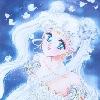
Exactly 1 year later. By the way, check out my other work, what do you want me to do next? Just comment below or on my profile page (Smile)") .
.
Related content


Comments: 49

You're really good at landscapes, but your art involving people needs better foundation. You do hair exceptionally well and the teeth have vastly improved. The only major problem I see is anatomy issues even for stylized art.
The arm is kinda at a parentheses shape, eyes kinda come really shape at the corners like a half moon. It almost looks like she doesn't have eyelids. She's got really strong cheeks bones and because the values are so strong it kinda looks a bit off. Forehead very small, normally the eyes come at the middle of the face. Eyebrows could be softer.
Lots of improvement, you're really coming along as a great artist.
👍: 0 ⏩: 0


Thanks! Also I'm seeing some good progress from you, keep it up.
👍: 0 ⏩: 1


WOW, so awesome!! Cool improvement bro!! Love the details!!
👍: 0 ⏩: 1
Thanks! It was so much fun to do the extra details haha.
👍: 0 ⏩: 1

Thanks again! A lot of motivation when you do these ^_^.
👍: 0 ⏩: 1

You're welcome! Yeah
👍: 0 ⏩: 0
1st one wasn't actually bad, but as far as detail you have improved in making it stand out and the new one looks really good.
👍: 0 ⏩: 1
Thanks! My main focus with the 2013 version was to fix the proportions and values, which the 2012 version lacked. Though I do agree that it wasn't that bad back then hehe.
👍: 0 ⏩: 0

CRAZY!! EHHHH The clothes and the hair and dramatic lighting!!!
👍: 0 ⏩: 1
Thanks! The clothes and hair was crazy to do, the amount of detail I need to consider adding haha.
👍: 0 ⏩: 1
I feel you. Its a mazing how much you have improved! Your gonna be a somebody in the game an concept industry!
👍: 0 ⏩: 0

Yay improvement! The main difference I feel is that you went heavier and were not afraid to give the edges real definition. (Not that fear actually has anything to do with it).
Ooo What to draw next? Something with colour! You don't play with that often enough. Maybe a bird? Im not sure I have seen one of those from you.
Keep up the great work.
👍: 0 ⏩: 1
Haha fear was the correct answer, I was afraid the piece would look too dark but man it would of made a difference! Though the 2013 version is pretty dark, ah wells at least I know now ")
Yeh colour would be great! The reason why I do grayscaled pieces is because I wanted to focus on values and volume. A bird would be cool to do! I mean a lot of them have great colours and pattern ^_^, thanks for the suggestion! Also thank you for liking my work
👍: 0 ⏩: 1
Aye it is quite dark. Especially in comparison but thats not a bad thing.
Yes greyscale is great for that but I wanted to suggest something different.
Glad you liked the suggestion and youre welcome for the like. I look forward to your future work.
👍: 0 ⏩: 0

your shading got much better as did your blending and your background skills
👍: 0 ⏩: 1
Thanks! The new tablet really helped me blend the surfaces nicely ")
👍: 0 ⏩: 0

nice improvement, I mean 2012 was great, but wow you really can see all the improvement in just a year.
👍: 0 ⏩: 1
Thanks man, a lot of things happen within one year, it just goes to show that it happens that quickly haha.
👍: 0 ⏩: 0

Possibly! Maybe I should decrease the values a little bit
👍: 0 ⏩: 1

The older version looked bright and Rapunzel looked younger and viceversa for the present one. Anyways, it looks great. I'm still in training and I can't even draw that good. Cheer up!
👍: 0 ⏩: 1
Haha I agree, the background in the 2013 version really helped her pop out more. Don't worry buddy, just keep practising and you'll get there
👍: 0 ⏩: 0


 (Wink)")

I really like the mix of hard and soft shading in the improved version as well as the wider range of value, compared to the original. Really nice improvements!
👍: 0 ⏩: 1
Thanks! I know, having a harder edge in some areas really made the piece much better than the previous, as well as the value ranges ^_^.
👍: 0 ⏩: 0

You were good the make it look like her in 2012, but you've improved veru much since then too! The 2013 version is so detailed
👍: 0 ⏩: 1
Thanks a lot! The 2012 version had a lot of proportion issues, it was my main focus for the 2013 version to fix that
👍: 0 ⏩: 1
I think everything got a lot better
👍: 0 ⏩: 0