HOME | DD
 DoubleDandE — His name is Bane

#comics #dc #digital #krita #banedc #artwork #bane #batman #bigmuscles #bust #colorful #darkknight #dccomics #digitalart #digitalillustration #digitalpainting #fanart #illustration #knightfall #male #muscles #supervillian #tubes #venom #darkknightrises #wrestlingmask #batmanrogues #batmanvillain #art #kritapainting
Published: 2018-06-18 18:32:15 +0000 UTC; Views: 1126; Favourites: 73; Downloads: 0
Redirect to original
Description
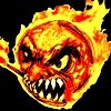
CLICK HERE FOR THE SPEED PAINT VIDEO
I drew this way back last month but never got around to it. It was supposed to be uploaded right after Ami Bandicoot.
The results were worth it though, as he's quite colorful, yet dark and true to his color scheme at the same time. I didn't go with a green venom tube, because I always felt the rubber tube was kind of wonky (something that was used often since his first appearance in the cartoons). In the Knightfall run, Bane's tube was more of a cable that ran up his arm, fed into a box which then had four medical tubes coming out and plugging into his mask. I went with that design here and the neutral white grey color that they use for it as well, which really helps it to pop out (in the speed paint you can see I was going for a red color but in the end opted for white. I think that was a good decision considering it would have clashed with the red on that circle).
Originally going to be a transparent background like Ami's one, I went with a textured background just to help him pop out more. It pays off, especially since it adds color to what would have been a rather darkened character. Enjoy.
Related content


Comments: 50

Nice work on the "Man whom broke the bat." Looks very cool, badass, and intimidating.
👍: 0 ⏩: 1

I came across your piece through projectcomment.
1. Background
I really like the tone, texture and simplicity of the background, it adds enough. but doesn't intrude on the main feature.
2. Framing
I love pieces where the character overlaps the 'frame' as it adds so much dimension. You have achieved this really well with this piece.
3. Lighting
I think some of the lighting is a little off in this piece - I think everything below the arm is too dark on the whole. The darkest darks are good, but there are no lighter mid tones.
4. Mask
The mask is pretty good, and black is a very hard colour to shade, however it is lighter than your darkest darks in the rest of the image and this should not be the case. I think the midtone of this part should be deeper, keep some good highlights.
5. Glow
I think the effect you have got with the glowing parts and the reflections are really well incorporated. At the moment I think there is slightly too much highlight on the belt, however if the torso was lighter in general this would blend in better, so I think upon reflection this is the right level.
6. Anatomy
I think the anatomy, especially the musculature is phenomenal, especially the shoulder and forearm. Love the subtle hairs etc.
Very good piece on the whole, I'm just nitpicking teeny-tiny areas of improvenment. Congrats xx
👍: 0 ⏩: 1

I'm from projectComment
I like the style you have here. You got a nice cartoony Bane yet also took the time to put down shading. The muscles look really cool, and I personally think the green glow is really nice. It's defiantly the highlight of the pice as it creates an eerie aura for the character. The spiked gauntlet also helps to make the character look imitating. I do think where you can improve on the piece is a few details on shading and texture. For example, the texture on the tube I think looks a little cheap. Perhaps it's the cartoon feel, but it feels a little cheap, perhaps a little more density would've made it more convincing. I also feel the most area is a little flat. By the looks of it, his mouth is open, but then the middle would be dipping deeper so there should be a bit more a black shade in the middle. But like I said, it's a really good piece blending cartoon style with a realistic. Even the comments I gave, I'm not sure how to make them so. Just food for thought. Great piece.
👍: 0 ⏩: 1

Thanks for the comment.
👍: 0 ⏩: 0

Hey DoubleDandE! I'm from ProjectComment
This illustration is great! I hadn't seen a FanArt of a secondary character lately, almost always from Batman, Catwoman or Batgirl ...
What I like the most is the work put into the details, especially the muscles, and what I see in them: veins, hair, clothing, accessories, etc. The glove and the hand I think also stand out for how well done they are! this gives a strong feeling to the character, and thats excellent !
The colors in general are nice and harmonize well, so +1 for that. I also love the green and pink light that reflects in front and behind the body, it makes a strange combination but I personally like it. Although usually it is said that these two colors do not match well in the same image ... but I don't pay much attention to those things which say to me how to think or like
The background is appropriate for the scene, I like how you have applied the gray textures, and I think it gives a professional touch to the composition and general appearance of the image. But perhaps it needed something more in the red circle, like another texture, to avoid the flat color.
In general I see correct the body proportions, even though the arms are huge, but it's normal in the character. The waist also looks very well molded and realistic. However, it has such a kind of squared texture on it that I don't quite understand why you added that over there. Maybe there is some reason, but I don't like it too much. It seems as if he had a net or mesh in his abs.
There are some details that could be improved, for example, as I'm speaking about the waist, there is an area that joins the belt, where I think there is some shadow or volume missing especially on the right side of the belt. The left side looks fine !
The tube that runs along the arm seems a bit flat. I would have narrowed the dark part that separates each section of the tube to give 3D volume.
The thumb looks somewhat sharp and pointed at the junction of the bone. Some softening could be good for a more organic touch.
Finally the head or mask, I think that in general is quite consistent and credible, but could give better results by adding small details, because it's a point where the viewer usually fixes more the glance. For example put more small shadows, wrinkles, folds, reflections and textures, whatever...
This would be all, the faults are minor, and the positive aspects are 99%
Good luck and keep going!
")
👍: 0 ⏩: 1


I remember his transformation in Batman and Robin terrifying me as a kid o_o...
This is really good though. You even added some body hair on him and it looks pretty realistic.
👍: 0 ⏩: 1
Thanks a bunch.
That one didn't scare me though, it only made me more intrigued about the character and who they were.
👍: 0 ⏩: 1
You're welcome  (Smile)")
Yeah, he looks pretty cool now. In that movie he just roared though.
👍: 0 ⏩: 1
Lol, yeah, what a bummer too- looked the part, but didn't act the part.
👍: 0 ⏩: 1
RRRREEURRRRGH!! UUUURRRRGGHH! BAAAAANNEE!!
👍: 0 ⏩: 0


oh damn! bane lookin to kick some serious BAT ASS
👍: 0 ⏩: 1
np brah ....hu dat behind ya???
👍: 0 ⏩: 0
RRRAAAAARRRRRRR!!!
Once a badass, ALWAYS a badass!
👍: 0 ⏩: 1
Perhaps my second best favorite villain there is thus far.
👍: 0 ⏩: 1
Oh I see. Who's your number one?
👍: 0 ⏩: 1

OMG ITS FREAKING BANE
HE LOOKS SUPER BADAAAAAAASSSSSSSSSSSS
👍: 0 ⏩: 1


Ooo I see now those tiny little hairs and vains, jikes he is even more bulky up close haha.
Well done
👍: 0 ⏩: 1
Thanks a bunch.
I was dreading doing all those hairs, but in the end though it wasn't so bad.
👍: 0 ⏩: 0

Thanks a bunch Peadgemaster.
👍: 0 ⏩: 0

I can feal my spine break for how much amazing you draw him owo
👍: 0 ⏩: 1
Thanks a bunch. Hopefully not break too much. :U
👍: 0 ⏩: 0

Ah yes, I remember this guy o_o Though I only saw his darker design from the movie, so this seemed strangely colourful to me.
👍: 0 ⏩: 1
Lol- yeah he does have more darker designs, but I wanted there to be some color in it.
👍: 0 ⏩: 1
Understandable.
Working with a lot of black can be difficult.
👍: 0 ⏩: 1
Amazing! You made him very defined, and I love the richness in color tones. 
👍: 0 ⏩: 1
Thanks a bunch. Yeah, he usually doesn't get much light compared to the other ones.
👍: 0 ⏩: 0
No prob man, this guy has to be one of my favorites Batman villains.
👍: 0 ⏩: 1