HOME | DD
 Eddy-Swan-Colors — Shahrazad Cover 6A

Published: 2014-05-21 04:00:02 +0000 UTC; Views: 3188; Favourites: 82; Downloads: 70
Redirect to original
Description
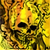
Some cover colors I did for Shahrazad by Big dog ink.
check out Big dog's facebook page for updates on release:
www.facebook.com/bigdogcomics
My Twitter | My Facebook | My Tumblr
Contact me at:Eddy_Swan@live.com.au
Related content


Comments: 12

 (Smile)")

I love the hues of purples and teal with the hints of pinks and yellows so pretty! <3
👍: 0 ⏩: 1

Yeah this one is probably one of my least favorite of the covers I've done for them so far. some more coming soon.
👍: 0 ⏩: 1
Well i think the colours look stunning! i really like the light hues and the combinations especially on the scenery outside. I struggle to work with lighter colours so it maybe time for me to try a super neon eye burning saturated thing Cx The fact that you may not have enjoyed it so much doesn't translate in the colouring =0
👍: 0 ⏩: 1
saturated colors just tend to come out more reliably in print. desaturated colors tend to become muddy.
👍: 0 ⏩: 1
I really need to up my saturation more =0 Thanks for the tip!
👍: 0 ⏩: 0
