HOME | DD
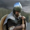 EgilSterkr — Charge B and W

Published: 2007-08-21 11:49:40 +0000 UTC; Views: 1989; Favourites: 23; Downloads: 1
Redirect to original
Description
I changed this work to B & White work it looks better.. I have darken the whole work and made new foreground..( foreground grass was too bright green in colored work..) Dwarf Clan chief riding mountaingoat chariot.
Background is from 2 diffrent source: sky is from stock [link]
mountains are found from the web( modified with the clonestamp tool)
Related content
Comments: 32

Thank you! (one of my friend took this as a tattoo to his back too
👍: 0 ⏩: 1

I CAN CERTAINLY PERCEIVE THE MOVEMENT IN THIS. VERY GOOD. ALL OF YOUR DRAWINGS IN YOUR GALLERY ARE GREAT.
👍: 0 ⏩: 1

Totally awesome! This art is full of expression
👍: 0 ⏩: 1


👍: 0 ⏩: 0

I really like the fact that it's dynamic but I've got to say that it would have looked better if the rocks in the foreground either went in unsmudged or smudged completely. I'm guessing you wanted to show movement. But, like I said, it's dynamic with or without the rock. Can't wait to see the painted background.
Now, tell me, is that the same goat flipped horizontally?
👍: 0 ⏩: 1

Thanks for the great comments! Ill hope to do the background soon..and ill do something to the foreground


👍: 0 ⏩: 1

lol..."clone it"! 
You're welcome. I've made a pact to comment more...so bear with me even though they might suck from time to time.
👍: 0 ⏩: 0

This is looking amazing! The movement and action really come through strongly - it puts you in the scene so much I want to jump out of the way!
👍: 0 ⏩: 1

thanks a lot! Does the background bother you? i myself dont like the foreground..but i think the mountains and the sky fits in quite nicely..
👍: 0 ⏩: 1

I think both the background and foreground work really well. You've got the right colours and tones in each to match your figure
👍: 0 ⏩: 0

That's pretty good. Although I would actually try drawing in the background to make it look seemless.
👍: 0 ⏩: 1

Thanks man! yeah ill probably do the background again
👍: 0 ⏩: 0

Lovely work! I really like your color choices and the background really finishes it. Wonderful work!
👍: 0 ⏩: 1

thanks a lot! i still have to paint the backround.. it doesent look right to me..
👍: 0 ⏩: 1

Well I can't wait to see it when the background is painted!
👍: 0 ⏩: 0

Looking good. The rocks in the foreground though should be much more detailed seeing how they art up close. Everything else is looking sweet 
👍: 0 ⏩: 1

Thanks for the great tips 
👍: 0 ⏩: 0

Thanks man! Glad you like it
👍: 0 ⏩: 0

Thanks! yeah i smudged it too much.. idea was.. that it looks like the chariot is on the fast movement toward you.. like this [link] or this [link]
👍: 0 ⏩: 1

Now it looks more like gems or polished Iron ore!
👍: 0 ⏩: 0

Thanks man! and thanks for the
👍: 0 ⏩: 1


