HOME | DD
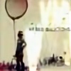
 escapepodone — LGS04_008

Published: 2004-01-12 17:08:21 +0000 UTC; Views: 9111; Favourites: 144; Downloads: 3820
Redirect to original
Description
Something for myself.This is about failure and passion and renewal.
Enjoy.
Vector Illustration
16.5" x 19"
-----------------------------------
edit: description only. \/ \/ \/
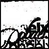
**another in the series... several rules apply. all elements must come from the original (+one new element per new design), all colors are limited to under 6. color scheme must match at least 4 colors from the original and change or alter the remaining colors.
*this is about proces and pushing my creative level to new highs (think, advertising campaign... branding must remain)... and magenta spot print ink bleeding from my veins. final output will probably include a UV gloss spot treatment of our lovers, the series'll hit the printers in a few months. LTD Edition run of 100.
Related content


Comments: 72


very nice,
it caught my eye on someone's favorites section
")
👍: 0 ⏩: 0


" bloody awesome, i cant enough of your work." agreed its amazing fave for sure
👍: 0 ⏩: 0

wow! i love this style, grunge and vector, great work, of course

👍: 0 ⏩: 0

....I stared at it past 5 minutes....it's damn good
👍: 0 ⏩: 0


Ohh this is so nice. Defintly 
Keep it up buddy =]
👍: 0 ⏩: 0

WOW this is very good work, the colours, the style, everything is great in this piece, I find it visually stimulating!
👍: 0 ⏩: 0


Great job son!!! Your skills depress me. But in a good way. I see that I have a long way to go.
👍: 0 ⏩: 0

 (Wink)")

Damn nice peace of art!!! Love the colors and the concept. Go on like this
👍: 0 ⏩: 0

wow , nice...
ok...here it comes once again...great 2D work!!!
love the white part , it´s standing out perfectly from all the other stuff in the image , good work!
👍: 0 ⏩: 1
ohh , i forgott...
the colors are perfect!

 (Smile)")
👍: 0 ⏩: 0


Very nice man, love they way it almost looks grungy but in vectors..some skill there
👍: 0 ⏩: 0

Rad stuff.
Nice mix between melted shapes and clean lines.
👍: 0 ⏩: 0

transic [2004-02-03 13:00:39 +0000 UTC]
Looks like a fucked up version of the DSOS1 cover from Designer Shock. Cool.
👍: 0 ⏩: 0


beatifull work..I love this. awsome colours..like all that deterioration...one thing: wich font is used in "newblood remix"?
👍: 0 ⏩: 0

this is some really beautiful work. im gonna have to check out your gallery.
👍: 0 ⏩: 0

This is really nice, I love how you did this. Like almost making an explosion of shapes. Great work
👍: 0 ⏩: 0

Great work. I wish I had a more intelecual mind, or a multi layered thought process to disect every inch and pixel of detail, but then I wouldn't be me...and I would have much longer comments haha. Truely beautiful. Makes me feel at loss with myself from the top left then as I move around I feel found again. Very powerful
👍: 0 ⏩: 0


i don't know how you do it. the attention to detail... the stretching of the side of his head, the body in the top right corner, all of the thought in the grunge.. it just keeps going.
this is about proces and pushing my creative level to new highs
i definitely think you succeeded
👍: 0 ⏩: 0

This is great work mate, trully brilliant !! I see the dsos1 influence but not in a bad way.
ave-a-fav

👍: 0 ⏩: 0

mmm, nice work, i like the upper right corner of the jewelcase shaped design the best.GJ
👍: 0 ⏩: 0


this is some great stuff.
I love the whole concept, and the way you realised it.
congrats!
👍: 0 ⏩: 0

Wow! Really love this, I'm beginning to think that my favourite list may just be your work soon!
Your really do vector really well, I've never seen this style used so well before, I also love the little touch of using little silhouettes of birds etc in the like little splats, Nice touch!
👍: 0 ⏩: 0


After looking at all the pieces so far in the the series, I've gotta say, you're work is among the best I think. I say this because you've managed to mix all these elements in a great stylistic way. I've got to agree with someone who said earlier that I'm glad to have you on my devwatch.
👍: 0 ⏩: 0


nice! same elements as the stuff you've been doing, but a whole different twist. I'm realy enjoying these.
👍: 0 ⏩: 0

its very appealing but the bottom lines bother me, i would of put them at a 45degree angle or taken them out. overall, very nice job.
👍: 0 ⏩: 0

oh fuck brandon. the hits just keep on coming...so much repetition, you've got me hot. Brandon, you've found yoru calling....fuck this is good.
Appologies for the not-so-helpful commentary. I can attribute that to a few factors: 1) the piece is fucking hot and doesn't need any changes. 2) i've gotten about 8 hours of sleep in the past 5 days so I can't really think of words.
+fav.
👍: 0 ⏩: 1

rock on man. i know ur in the heat of the CU test right now... ur excitement is well enough to keep me juiced for now. looking forward to seeing how things turn out on the test... and what ur going to do with ur spare time afterwards in between now and the fall.
👍: 0 ⏩: 1
| Next =>