HOME | DD
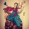
 FairyBunni — Cookie Knife

Published: 2016-06-28 13:57:56 +0000 UTC; Views: 283; Favourites: 33; Downloads: 0
Redirect to original
Description
All I need is my gingerbread knife to take away the painRelated content
Comments: 18

Hey, I see someone else gave a pretty in depth critique so instead of reiterating what they said I have some suggestions for your general improvement, firstly, learn about perspective, specifically about horizon lines and how it affects a picture, the most basic use of that is you can follow a simple rule of anything above the horizon line you will be looking up at and looking down at anything below the horizon line, secondly, learn the skeleton because it will help you pose characters much easier, I took some time to learn the hips specifically and it helped me immensely, thirdly, about lighting, I know you have shaded this but it's inconsistent and that takes you out of the picture a little, learn about form shading and cast shadows, as well as reflected or bounce light, these things can really make a picture stand out, I like the cutesy style you have so don't change that, but once you learn these things it will help your work feel more believe and tangible, hope that helps you a bit!
👍: 0 ⏩: 1

Aaaah yes Grazie so much!!!!!!! ^.^ I really love hearing different critiques so sorry ah!
But yes!! I need to practice with lighting for sure and with anatomy!
Grazie again!!! ^.^
👍: 0 ⏩: 1

It's a gradual process, don't rush, take your time, I will do a quick redline drawing to show you roughly how it could look in proper perspective, since I didn't actually contribute anything, be done soon
👍: 0 ⏩: 1

All done www.dropbox.com/s/227g4rvfepsn…
👍: 0 ⏩: 1

So there are a few technical issues and a few conceptual issues I'd like to go over with this illustration. First the technical drawing issues. So the first thing I notice is the poor anatomy, namely the hands. I am not sure if it's intentional to make them look like finger-less stumps but it's very distracting. I can see your going for a more stylized approach, but having the hands look like hands is very important. when we look at people some of the first areas we notice are the head and the hands. Taking the time to get reference and learning how to draw hands is very important even if your going for a cartoon/anime style.
Next area I see some issues with is the perspective. A lot of the items just have really wonky perspective that you need to watch out for. The poor perspective is only highlighted by the overall lack of depth and flatness of the character and a lot of the objects around her. The other issue I see is with the lighting. Now I can't see any definitive light source which makes her look very flat. Also the lack of a ground shadow of some sorts underneath her makes her look like she is awkwardly floating along with all the other items on the ground. This again adds to the nagging issues of everything looking super flat.
Another issue I see is with the line work. The good thing is that you have varied line work. Unfortunately the line is inconsistent at best. So when your working with line, the light source is much more important than most people tend to think. The idea is that the line gets thicker and thinner depending on the light source. The closer to the light, the thinner the line and gets thicker as it gets further from the light. That's a very important detail to always keep in mind. Also when your working with line it's important to keep the integrity of that solid black since the dark line work is what helps the illustration stand out. Because of the material you used to color this, you are left with areas were the line is very muddy and dingy which kind of deates the purpose of even having line work. I am not sure what you used to color this but it's something to keep in mind in the future.
So now i'll move on to some conceptual issues I have with this. This is all a matter of opinion unlike the technical issues. So what I read from this illustration is a interesting contrast between the super bright, bubblegum colors and the somewhat dark themes with the knife, blood and bandages. Now I think what is bothering me is that this is not being sold as well as you could sell it. Like imagine if you had a few more elements that suggested that something like was amiss with this bright cheery world. Things like having dead flowers or having her dress being more frayed at the ends, or perhaps having her bunny torn open like she practiced with her knife on it just to subtly suggest a darker underdone to this. I think playing around like that could really help give this illustration some conceptual depth.
So in conclusion, this is a solid idea bogged down by a few technical issues. I think doing more to address a few issues like the line work, anatomy, and lighting will go a long way to really helping this illustration. I also think you could push your ideas a bit further. It's always better to go a bit over the top and scaling back as need be.
👍: 0 ⏩: 2

Woaaaahh! Your critique is soo harsh and detailed!!! Would you mind critiquing my artwork? I'm not self-advertizing here but I feel real need for improvement and I'd love such a detailed eye as yourself to tell me the flaws!^^ I would be very grateful if you could but please don't feel pressured if you don't have the time!!!
👍: 0 ⏩: 1

Sure just put any piece you want critiqued in my forum post and i'll get to it when I have the chance
👍: 0 ⏩: 1

Wow thanks! Then I'll do so if you don't mind! Just remember that you can skip on mine if there's too much of a burden!^^
👍: 0 ⏩: 1

I will definitely try to get to it if I can. I can't make any promises but I will definitely try.
👍: 0 ⏩: 1

Yea, don't make any promises and it's fine! Thanks a million for all the trouble!
👍: 0 ⏩: 0

Woah... Your critique is so descriptive!!!! And in depth indeed!!!! Grazie so much for your critique!! And Yaaa I have lots of them weaknesses in art whoops... But yes! I was really experimenting with this piece (with my crazy major weakness in backgrounds QAQ and with concept) so it's nice to read your in depth critique so I can some perspective on what to work on!
I did indeed try to make it wonky on purpose with the lack of shading and foreground to make it seem strange but it ended up with an opposite effect from what I wanted QAQ but yes I shall work on it!!!
I'm going to take a figure drawing class in the fall where I'm going to be forced to learn to draw hands (YES! I look foward to this! I need someone to force me to learn to get that motivation goin) so hopefully by the time that class is over hands and I are a team! Also to get better with poses is a huge hope for me too since I've been trying to get out of drawing the same type of poses all the time~
Grazie so much for your critique!!! It is really helpful!!! ^.^
👍: 0 ⏩: 1

Your welcome, glad I could help in some way
👍: 0 ⏩: 0

its odd that the style and colors don't reflect the dark tones that show in this work. Good job
👍: 0 ⏩: 1


