HOME | DD
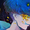
 Felderanto — Doodle No.7 ''Ying and Yang'' coloured

Published: 2013-08-16 22:51:42 +0000 UTC; Views: 1015; Favourites: 29; Downloads: 0
Redirect to original
Description
This is an improvement of the old ying and yang one! (Smile)") I might take this down because my internet is quite faulty and usually goes wrong! Any constructive criticism would be great!
I might take this down because my internet is quite faulty and usually goes wrong! Any constructive criticism would be great!
Related content


Comments: 23


I like this one. I'm always trying to get my friend to use color. It adds contrast and brings out designs that might have been lost in the black and white only. 

👍: 0 ⏩: 1

You are correct, our art styles are pretty similar. I particularly liked this one. Keep up the good work!
👍: 0 ⏩: 1


wow the color really stands out on this....love it
👍: 0 ⏩: 1

The pattern looks great, but for the différence made between the ying and the yang, it is a little unclear as the black color is really present and then the two parts lose its constrast. But I still like the look it gives, that's an esthetic one
👍: 0 ⏩: 1


this is better than expected but I recommend coloring in more fully it will look better that way also maybe try making the circles were the flowers are more circle. idk how large this picture actually is but you could use a nickel or quarter for a circle or an can of some sort if coins are 2 small
👍: 0 ⏩: 1

Lol, yeah I couldn't find anything to use, forgot about any coins lol, there isn't any way I can colour the other parts of the left side because they've already be greyed in and the pens will mix and make a really dark red colour, thanks for the suggestion anyway though!
👍: 0 ⏩: 0

It's really lovely! The only thing I might say is to color it in more completely so it is a single solid color (although I know how some medias are ")
👍: 0 ⏩: 1
thank you! but when I colour over the greyish bits it smudges and makes it a really dark red which is too dark!
👍: 0 ⏩: 1
Oh, no I don't mean color over more area, I mean color over the areas you've already colored to make it more solid. It's not a big deal.
👍: 0 ⏩: 1
Yeah, I see what you mean now!
👍: 0 ⏩: 0

this turned out beautifully! very good
👍: 0 ⏩: 1