HOME | DD
 firedaemon — Let's be friends

Published: 2005-12-05 00:44:27 +0000 UTC; Views: 2712; Favourites: 38; Downloads: 215
Redirect to original
Description
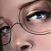
Let's?Two faeries in the forest canopy.
This was very much an experimental piece. I wanted to work with laying down a layer of shadows on the paper first, before colouring. Also I didn't ink the outlines of the background, so as to make it appear more out of focus. I've been playing with 2 versions of this and I'm not sure which I like better. One is more densely shadowed and thus emphasises the dappled light of the forest better. The other gives a clearer more colourful image.
Hope you like the decided final outcome ^^
Alcohol-based markers and black pigment fineliner.
x x x
Related content


Comments: 37


reli cool colorings.. didnt noe markers could do such great work
u have enlightened me..
like da concept .. da forest looks so cool.. da characters looks great 2..

 (Smile)")

👍: 0 ⏩: 0

nice one...
nope no critical critique today... sorry...
👍: 0 ⏩: 1

No worries, and thank you again
x x x
👍: 0 ⏩: 1


Thank you. I'm glad that you like it
x x x
👍: 0 ⏩: 0

very nice <3 ")
👍: 0 ⏩: 1
true. It's supposed to be dappled light, but I guess that part is a bit inconsistent
x x x
👍: 0 ⏩: 1

Great artwork  (Wink)")
👍: 0 ⏩: 1

w o w
you're always getting better
which is cool, because you really kick ass.
VERY well done!
i like the scene a lot, but the shadows really complete it.
👍: 0 ⏩: 1
aw thank you ^^ That's really sweet of you. I strive to improve, so that people will buy my art and then I can eat... heh
x x x
👍: 0 ⏩: 1
GO FOR IT
my parents are both artists. they have never buckled and gotten second jobs. they rule. they're happy. DO IT
👍: 0 ⏩: 1
heh heh cool. I'm currently doing a degree in Computer Animation. I'm not that great now, I need a lot of practice. But if I could sell my art for a living, I'd do it ^^
x x x
👍: 0 ⏩: 1
hrrmn, well, if you would be happy with computer animation, do it to pay the bills until you can focus on what you really want.
just make sure you're happy, and CREATING!
👍: 0 ⏩: 1
of course. I could never let myself not be happy. I always find away to work things out ^^
x x x
👍: 0 ⏩: 0


*mwa* So do you, despite what others seem to think *kill dan*
x x x

👍: 0 ⏩: 1

👍: 0 ⏩: 1

I must say, you really are developing a unique style. It's very recognisable, and very *you*. That's something I would imagine that most creative types would spend ages striving towards. Well done.
👍: 0 ⏩: 1
Thank you Justin 
I'm glad that my style is finally settling down into something recognisable
x x x
👍: 0 ⏩: 0

wow this great so much detail your really talented
👍: 0 ⏩: 1
Thank you
x x x
👍: 0 ⏩: 0

... Wow. He's thin.
The anatomy's great, keep it up. Love the style.
I'd like it if you did outline the tree they're sitting on, but the rest looks great outline-less.
The color's really lush and rainforest-looking. Shadows-first works for this.
I love the detail.
The girl's head is off, though. The cheek and jawline are really distorted, and her hair makes the head look lop-sided. Also, the highlights on her hair make it look flat.
My main problem is that the watermark is so obvious and distracting. Maybe a little bit lower and less opaque.
It's great, though. I think I might watch you.

👍: 0 ⏩: 1
Thank you. I love effeminate men ^^ most of my figures are thin and long limbed. They used to be called gay, but now it's just my style.
Thanks for the crit. The tree could do with being outlined to be more in focus I agree. I personally don't have a problem wiht her head. The strong shadows and highlights make it look a little odd, but it emphasises the surroundings I feel.
The reason for the bold watermark is because I've had a few problems in the past with my art being used by other people. I know it detracts from the art, but it also serves as an encouragement for print buyers ^^ as I remove the watermark on the print version.
Thankies again 
x x x
👍: 0 ⏩: 0

You are so very skilled with markers! The colours have come out so smooth...it's really wondeful!
I think your method of shading is very suiting for the rainforest theme, with the shadows through the trees. The figures are also so very beautiful! Reminds me of some of Brian Froud's work
Wonderful work, please keep it up!
👍: 0 ⏩: 1
Thank you very much. I'm glad that you like it. I went for the darker shadows to make it more dynamic and like you said, enforce the theme.
Thanks again
x x x
👍: 0 ⏩: 0