HOME | DD
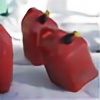
 fishydraws — Contest: Martrishka the Vampire

Published: 2013-02-11 14:24:44 +0000 UTC; Views: 2285; Favourites: 33; Downloads: 2
Redirect to original
Description
This is an entry to 's contestThe point is to be creative and playful while drawing one of her OCs. Martrishka the Vampire is an OC with very little information known about her, even the creator herself doesn't say much. I guess the only things we can assume that she is a vampire and she has an obsession with bats (from the original picture [link] ). The playfulness in this is that she is indeed playing hide and seek. And the creativity.. well I was thinking about what kind of character she is. At first I thought that she might actually have bats and she likes to play hide and seek with them. Another thought which came to my mind is that she is a bat-like vampire who actually has the ability to use supersonic sound waves (the reason why the background is made as it is) that's why she's so good at hide and seek and likes winning!
But... you know.. that's all I could think of, she's still not my character, this is not actually true, these ideas only helped me to think of the idea and create this entry to the contest.
The creativity and fun from me as an artist is that this is the first competition I'm competing in on dA c: also I'm not a fan of using words in artwork so this was an interesting experience. I still don't like how it turned out so I might make a few edits to the artwork before the contest's deadline. Might, that doesn't mean I will. Also there's also some creativity in the style, maybe it's not really from my part but as you can see it's not drawn in the style of the original. I hope the owner doesn't mind
Tools: HB mechanical pencil, red and black ink. And ps for the hair. Too bad the scanner killed the colors and brightener the pencil so much that half of the details are gone :/
Oh well.. I hope momo-lady will like it c:
Related content


Comments: 67

This is actually really creative and clever. Well done, I like it
 (Smile)")
👍: 0 ⏩: 1

Thanks! I'm very glad you do
👍: 0 ⏩: 0

I absolutely love it~! great work all around
👍: 0 ⏩: 1


Woah! This is great! 
👍: 0 ⏩: 1


Found in
The character's pose and expression are brought up quite well. I like how the shades on the girl go well with her. The thing that you could possibly work on is the hands. Also, I think you could also try to thicken the outline of the words behind it, to make it more revealing. At least, it'll be easier to differentiate the words from the black and white background itself. Also, the black and white circle background look really good btw. You could also draw some little bat designs in the background, considering the character loves bats (but thats just my opinion 
👍: 0 ⏩: 1
Thank you very much for the lovely comment, I really appreciate it! And thanks for the tips
👍: 0 ⏩: 0

This is a really great piece! Looks like something that would be displayed on a poster. I love the effect you made with the bubble letters over her head. And did you use watercolours for the background? I love the mood that adds to the piece. How you have that bit from her skirt dripping down like blood is a sweet touch too.
The anatomy is very well done. The only thing you would have to work on are the hands. But honestly, we've all been there...
I like the contrast between red and green in this piece as well, and how she's centered right in the middle.
I could also give you a suggestion for your brightened pencil problem. Since you use Photoshop, I suggest going to Image> Adjustments> Levels. Select the parts you want black with the black eyedropper. That's how I vamp up all my scanned work.
👍: 0 ⏩: 1
Thank you so much, what a nice comment 
No, both black and red in this piece is done with ink!
And thank you so much for that tip 
👍: 0 ⏩: 0

You did a pretty good job of using words in this piece, particularly the N for the hair. I like it quite a bit, the hide and seek theme as well as the sound waves are well represented. Interesting and well thought out work!
👍: 0 ⏩: 1
I'm glad there are people who read the artist's comments ")
👍: 0 ⏩: 0


Thank you very much! c:
👍: 0 ⏩: 0


This is a very interesting concept. I like how you have the "n" as her hair. Very creative there.
👍: 0 ⏩: 1
Thank you very much! I'm glad you noticed
👍: 0 ⏩: 0


Oh I loved this drawing
the colors are fantastic, and the kind of drawing reminds me of the album covers of horrorpunk bands
congratulations
(and sorry for my bad english) ♥
👍: 0 ⏩: 1
That's okay, you're doing very well c:
And thank you very much! I'm glad you like it

👍: 0 ⏩: 1

What I really like about this piece is the the washed-out colors realistic shading. When the entire drawing is done in a rather surreal style, the soft shading really adds another element to the piece, and the red adds a nice splash of color to the otherwise B+W piece.
The way her skirt fades into the bottom was a nice addition as well. It's like she's bleeding into the background.
Something I would suggest, however, is to possibly darken the colors in the background to make the words and the red in her face stand out more.
Also, I'd try and look at some references with the nose, it seems a touch crooked and small.
But overall, I really like how you've done this!
Commented on behalf of #ProjectComment
👍: 0 ⏩: 1
Yeah, the nose is my hell in drawing, I tend to fail at shading. In most of my sketches I make the noses too big, I tried my best not to make it big and overdid it.. Thanks for the tip though!
And I'm very glad you like it! 
👍: 0 ⏩: 1
Noses are a very difficult part of drawing. I spend way too much time on them.
You're welcome, it was my pleasure!
")
👍: 0 ⏩: 1
I'm kind of glad I'm not the only one thinking that
👍: 0 ⏩: 0

| Next =>