HOME | DD
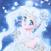
 Garth2The2ndPower — Demon Child 2

Published: 2010-06-06 21:12:50 +0000 UTC; Views: 3058; Favourites: 62; Downloads: 75
Redirect to original
Description
I felt like doing another Nico Robin portrait as a way to gauge how much I've improved since I made the last one. [link]What do you think?
Related content


Comments: 26


Funny she looks nice enough ")
👍: 0 ⏩: 0

Much more professional. Very well Garth now show us something that will blow our minds out our asses.
👍: 0 ⏩: 0

Dammnn this is nice shading
But in terms of critique, all i can say is that her face looks a bit too flat for the shading style and her shoulders look a bit too manly in my opinion
👍: 0 ⏩: 0

WOW!! This rocks!! Robin-chwan is sooooooo hard to draw. I've spent forever trying to figure her face out, and you nailed it!!
👍: 0 ⏩: 0

mah, the first one is better. I'm not saying that you haven't improved, it's just this pic that doesn't look like her. I dunno, s.m.th. in the shapes?
👍: 0 ⏩: 0

It's a bit too soft. The line isn't varied and the use of highlights makes the body meld with the background. On a personal note, a nude portrait like this is rather dull, it doesn't have enough "pop" to make it stand out. The shape's on point and the anatomy is too.
👍: 0 ⏩: 1
Lastly, While you do draw them well, this is far away from Oda's style. It's a lot more like Tite Kubo which isn't a bad thing.
👍: 0 ⏩: 1

I'm not sure I see any resemblance to Kubo's style, but I wasn't trying to mimic Oda's style either, so I'm satisfied.
👍: 0 ⏩: 1
I meant in the construction of the shape, you seem to look at human anatomy realistically like what Kubo seems to do.
👍: 0 ⏩: 0

Not quite Oda's style, yet it's not a completely totally random style, you know? We can identitfiy who it is yet it has a different touch.
 (Smile)")
👍: 0 ⏩: 0

This one looks less realistic and more animated. The shading is smoother too. I kinda like your older style better, but you are improving.

👍: 0 ⏩: 0

You're able to deviate from your own style a bit more and still look nice, that much is for sure. Mimicking Oda's style to a tee is wicked hard though so 9/10, sir.
👍: 0 ⏩: 1
And by "Oda" do you mean "Kubo", right?
👍: 0 ⏩: 0

If she is a demon, she's a succubus who has stolen my heart.
👍: 0 ⏩: 0

:3 Closer to Oda, for sure. And the colouring is well done.
👍: 0 ⏩: 0

ROBIN-SAMA~! <3
*ahem*
Good show, I say, good show. Went ahead and checked the link you left in your comments, and you can really tell you've improved. Top-notch demonstration of your change in ability.
👍: 0 ⏩: 0

I liek it. It's a lot better. Something about her right eye bothers me, though... I think it may be a few inches too close to the other.. but that could just be me. :/
Either way, it's still really good.
👍: 0 ⏩: 1
Yep.. Not to mention.. SHE'S NEKKID!! *Gets out camera*
👍: 0 ⏩: 0

You have improved greatly, especially if this was pure tablet drawing.
Robin-chan never deserved what happened to her. I WANNA KICK SPANDAM AND HIS FATHER`S ASSES FROM ONE END OF THE RED LINE TO THE OTHER!!!!!
👍: 0 ⏩: 0

Your mastery of the style is even better than before! Good work Garth!
👍: 0 ⏩: 0

I kind of like the old one better. But that might be because I prefer traditional over digital work.
I like her nose better in this one though. But her right(or left, whatever) eye is too big. I think if you'd just fix the eye it'd look much better, and more like her. Or so I think.
")
👍: 0 ⏩: 0

Robin is such an awesome character. So calm and kind, even though nearly the whole world is against her. How can you not cry after reading about her past? T_T
👍: 0 ⏩: 0


She ish NOT a demon >.< Poor Robin-chan DXX
No- but really- this is amazing! >w< Envy~!
The last one was amazing too, but this has show a great deal of how you've changed X3 though I am NOT one to talk XD
👍: 0 ⏩: 0