HOME | DD
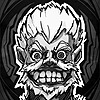
 gennady — Austronaut Ape Redux
by-nc-nd

Published: 2009-05-20 04:42:21 +0000 UTC; Views: 2029; Favourites: 35; Downloads: 54
Redirect to original
Description
This is a paint over of a previous piece that Ive decided really sucks. Hopefully its an improvement. Crits welcome.Related content
Comments: 3

This is a fantastic picture. What would an ape space habitat look like?
👍: 0 ⏩: 0

I'd say it's an improvement, except that his head no longer separates so clearly form the background.
👍: 0 ⏩: 0

This is fun and I like how his head contrasts with the background. But I feel like his facial features get lost just a little bit. I actually like the lighting on the original one a bit more - I feel this one is a bit too dark in key areas that need to be read clearly. I do like his facial structure better in this one though (a little more prognathic and less "jowl"y). I understand that the light source is coming from behind but I could see you pulling out some of the facial features a little more with some subtle lighting. In the preview of this image, you can't see his eyes at all. If there's a way to do that without subtracting from the richness I think you're set.
That, and the air puff is gone! I liked that, it gave you the sense of chilly-ness.
Overall though Genna, great piece! I wish I had an 1/8th of your talent.
👍: 0 ⏩: 0


