HOME | DD
 h41i70515 — almost finished
Published: 2003-01-18 08:54:45 +0000 UTC; Views: 202; Favourites: 1; Downloads: 135
Redirect to original
Description
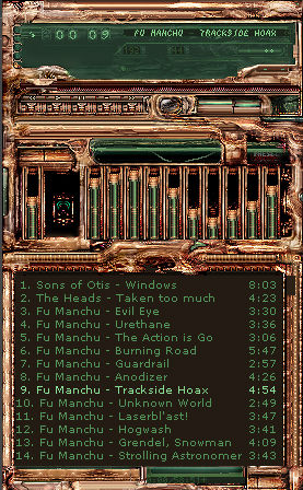
just finishing up on the wsztrying to make it work, as it were :/
... it's mostly functional, just don't touch the playlist
Related content


Comments: 18


i dot agree with paroxysm, fuck what most people like, this is beautiful as it is.
finnish the volume bmp and make the minus(-) playlist button obvious so i know where it is exactly, i use it!!
👍: 0 ⏩: 0

very cool... agree with all of the comments... Make it an insects eye or i will kill you....
👍: 0 ⏩: 0

looks fantastic! but i have to agree with t-k abbout the shuf/rep and i am not sure about the black areas in the eq.
👍: 0 ⏩: 0
How about a working on the shufrep. It's nice but its been done too many times and doesn't seem right on this baby. Besides that love the choice of green but more of it on the eq would be nice
👍: 0 ⏩: 0

Love the col;ors and how the design is looking so far looks close to being completed
👍: 0 ⏩: 0

wow...this skin is sick...i mean that in a good way...
...lookin great man.
👍: 0 ⏩: 0


Excuse my langauge, but it looks fuckin' awesome.
Now for my thoughts :
I seriously have no idea where the winshade mode buttons are - I'm guessing, and I hate guessing... I don't like the the blue in the playlist play-pause-etc buttons. I'd prefer it if they were the same green as the screens. Other than that, I can't wait for the final release .
👍: 0 ⏩: 0


warning: some filters were used in the process of this skin
👍: 0 ⏩: 0


All I know is I'll definitely be downloading this when it's done.
👍: 0 ⏩: 0
keep in mind that this skin was originally based as a metroid tribute. well, still is, but it's been much skinned over and probably will continue to be worked and reworked by myself or intolerant3d. I'm finishing this stage so a new one can take effect; eventually towards the final version of ZebethM510.
👍: 0 ⏩: 0

looks like corroded bronze. high degree of detail - the amount of work behind this is obvious. it's not really compatible with any desktop themes out there but as a standalone skin this is top notch.
if i had to point out anything negative, it would be that this skin is too abstract. people like to recognise an element or two (even if it's as simple as a gear or switch). that way it gives the skin an association that the viewer can identify with. with this skin, one can't tell whether it's medival or gothic or whatever. for example - if you made the eject button an insect's eye, it would improve this no-end because the rest of it would seem like a close up of a bug or alien.
👍: 0 ⏩: 0
