HOME | DD
 Hooke — (Commission) Sura II
by-nc-nd
Hooke — (Commission) Sura II
by-nc-nd

#gold #zykla #anthro #collar #furcadia #furcadiaportrait #furcport #goldentether
Published: 2016-01-04 01:43:57 +0000 UTC; Views: 1058; Favourites: 49; Downloads: 0
Redirect to original
Description
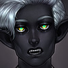
Portrait for Sura, of Furcadia.Character © 2015, her player.
Art © 2015, B. G. Hooke (Hooke ).
Related content


Comments: 5

how do you choose the colours? they look so good"
👍: 0 ⏩: 1

HOLD ONTO YOUR PANTS, THIS IS GOING TO BE A LONG ANSWER.
When choosing colours, I first pick a primary colour for the overall atmosphere of the piece - for me, this is more often the colour of the shadows than it is the colour of the highlights, because I work from dark to light. This colour is often chosen to complement the dominant colours seen in the character I'm rendering. The primary atmospheric colour above, for example, is a dusty pink. In order to create the illusion of white (without actually using white, which will tend to make an image look flat) I then picked an opposing colour for her highlights - in this case, a very pale yellow-green. I could have used a colder green, but I wanted a warm atmosphere. Following all this, I'll often choose at least one accent or splash colour. This third colour can either oppose or complement the primary tone used for shadows, depending on whether I want a more subdued or dramatic piece overall. Here, the accent colour is a rosy gold - a complementary tone conducive to a more relaxing, contemplative atmosphere.
This is a very abbreviated overview, and doesn't take into account subjects that call for a more complex use of colour, like skin.
👍: 0 ⏩: 1
Alrighty! Gonna keep that all in mind! THANKS!
👍: 0 ⏩: 0
