HOME | DD
 Jaydehawk — About to miss a train

Published: 2005-12-08 19:53:02 +0000 UTC; Views: 4640; Favourites: 83; Downloads: 186
Redirect to original
Description
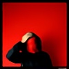
Deeply engrossed in her newspaper, she did end up missing her train. I ended up missing the same train as they had it leave from yet another platform... Eventually we both ended up in the same train, but I didn't show her the shot.Schiphol Airport
Related content


Comments: 43

great shot you should of showed her , would have freak her out maybe?
👍: 0 ⏩: 0

I love the feel of this picture. The hint of colour really adds a human feel to the photo. Its simplistic and complicated at the same time. Basically, I'm jealous : D
👍: 0 ⏩: 0

incredible cool picture..
love the simplicity, also the design of the whole place, the ceiling lights and such are very beautiful
fantastic capture


👍: 0 ⏩: 0


 (Smile)")


Thank you. I was lucky to catch the moment.
👍: 0 ⏩: 0
Thank you very much for the kind words.
👍: 0 ⏩: 0

Thank you very much
Both for the comments and the 
👍: 0 ⏩: 0

lovely shot. agree with all the other comments about the very balanced compo and choice of elements here - the pattern of the ceiling, the negative space etc - great mood! Desat works really well for me too. Now, I have one minuscule niggle but it does stick into my eyes immediately (sorry  (Wink)")
👍: 0 ⏩: 1
Thank you very much for the elaborate comments
👍: 0 ⏩: 0

")

I dont think the B&W would have had the same richness as this version. The partial desaturation lends a certain vibrancy to it.
👍: 0 ⏩: 1
My thoughts exactly.
(I like your quote...)
")
👍: 0 ⏩: 0

wOw... I really like the composition here... and also her natural pose while reading the news... nice shot mate
👍: 0 ⏩: 1

this really is a great shot ... so strong . simple . and clean ... at first I thought it was b+w, nice work
👍: 0 ⏩: 1
Thank you
There was some argument over whether full b/w would have been better, but I decided to leave it as is: severely desaturated
👍: 0 ⏩: 0

simply taken, the photo tells a story too, with the woman being in the image, adding more depth to it. good shot!
👍: 0 ⏩: 1


i agree that this is very good.
appealing, straight and clean.
pure bw would have been my
prefered choice as well. but
thats a personal taste issue.
👍: 0 ⏩: 1
I'm glad you like it (if not unconditionally
👍: 0 ⏩: 0

i do like the composition and the way you framed the picture
👍: 0 ⏩: 1


Loverly shot, so you do take your camera to work with you!
I like the structure and the light through the ceiling circles. I like how you did keep a hint of colour in it, it makes the girl look more "human" in such a beautifully stark surrounding.
Hope you was'nt late for work / dinner
👍: 0 ⏩: 1
I desaturated the image by a bout 90% which left just a hint of colour. I'm glad you like it
Oh, and I was late for work, but luckily I was late already
👍: 0 ⏩: 0

oh yes !
I guess I know what devil did ride you here.
opportunities makes thieves ...
👍: 0 ⏩: 1
sputnikpixel [2005-12-08 21:01:16 +0000 UTC]
Wow, great shot Jan. I like how reduced it is to simple elements, the column, floor and ceiling, the woman on the bench. The composition or balance is also very good - placement of the elements over the format and the mixture of dark and bright areas. The only thing I would criticize is the slight sepia-toning, bare b/w would be my choice. But that's nitpicking.
👍: 0 ⏩: 1
Glad you like it and many thanks for the
I tried verious options when reducing the colours, but ended up pleased most with this desaturated version.
👍: 0 ⏩: 0

really well done capture, i mean the whole concept, lights, this white column and her sitting on the bench.
👍: 0 ⏩: 1


I like the tidy'nes of the sharp "straight to the point" attitude the scene creates through its situation/surrounding.I especially like the way you have captured a very set and perfect setting through the objects set in place and how you have used these rather than the scene make you feel used ie setting in your own feel within the shots placing.While the person sat reading adds the perfect amount of depth and reality the work needed and idea.Overal a tidy,sharp and clever shot along with the meaning.Good work.4D.
👍: 0 ⏩: 0