HOME | DD
 Jinbae — A Summer's Breeze

Published: 2013-07-12 19:30:14 +0000 UTC; Views: 8575; Favourites: 448; Downloads: 169
Redirect to original
Description
Almost forgot about my fashion series!So here's the first of Season III with Anko Mitarashi!
I tried a new method of coloring where I don't make a super clean lineart first.
A Summer's Breeze©2013 JIN artworks | jinbae.deviantart.com
NARUTO© Masashi Kishimoto | Shueisha Inc.
DO NOT STEAL, REPRODUCE, ALTER, OR DEFACE WITHOUT WRITTEN PERMISSION please...
Please DO NOT REMOVE WATERMARK and give credit where credit is due .
Related content


Comments: 56

 (Smile)")

Amazing enough Anko nee-chan is wearing more poolside than she usually does.
👍: 0 ⏩: 1

 (Wink)")
👍: 0 ⏩: 1
And a break from stabbing mission targets in the face.
👍: 0 ⏩: 0
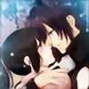


Finally it's Anko's turn
Did she dye her hair? (In this illustration only I mean)
Big thighs are sexy~ lol, but in this pic I think Anko's thighs are a little too oversized compared to the rest of her body
Nice coloring and shading as usual! Keep it up!


👍: 0 ⏩: 1
Haha I had a orange-redish overlay so it looks a lot lighter than it's supposed to be 
:c Yeah her thighs are like, bigger than her face D:
I definitely should have reduced the size on them ahaha......................
Thank you!!
👍: 0 ⏩: 0


your lineart being this way looks super cool as well, as "sketchy" is the new in-thing nowadays.... Also, I like the way you kept Anko's characteristics intact whilst still maintaining your own style of drawing girls. I admire you for that XD Next, the thighs are a liiiiiiiiiiiiiiiiiiiiiiiiiiitle too wide in my opinion. She's bathed in light, whch makes the whiteness give more sense to the comp, as well as you have somewhat of a rule of thirds going....
Although all this is awesome, I must ask, why the back of the hair is blurred??? I mean, its not something you see at first glance, but still... Were you going for a DOF kinda look? In that sense adding more elements to the composition is the trick, but that would prolly ruin it considering the white's dominance. So yeah. the blur is something i wanna know xD
Also, you could have aligned her more onto satisfying the rule of thirds... I know this is more of a personal preference, but she is placed a little awkwardly in the composition, unless you want the audience's eyes to travel toward her thighs first XP
Check this out as i suck at explaining stuff ")
Next, this could be a screen-glitch, but i totally cant see the sakura petals (are they sakura petals?) nor the writing clearly. Again, this could be an issue with my screen, but just putting it out there!
Phew, sorry Jin, for this extra long comment! i was away out of town at the time this was initially uploaded, and now that I have the time to respond to my comments, i thought i'd float one your way about what I wanted to say about this at the first place xDDDD
Peace!
👍: 0 ⏩: 1
Ahaha I think you might be reading too much into it!
But to respond to your critique,
Yup I'm trying to see how my sketchy style is going because it's more efficient and adds more life, I suppose, to the artwork haha
Yeah looking back at it I should have drawn the thighs smaller,
It looks weird since her thighs are basically bigger than her head
As for the rule of thirds,
I personally don't really follow the exact guidelines (mainly because I don't have any programs that can pop it up and I'm too lazy to draw it myself...)
Or at least I don't consciously follow it haha
The original intention for this piece was actually to have her in the middle as the canvas was almost a square,
But I thought that was boring so I just extended the canvas to make it close to widescreen ratio haha
I'll have to be more conscious about placement though I suppose,
It always looks nicer if following the rule of thirds haha
Well what I'm really wondering is what program are you using? It looks fancy
For the blurring,
It's not so much to add depth but rather just to look cool AHAHA
Like in this artwork: fav.me/d4qq747
The blur doesn't seem realistic but just makes the artwork pop out a little
And it's fun to do too!
Oh hmm...
The petals and letters look fine on my computer,
But maybe that's just the contrast difference on my monitor screen maybe?
I even chose dark red as the color!
I usually use black but I didn't think that would match very well in this particular artwork haha
No problem! I appreciate critiques haha
👍: 0 ⏩: 1
sorry i just went all-out on it..... 
I'm using Photoshop! Love PS and SAI they are the perfect combo
well, im kinda sorta a rules guy (cant blame myself... i was coached by the digital ruler =Eddy-Shinjuku ) so i went and analysed it all.....
Yes, i saw it on my PC and looks fineXD
👍: 0 ⏩: 1
Haha no problem! I appreciate the critique!
Uhm CS6??
I've never seen that type of interface layout before haha
Haha I've never had any teaching from anyone so I never got used to following the rules
Which is sometimes good and sometimes disastrous AHAHA
Hmm I see well I'll still have to make the contrast darker next time!
👍: 0 ⏩: 1
yesh, CS6. it rocks but the cost shocks.

yeah well for someone who hasnt been taught youre a pro! ")
👍: 0 ⏩: 1
Haha I just use CS2
I use GIMP for coloring so I never end up using CS2 for much besides just finishing touches here and there
Haha well getting lessons from a professional wouldn't hurt
👍: 0 ⏩: 1
sorry to changeth the subject but you changed your icon.
👍: 0 ⏩: 1
Why thank you for noticing good sir
Indeed I have changeth my profile icon.
👍: 0 ⏩: 1

and thanks for letting it into my group
👍: 0 ⏩: 1


| Next =>