HOME | DD
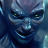 JoaoRodrigoBaptista — Warrior - Color

Published: 2008-02-27 01:40:42 +0000 UTC; Views: 1186; Favourites: 18; Downloads: 10
Redirect to original
Description
I had posted this piece's lineart some weeks ago, and the other day I decided to color it.I'm getting better at it, and now I've been experimenting with Painter X, and I think this came out cool.
Painter X + Adobe Photoshop CS3 over the previous lineart.
Special thanks to the beautiful for some very needed advice on it.
Hope you like it.
Related content


Comments: 95

That is brilliant - the drawing is incredibly good, esp his expression and the colours are fantastic too
Faved
 (Smile)")
👍: 0 ⏩: 0


I like what you're doing here. The boots are fantastic! But the armor and his coat are a little off in comparison to those fabulous boots. Next time in your shading, add some highlights to the edge of every fold of fabric closest to the light source. This will help to add some more depth and sense of 3 dimensionality to the image.
👍: 0 ⏩: 0

Nice pose and awesome colouring. ")
Looks very good.
👍: 0 ⏩: 1

Well Done. I like how you colored and highlighted the hair.
👍: 0 ⏩: 1


The framing on this really makes it pop. It gives it a very finished look. I think you should do a series where you frame out the figures, it could give your art more attention, and not blend in with some of the other characters on DA.
👍: 0 ⏩: 1

hmm... That's actually not a bad idea...
👍: 0 ⏩: 0

This guy looks like a fairly generic RPG hero. However, he is well done.
I think the biggest thing I would like to see from your art is that I would like to see you branch out and demonstrate some creativity.
I see a lot of generic stuff in your gallery. Like "the generic cheerleader" or "the generic werewolf" or the generic RPG swordsman.
You clearly have artistic talent and can put together some really legit pieces. I would like to see you really let loose in terms of designing your art work. Go nuts. I'm not saying you should clutter your drawings/illustrations with a lot of unnecessary stuff. However, I think you could use a bit more variations in color or employ your imaginative capacities to demonstrate more than strictly formal skills.
👍: 0 ⏩: 1
I agree. I remeber when I did this one, I was struggling with an "artist's block", so the best I could come up was with this one. I'm glad that you think it's good, technically.
👍: 0 ⏩: 1
Ah. That makes sense. Even if you do have some sort of creative block, it *is* good to work on something just to practice your skills and get better. You do have talent, though and you do good work.
👍: 0 ⏩: 1
Thank you! I appreciate your kind comments! Sometimes the hardest thing in a drawing is to come up with an idea for the piece. When I have it, things normally come along well.
👍: 0 ⏩: 0


Looks great, though I think you should have made the character a bit bigger.
👍: 0 ⏩: 1
He could be a short motherf#cker....
👍: 0 ⏩: 0


a very interesting desing, i like so much, and de yellow light coming for left...
👍: 0 ⏩: 1

Nice. Yes... Colors are graet.
He looks like he noticed that somthing havy was thrown in his diraction
Anyway... (
 (Wink)")
👍: 0 ⏩: 1


Hmm... Probably.
👍: 0 ⏩: 0
You sure got some nice colouring skills I see, I love your palette. What do you do for the line art? ^^
👍: 0 ⏩: 1
Thanks! I'm always a bit self-conscious about my coloring, because I'm colorblind.
For the lineart -->[link]
👍: 0 ⏩: 1
Colourblind huh? Entirely or partly? In any case, the self-conscious thing sure pays off
And thanks for the tutorial, I'll go read it
👍: 0 ⏩: 1
Partly. I only have trouble with certain colors. Hope you enjoy the tutorial.
👍: 0 ⏩: 1
I did, but I don't really understand what media you're referring to in that tutorial... ps7 or cs3, or maybe real ink perhaps? o0
👍: 0 ⏩: 1
Oh, sorry! Manga Studio 3EX was the software used. I haven't been using it lately, now, though. But it's a bit irrelevant, actually. Every image software works almost the same way...
👍: 0 ⏩: 1
Manga Studio, never heard of it before o0
But you're right, they mostly do work the same way..
👍: 0 ⏩: 1

Thank you, my friend!

👍: 0 ⏩: 0


The face is somewhat flat and his neck is too bulgy for his body. Other than that, it looks nice.
👍: 0 ⏩: 1
I think you have a point there.
👍: 0 ⏩: 0


Thank you very much!
👍: 0 ⏩: 0

i like the colors. and of course, the art itself. you have a kind of classic style that i like. everyone is too busy trying to find a seperate niche in art that they dont bother trying to be any good. you, i see, have no problem with being skillful.
👍: 0 ⏩: 1
| Next =>