HOME | DD
 JowyB — Louder HISS :FIM title cards series

Published: 2014-01-03 01:31:31 +0000 UTC; Views: 21119; Favourites: 781; Downloads: 464
Redirect to original
Description
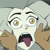
Think of the cider! Won't somepony please think of the cider?!

uhh...that songs been stuck in my head this week the Danny Elfman vibe to it is too noticeable not to find it catchy.
This was not the title card i was expecting to do next folks but the potential for this episodes particular design was too good to pass and i wanted to get back in to making more title cards for season 4 again.
i went for a rather ambiguous composition to add to the mystery to the whole episode
The FIM title cards project aim is too create a quirky unique title card art for each of the episodes of the show we know and love ")
this year i plan to do more title cards based on fan creations this includes Friendship is Witchcraft as well.
 (Wink)")
anyway Until next deviation LATERS Bronies

painted in Photoshop CS6 with my Wacom tablet 5
Epic FTW


Related content


Comments: 37

👍: 0 ⏩: 0

Overall


Vision
Originality
Technique
Impact
Nice one Jowybean, though I'm not pretty amazed with this artwork of yours. So, I'll start pointing the goods at first:
You have a good artistic drawing, as I have seen a little of your work lately, and it isn't different about this one.
The apple, the barn, the bat, the trees, the moon... And, of course, the message! These are the focus of your picture, and you got all of it into your own style. Your technique is impressive.
The gloomy sky was pretty charming, it gives the idea of creepy, and still combines with all other drawings you've made for it — some artists simply cannot mix one with another without harming the already done art, and that's not good when it happens (but that's not your case).
Colors were meaningful, standing by to fit one unique color of blue(except for the bat), and thus praises even more the idea of creepy and charming of your job.
The stone aspect coming from the bat wings were astonishing!
But, there are a lot of things could be worked on to make it better, if you want perfection or just... being great.
The first thing I've been worried when watching your artwork closely were just the message, where it says: "Written by Merriwether Williams". Not about the writer — of course, no. e.deviantart.net/emoticons/b/b… " width="15" height="15" alt="
The barn you have designed seems to be hiding something behind the door. It looks more like a water reflection or a mirror instead of a door, and I can't disguise if it's open or close. The problem here is: it doesn't gives the same idea, and do not combine with the picture at all. You can work better for the details. Don't give imagination where it shouldn't be, for who's appreciating your art — as an example, most of artists do it for the trees, I think you could've worked better for the trees as well, but I'll not consider this as a mistake since others do normally.
Effects you've made using light and shadows were not successfully impressive. They aren't really well made and positioned throughout your artwork. The bat's tongue could be darker, as well as it's wings: the light seems to be coming from the word "Bats" instead of the moon. If that was your idea since from the beginning, it wasn't catchy.
Now, not the blue colors(these were amazing), but the colors from the bat and it's wings could be changed into a creepiest vision from everything else. Where into one side, we can see the gloomy sky, the scary trees and the fog... The other one, we can see a colorful bat? It's strange, some may say it was a good contrast, I do believe it was overrated just to give a look for the message.
Givin' the critique, I suggest you try to be naturally outstanding and to pay attention with details next time. And, maybe, follow a more balanced thread for the next ones.
With love, Guilherme L. B. (a.k.a Calena).
👍: 0 ⏩: 0


Title card SFX should be a dramatic sting and the sound of a hiss
👍: 0 ⏩: 0

This reminds me of ed edd n eddy. In the beginning of each episode there's a thing that has something about each episode...
👍: 0 ⏩: 0
This title card looks perfect! It wouldn't look out of place on Courage the Cowardly Dog.
👍: 0 ⏩: 0


 (Smile)")

Wow, this was a great eppie! Am I the only one to think Flutterbat was a total badgrass?! And I really liked the musical number where Fluttershy and Applejack argue about what to do with the vampire fruit bats.
Any eppie which shows a more, dare I say it, hardcore Fluttershy is worth seeing.
So far I am liking Season Four a lot. Might I suggest doing one or more of the Season 4 eppies next:
1. Princess Twilight Sparkle, part 2
2. Flight to the Finish
3. Power Ponies
4. Rarity Takes Manehattan.
👍: 0 ⏩: 0

GEEEEEEEEEEEENNNNNIIIIIIIIIAAAAAAAAAAAAAAALLLLLLLLLLLLLLLLLLLLLL
👍: 0 ⏩: 0


i wonder how you are gonna make the episode: power ponies
👍: 0 ⏩: 0

I've already made one innuendo about Flutterbat in the last 5 minutes, so I'm going to go ahead and ignore the possibilities of that tongue.
👍: 0 ⏩: 0

I really like that you didn't directly put flutterbat in this! LOVE that. It's just perfect. (on that note, I did NOT see that coming!)
👍: 0 ⏩: 0

ahhhhhhhh love this one so much, short sweet and straight to the point
👍: 0 ⏩: 0


Took me a bit to realize that the right side of the frame was a mouth. Well done.
👍: 0 ⏩: 0

Holy crap is this awesome. This is a really good episode and shows Merri is not a shit writer. People stop saying she sucks ass because not all her episode hit the shit here.
👍: 0 ⏩: 0

Gosh, it's like AppleJack's house is haunted here. x3 I find this very interesting~
👍: 0 ⏩: 0

Great titlecard. They really should hire you to do these for the show!
👍: 0 ⏩: 0


That tongue is... just sort of awesome piece of perspective right there. Love the tongue and the teeth.
The details on the background don't look too shabby either ;D
👍: 0 ⏩: 0

I just now noticed... Merriwether Williams seems to be putting out a LOT more of the best episodes these past couple of seasons. I guess she really wants to put her first episode behind her. And she's succeeding.
👍: 0 ⏩: 0

Raise your hands if you love red eyes! *raises 100 million hands*
👍: 0 ⏩: 0

I see these energetic title cards and keep replacing the titles with Ed references.
EDS!
👍: 0 ⏩: 0

I love this Pic. Does this mean that we will be seeing more tittle cards faster?
👍: 0 ⏩: 0

That is awesome dude. Wish I could of used this as the thumbnail in my collab on this episode
👍: 0 ⏩: 0


