HOME | DD
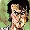 justblah — The Darkness II tryout the first

Published: 2011-12-11 04:19:48 +0000 UTC; Views: 4065; Favourites: 14; Downloads: 17
Redirect to original
Description
first thing id like to say is, i SUCK BALLS at lettering. i cant get my head around it haha.anyway,
this was fun! ive never done interior art in traditional colors before, and it was a mission haha! once the pencils where done i think i spent a good 5 hours painting which is long for me


this is my first submission, i will submit more.
so yeah! with this one i kinda used my style more then the one we were told to try and replicate, because my style still kinda has that rough handmade grittiness the actual comic has. i do feel like this page is messy as hell though.
next time ill clear things up. and yeah..there's so many ways to lay this page out i just ended up doing a random selection from the thumbnails i did before hand. so next time will be different and ill use a different approach with technique as well.
EDIT:
CHECK OUT MY SECOND SUBMITION:
Related content
Comments: 37

There's an important problem...If a script says "3 PANELS" u have to do 3 panels...You'll reply that some pros love to split panels in 2 or 3...yes, u're right, but believe me, IF YOU ARE A PRO u can do it, if u are a rookie and try to change the script, for 95% editors u're not a creative artist, u are a PROBLEM
I hope I helped in some way
👍: 0 ⏩: 1

cheers! your right though, i just kinda figured it might look good takin initiative
my next one only has 3 panels, and the next one ill submit after that too
👍: 0 ⏩: 0

wow! this is awesome im totally digging the detail in the power box!
👍: 0 ⏩: 0

Nice Work! Aren't you supposed to have 3 panels only?
👍: 0 ⏩: 0

i thought it was supposed to be 3 pannels... sick though
👍: 0 ⏩: 1

haha 3rd time answering this.. when you get a script, if it helps the story telling, you can add panels. most pro's do it.
👍: 0 ⏩: 1

lol my bad for the added repetition and thanks
👍: 0 ⏩: 1

haha no worries 
👍: 0 ⏩: 0

its nice but dont put you dreams up! you never know.
👍: 0 ⏩: 0

was going to enter, but after seeing this, i won't bother. i can easily see this being published. "a get my hands dirty kinda guy" in the first frame seems to be exhibiting some improper bold use? just thought i'd mention it. i would have gone with "a get my hands dirty kinda guy"
you've got my vote.
👍: 0 ⏩: 0

use a faux italic with the photoshop paragraph properties?
never seen ms comic sans in context before. looks good i think
👍: 0 ⏩: 0

And yeah, this page is(along with the "Ashley Wood" page) the best up to now.
👍: 0 ⏩: 1

thank you 

👍: 0 ⏩: 1

This guy [link]
I call him "Ashley Wood" because his style is very similar (for me).
👍: 0 ⏩: 0

damn this is really good. i like this one the most. i think i might just give up on my mines...not turning out the way i want.
👍: 0 ⏩: 1

aw dont give up man! if anything, get inspired! and do your best to win!
and thanks
👍: 0 ⏩: 0

im entering the contest as well and i have no idea who the brotherhood are? anyway you can help?
👍: 0 ⏩: 1

I understand you 
[link]
👍: 0 ⏩: 1

Looks good! I'm thinking of entering too, but I don't quite understand the thing about panels. The rule is you have to have 3 panels, but here I count 5 panels. Or am I not quite getting it?
👍: 0 ⏩: 1

thanks!
i found that panel 2 had to much info to make it work and look good, so i split it up for the sake of story telling.
alot of pros do add panels when they have trouble including everything in one panel, so i figured that id rather take some initiative and add panels so i dont have 1 big weird panel with too much going on 
but yeah, i didnt quite understand either to be honest. so i just kinda did my ow thang haha
👍: 0 ⏩: 0

Nice work pal ! your colors are great. Only thing is there's 4 panels. They really gave too much stuff for 3! You have a good chance if they are not too pointy. I'll submit too, when i find time between sleeping and studying. Good luck!
👍: 0 ⏩: 1

hey thanks 

and thanks again! i look forward to seeing yours !
👍: 0 ⏩: 0

Oh shit, it's like you've already won the contest, hah. Can't imagine anything with bigger BOOM! factor.
👍: 0 ⏩: 1

haha thanks 
i will submit a few more that will be better then this (cuz i find my storytelling in this rather messy)
i just kinda felt like i had to submit something this early cuz so far we have had like..3-4 legit submissions and the rest is people being dicks an seeking attention haha!
i am super competitive and figured..well, if i try now, and people beat that, then i should try even harder on the next to beat em 
you joining?
👍: 0 ⏩: 1

Hah no problem
I'm looking forward to your further submitions - your art has a really interesting style and i'm sure you can win this
Yeah, but i'm sure you'll get a great competition from other artists soon, so don't think that these 3-4 will be all of it, haha.
And you will know what to improve if they beat it. Keep up the work and don't let them win! You know we're counting on you!
Me? Joining? No, there are too much proffessionals in there (and I suck in drawing people, hah)
👍: 0 ⏩: 0

I still do not get the idea of the size the page is supposed to be. And the bleed area around it. The only photo manipulating program I have is Photoshop Elements. And I have no idea how to use it.
👍: 0 ⏩: 1

im not sure what photoshop elements is, but basically, when you download the template they give you, they describe everything in it. there is a bleed area to make sure that when it goes to print, and they trim the pages, that there is no white border around it, so it has a professional book finish. and the size of the template is obviously the size of the book.
9i struggled a little with it, cuz i draw on A3, and had to crop a bit of my image off the sides to make it fit, but basicly you just need to fit your page in it.
👍: 0 ⏩: 0

Your hard work with the painting worked out reaaaallly well. This is unbelievably badass. Keep up the great work dude! Can't wait to see more.
👍: 0 ⏩: 1

thanks 

i feel its way to busy to allow an easy read though..which is why ima do a bunch of these 
this one is kinda my warm up hehe
👍: 0 ⏩: 0

Ya I wish we didn't have to do lettering. Sick artwork man. It's got a nice grit to it that fits The Darkness really well
👍: 0 ⏩: 1

yeh lettering sucks the penis. i highly respect people who are good at it cuz for me, the drawing part is much easier haha!
and cheers 

👍: 0 ⏩: 1

so did I. I actually have it written down as one of my life goals to work on this book lol. I'd crap myself if I even got top 3. Cuz it'd mean Marc saw and liked my work.
👍: 0 ⏩: 0


