HOME | DD
 k-dezign — Hugh Laurie 2

Published: 2009-10-21 07:49:59 +0000 UTC; Views: 2496; Favourites: 43; Downloads: 39
Redirect to original
Description
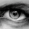
Hugh Laurie- A4 paper 110gsm
- Approx. 7 hours work over 3 days
- Drawn with 2H, HB, 2B and 4B pencils, eraser and a paper stump
Obviously I've redrawn Hugh, making this my second attempt. You can view the old one here: [link]
Personally, I think there are many improvements as oppose to the old one. I made the nose too round and I still need to pay more attention to detail with the hair/facial hair. Other than that, I think it turned out fine. Please provide comments with your honest thoughts. Favs are always welcome
") though I prefer constructive comments so I know how to improve. Thanks and Enjoy.
though I prefer constructive comments so I know how to improve. Thanks and Enjoy. ")
Drawing is open to criticism...
Related content


Comments: 44

How you can draw so realistic hair? I'm so jealous
👍: 0 ⏩: 0

this is prpbly anoyyin me senndin all thees comments but is this heugh playing house
👍: 0 ⏩: 0
one thing i have not seen hegh with such clean crisp eyes
👍: 0 ⏩: 0


Thanks!
👍: 0 ⏩: 0

I love how uneven it is; the ears, the eyes, the nose. I think the hair is a bit too dark, though. But maybe you were drawing him in his younger years, I wouldn't know. That would explain why Hugh doesn't have that many wrinkles. Ya, that all makes sense, I don't know why I didn't notice that in the first place. I guess I just prefer him in his older years.
The wrinkles on the forehead look more like scars, though. They seem like old cuts.
The shading on the cheeks is (are? is?) magnificint!! It looks so life-like, I just wanna pet him!!
Ahem. But, anywoo, wonderfully drawn! I Gotta love Laurie!! <3
👍: 0 ⏩: 1
Thanks heaps for the comments!
👍: 0 ⏩: 0

fantasitc! I love hugh laurie and you drew him perfectly. it'll take me forever to get as good as you! critisism..... critisism..... well it's hard to say because I like it so much but the left ear looks weird compared to the right one (or the other way around) and it might just be me but the nose looks different, idk. ahhh its hard to critisize someone who's so much better than you ^_^
👍: 0 ⏩: 1
Hehe, thanks again
Thanks for your "attempted" criticism  (Wink)")
👍: 0 ⏩: 1
I'm glad to hear that my attemppted criticism was actually worth something
👍: 0 ⏩: 0


ooooh, house being all dark abd brooding - i think this is the darkest version of house i've seen - but it works quite well!
👍: 0 ⏩: 1

Haha... Yea the contrast is a bit heavy but thanks for the comment
👍: 0 ⏩: 0

wow this portrait is amazing! The details are amazing and the hair too, it looks so real!
But I think the shading in the face is way too dark...

👍: 0 ⏩: 1
Yep, it really should be lighter, I completely agree
👍: 0 ⏩: 0


nice contrast!
I've seen this particular picture drawn many times but your version seems more menacing, there's more attitude.

👍: 0 ⏩: 1

I'm Hugh Laurie, and I approve this pict -- wait, no I'm not.
👍: 0 ⏩: 1

That is amazing - wonderful work! So much expression.
👍: 0 ⏩: 1

First of all i need to say that that is is a (another) great work
Now for the "mistakes"  (Smile)")
It also have some lovely details like the eyes and some wrinkles
I wouldn't do better
👍: 0 ⏩: 1
haha thanks mate
Really appreciate the honesty and the constructive criticism
True, contrast is a bit excessive, my shading on the nose made it look too round and the proportions of the eyes/eyebrows are incorrect. I'll make a note of these things for my next drawing to come
Thanks for the 
👍: 0 ⏩: 1

incredible good work! you really inspire me.
👍: 0 ⏩: 1
thanks mate
👍: 0 ⏩: 0
