HOME | DD
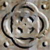 kaidoh — Mobius Revisited

Published: 2005-08-13 15:39:34 +0000 UTC; Views: 2694; Favourites: 52; Downloads: 227
Redirect to original
Description
EDIT: I changed the knotwork inside the mobius strip.. to make it more visible.Please do a full view or you'll miss the detailing on the strip.
...
The three children stared at the table top..
"How's it doin' that?" the fair haired boy whispered, reaching two fingers out towards the dull metal object. The only girl of the group, tall and gangly, squatted down, peering under the table.
"It's got to be some sort of trick.. you know, like magic tricks on TV." she muttered, touching the wood of the table top from underneath. The darkhaired boy, runt of the litter, took a step back. Visibly nervous, he shoved his hands in his pockets.
"Told you we wasn't supposed to be here." he said, his voice cracking into splintered tones..
A distant hum became faintly louder as the three stared at it. The fair haired boy's fingers lightly brushed the edge of the metal, and it bobbed slightly. The hum began to sound like audible chanting, voices from far away.. The children couldn't quite make out what it said, but the dark haired boy had enough. He bolted through the empty rotting rooms, out into the cool evening air where only the wind was heard. About 30 feet from the broken door of the abandoned house, he turned.. expecting his friends behind him. Only the gaping windows followed him. He sat down in the dirt path, waiting..
Not the greatest attempt, but it is a true Mobius strip. One edge, one side.. You can follow the lines if you like. (If you don't know what a mobius strip is, look it up. It's very interesting, and I still can't quite wrap my mind around it.) Concieved for the contest for . As I drew it, I remember different kinds of stories I'd read as a kid.. Two in particular, from different sources. One was a book I'd had about these four kids that find a dragon puzzle. as each kid puts it together, they're transported to a different place in time, each with a different task. The other was a generic scary book for 8-12 year olds about a haunted house that really was haunted.. I don't remember the details, but that's where that little bit up there came from..
It's not great.. but it's a good first attempt. And there is a deadline date to the contest, so I wanted to reach that. Thanks to hubby for the help (how to do metal textures and color variations)..
Related content
Comments: 52

Thank you.. You should see the companion piece in my gallery though.. Mobius.
👍: 0 ⏩: 1

i will...i was just looking through real quick
👍: 0 ⏩: 0

That's really gorgeous, I wish I could do that stuff!!! the knotwork is wonderful and simple all at the same time. hehehe ^_^
And yeah...what IS the deal with mobius strips??? I don't get it either...is it supposed to be astrophysics or something? How can something be one-sided? it's...uh...what the heck??? I'm so confused! It's not possible! It's always going to have SOME other side, right??? *brain fizzles and dies...gets a dumb look on her face and drools on herself.*
👍: 0 ⏩: 1

See? See?? I'm not the only one bugged out by this! I'm just boggled by it..
To more illustrate the sides, here's the companion piece I did for it; Mobius
but it's a physics puzzle, that isn't a puzzle because obviously it's real and easily done, but how it's done just freaks me out. It's just wrong, man.. i tell ya, it's just wrong.
And thank you very much for the compliment.. Really appreciate it.
👍: 0 ⏩: 1

lol I'm sure that there are lots and lots of people who have brain contusions from this one. XD hahaha.
OOH! I like that one, too! hehehe ^_^
but...but...how can it be real when it's only supposed to have ONE side, and when you do a piece of paper into a mobius strip, there's TWO sides!!! 'cause the two sides of the paper! and! and! AND! AND! oh snap, I'm confused again. -_-;;; maybe the mobius strips I've done in class are just...blah? stupid kiddy representations of a mobius strip? I don't know! It is just wrong! They can't do that to us peoples! They'll give us brain farts that last the rest of our lives! lol
And no problem. ^_^ hehe. I like commenting on stuff. hehe. It's teh fun. XD
👍: 0 ⏩: 1

No, wait.. when you take a two sided paper and make a mobius strip out of it.. seriously.. it becomes one-sided. I've done it countless times to illustrate to ppl what a mobius strip is (you'd think I had all the time in the world. This is one of those situations where the ppl working around me just nod and think Im a kook). and it's ONE-sided..
pfaarrrkfph!- okay, my brain farted. LMAO
👍: 0 ⏩: 1

>_>...I still say it's one sided...'cause...it just gives me a brain contusion...there are the two sides of the papers!!! it's like...BLAH! two sided! o_o front and back! and...FWAH! I don't know...it hurts my head and makes me go "Dubayooteeayf???" O-o 
👍: 0 ⏩: 0

this is beautiful. the detail...the knotwork on the metal even has the distinctive look of an engraving...
heh...i never know what to do when people ask for advanced critique on practically perfect deviations..
I might say...that the detail on the stone border might look better if it were somewhat sharpened...its somewhat blurry. but i could be wrong seeing as i don't really know exactly what it would look like if it were real.
👍: 0 ⏩: 1

"the knotwork on the metal even has the distinctive look of an engraving..."
Thank you.. that's the best compliment I could get, cuz that's what I was going for..
Gracias muchos!!!
👍: 0 ⏩: 0

I love triskel. I really do... I remember once I had a pendant with one triskel surrounded by two knotwork lines... it was the most beautiful piece I had ever seen.
I enjoy this work very much, my dear, I wish I knew how to do that too
👍: 0 ⏩: 1

Merely shadow and lighting to fool the eye. THank you very much. Your pendant sounded lovely.
👍: 0 ⏩: 0

Thanks! How so? Can you follow the edge all the way around? I'm working on a mobius strip companion piece..
👍: 0 ⏩: 1

Yup. I can follow it. Makes my head hurt, though.
👍: 0 ⏩: 0

Thanks.. I'm excited to see who wins.. I'm not checking until tomorrow night when it ends though. I've got a good mind it's gonna be either Frailty, Anger or Biohazard though.. They really met the criteria excellently.
👍: 0 ⏩: 0

Thanks.. curently working on a companion piece for it..
👍: 0 ⏩: 1

This is awesome! I never realized there was a Celtic knot pattern in the middle of the trefoil mobius strip until I enlarged it. Lovely! I like the marble texture of the background, too.
👍: 0 ⏩: 1

Thank you! I had to re-edit it because the knotwork was too faint.. I was going for an etched feel instead of carved, but it was just too faint and I don't think anyone was seeing it. ANd thank you on the marble.
👍: 0 ⏩: 1

When I saw it, it looked fine. It didn't show up in the small image, but that's true of a lot of things. You're welcome.
👍: 0 ⏩: 0

absolutly breathtaking!! i am so fortunate to have you on my friends list... i get to watch you get better and better at creating the most dazzeling pieces... what else is there to say?
👍: 0 ⏩: 1

this one is very impressive,
the 3D effects are really well done : the central trinity knot seems to be floating over your background, just as if it was going to turn and turn to show you some way...
How did you make the background? It looks like a red moon, or something like the "soil" of Jupiter...
I think the patern of the external circle is a bit too blurred, but this is a mere detail.
The whole thing is incredibly well done, I wish I could do the same with Photoshop... but it would take me years before I find the secret...
Everything in your picture is harmonious and smooth, and you manage to keep it very noble in spite of being digital, using "materials" looking like sand, stone and gold... This is very refined.
Good luck for the contest, but with a piece like this, I trully believe you've got chances...
As for me, I wish I could participate, but it will be for the next time, I'm working this summer and I don't have enough time to make a proper knotted deviation...
👍: 0 ⏩: 1

Thank you. I use several techniques to make the "soil".. a combination of a particular brush, smudge tool and water color filter.. Stone was done the same way with minor details added by hand.. and the metal is a combination of noise, blur filters and saturation and lighting elements.
Thank you so much for the wonderful comment.. I had originally intended on the central knot being silver.. but it just didn't look right.
Maybe a companion piece.. hrmm.
And I understand completely about the contest.. hope to see more of your stuff in the future, it is so fantastic. THanks.
👍: 0 ⏩: 0

Okay, I always love your work... but this takes the cake.
There is a lovely sense of balance and sheer simplicity to this, a sum of all the parts working together that's just amazing. From the lines and textures to the colors and small details. This entire piece works in harmony. If I knew how to do a devart nomination, I would. Show me, and I will. The subtlety of the colors complements the simplicity of the lines. The knotwork continued fluidly, and the slight "defects" around the lines make it even more indicative of carving and believable.
The shadowing. the taper of the knotwork... everything works.
I want to dip my hand into this and pull out the knotwork strip.
This is what good CG should be like, what conventional media cannot do.
ROCK ON!
👍: 0 ⏩: 1

Thank you 
Thanks so much!
👍: 0 ⏩: 0

cool 3Dish effects
The 3D effects need improvement. but it looks very nice. make more stuff like this.
👍: 0 ⏩: 0

CRAP! Thats wonderful! Your works are getting sharper, more detailed, it just keeps getting better! The marble rendering is very, very good. Only crit I can think of is the minor pixelization around the edges of the knotwork, perhaps due to the perspective/ warp effect applied to it. Otherwise, this is an A+.
👍: 0 ⏩: 2

oh wait.. which knotwork? The mobius strip or the knotwork decoration inside it?
👍: 0 ⏩: 0

Nah.. I think that's just due to laziness and being tired of looking at it.
Thanks very much! I'm trying very hard to utilize Photoshop correctly. And, dadblameit, I was pretty proud of the little snippet of a story I put with it..
👍: 0 ⏩: 0

Wow! great stuff! The appearance of different materials is very effective. The textures are very real--you can imagine how they would feel to the touch--and you've used it well for contrast, allowing more muted colors than would work on a similar image with less variation in texture.
I think the Mobius/Trefoil in particular has a neat finish. My only suggestion would be to try and add a bit more depth to it; the ribbon appears very thin as it turns perpendicular to the eye. Thicker, more defined edges might make it easier for the eye to follow the twists.
Really neat. I hope you'll do more exploring of these techniques!
👍: 0 ⏩: 1

Thank you so much for the wonderful comment!
I was going for a very thin ribbon of metal.. I had originally planned for it to be cloth material, either tapestry or actual ribbon material.. but as I was working on it, and started forming a more quartz/marble-esque background, the idea of metal really appealed to me..
I started with a brushed steel type metal, after my husband started showing me techniques for creating a metal texture.. toned it down and decided I wanted something less grey against the background. Once I got the metal tones I wanted, I desaturated each piece individually until I got the feel I wanted. Our eyes perceive things in color, but as we get more realistic, the eye doesn't accept color so well.. Light versus shadow and things get tricky for colors..
My husband has taught me a lot as to colors/hues, saturations, etc.. I plan on doing more exploring because I'm really tickled with the outcomes. Finally! I'm doing more stuff on purpose and having fewer "happy accidents".
thank you so much for the comment.
👍: 0 ⏩: 0

That's awesome! I really like what you did with it! ^_^
👍: 0 ⏩: 1

Incredible! All aspects are done superbly, though if I have to be picky, the shadow of the three winged celtic symbol (?) seems out of place with the shadow of the stone. Everything else is fantastic - beautiful colours and texturing; everything looks so real. Your art is truly wonderful, and you get better with every piece
👍: 0 ⏩: 1

Thanks.. The Trinity Knot tho, is floating above the stone, which is why the shadow is like that, but that's just an abstract thing. Thanks a lot though
👍: 0 ⏩: 0

Wow, that's crazy! It has such a surreal look to it. Good job.
👍: 0 ⏩: 1
| Next =>


