HOME | DD
 Kaitrosebd — 1 Vanity

Published: 2004-08-11 22:01:28 +0000 UTC; Views: 2435; Favourites: 15; Downloads: 504
Redirect to original
Description
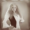
*****************************FULL VIEW**********************************You can't see any of the detail in the thumbnail, especially in the frame!!!
Lots and lots of symbolism here.....This is the first in the seven deadly sins series. It was made up of over 45 layers and came close to crashing my computer! Took on and off about a month to create..... Lots of breaks in between


 Over all I am very happy with the result, I think this is probably some of my best work personally and I am very proud. Sorry the full view is so huge but it was the only way you could see all the detail so I decided not to shrink it too much.
 As far as the symbolism goes I’m not sure if you would rather me tell you are make you try and figure it out? Lets just say I did quite a bit of research on this. Everything in this series will hopefully have quite a bit of symbolism in it..... I'll just say this, there is a purpose to the horse ;D
If you like this please fav it I would really like to feel like it wasn't just me who likes it


 thank you ahead of time, I really do apreciate favs and comments. I usually respond to every comment also so feel free to leave them


Thanx also goes to all the stock artists who allowed me to use their work


Textures
resurgere: [link]
binarystock: [link]
n-gon-stock: [link]
redhairtie: [link]
hybel: [link]
foleydurden: [link]
DyingOrchiD: [link]
lebstock: [link]
Horse
darkartificerstock: [link]
Woman
serp-stock: [link]
Frame
AsphyxiaStock: [link]
Everything Else: sxc: [link]
Some brushes used, see front page for a full list


Others in the same series: #2 Envy [link] #3 Anger [link]
Related content
Comments: 105

Thank you very much 
👍: 0 ⏩: 0

Wow, creepy!
Definatly not the kind of thing I normally see.
I can appreciate your sense of darkness thought.
👍: 0 ⏩: 1

this is frikin awesome. love the colors. very creepy. right up my alley.
👍: 0 ⏩: 1

I'm not a huge fan of the high level of grain, nor the eyes, but everything else looks good to me. The added wounds were well done and the idea for the composition is neat. -Kia Lola
👍: 0 ⏩: 1

lol yeah the eyes seem to be a hit or miss with most people
👍: 0 ⏩: 0

yipes this is creepy, that face will give me nightmares all week. I think for this I like the extra rich colors, they add to the eerieness of it.
👍: 0 ⏩: 1

Thank you, this is actually my favorite in my gallery and the one that took the most work. I appreciate it
👍: 0 ⏩: 0

holy underwear monkies... wow... the blue eyes... the slashes (I cant stand neck or wrist slashes)... the frame... the contrast...
lovely job... I like the stitching the best
👍: 0 ⏩: 1

hehe you said underwear monkeys 
👍: 0 ⏩: 0

colour choices work well, blending well done, obviously it holds some signifigant meaning, but I couldn't work that out.
But that doesn't mean I don't like it....in fact it is very well done, clearly you have put in major effort and time....
I enjoyed looking at this, even though it made me feel a little squeemish.
👍: 0 ⏩: 1

well thank you 

👍: 0 ⏩: 0

Holy- whoa! This is so creepy, yet, so cool. It made my throat feel all weird when I first opened it up! Anyway, I LOVE the eyes, that's a great bit. The colors you worked in are very effectively dark without "bringing the picture down". It remains lively and engaging.
I'm going to take a while getting over the creepiness of those eyes! 
👍: 0 ⏩: 1

lol thank you 
👍: 0 ⏩: 0

Yup - you definitely need the full-view. Those eyes are bizarre - really piercing. And the way the entire body appears to be... well, barely there from the shoulders down is good too. Clearly, you've put a lot of work into this, and it shows. Sterling work!
'Felix'
👍: 0 ⏩: 1

Thank you very much and yes the thumbnail shows absolutely no detail
👍: 0 ⏩: 0

Wow... intense... I really like the colours used in this. The image as a whole is very interesting. **goes to invistigate it closer**
👍: 0 ⏩: 1

Thank you and in the closeup you can actually see the detail... so please do investigate closer thanx 
👍: 0 ⏩: 1

after closer investigation i must say that i very much like this image. it seems strange and bizzar... but those are things i like... sooooo.....
👍: 0 ⏩: 1

lol...thanx yeah it is pretty strange and bizare
👍: 0 ⏩: 0

Vanity: I am better than all of you
Positive Self-Image: I am pretty
Negative Self-Image: I am ugly
Self-Loathing: You're all better than me.
👍: 0 ⏩: 1

ok.....not sure how to respond so
👍: 0 ⏩: 0

You're right, lots of symbolism. I like to study stuff like the seven deadly sins myself so I have to say I like this piece a lot. The eyes are a bit weird, but the candles and frame are well done. You've also done a nice job with the textures and all the violet.
👍: 0 ⏩: 1

thank you, in theology violet represents this sin and so it is a very dominant color.....lots of little things to disect here 
👍: 0 ⏩: 0

Very dark manipulation of photos. Great use of stock well put together. Everything perfectly fitted and I must say the decaying horse is a really nice touch. the person in the picture. A little weird looking. Resembling a witch becauose of the shape of the nose. the golden frame. Great usage. the Candles. How odd that two aren't lit while the rest is. You mentioned Symbolism and the horse being part of it.
"Two peas in a pod" LoL.. I mean. even the death look of the horse. the woman is similar. I guess both of they looked decayed and rotting at certain points. I know. i didn't even get close to the picture but i really like to think. Great job on the picture!
--
Darkunderworld
👍: 0 ⏩: 1

thank you, this is probably one of the most intense and difficult ones I've done. I like your symbolism, doesn't matter if it was close or not because it really is whatever the viewer wants to think it is, thats the point. Yes some people will understand what I was thinking when i did it and some will see something completely different, but in this one just about everything had a point or meaning to look however they look. Thanx again for commenting
👍: 0 ⏩: 0

cool. love the expression and angle of the face.
👍: 0 ⏩: 1

This is insane.....45 layers? A month? Dear god...and the detail is so spectacular. 
👍: 0 ⏩: 1

Thank you very very much thats a huge compliment and yes it was at least 45 layers.....I'm not sure of the exact count because it started getting to big and i was forced to merge layers and change things around a few times......But it was a lot
👍: 0 ⏩: 0

well honestly ..i don't really know shit about dark art.
but, as an artist, i'd work on the resolution of this pic. it's kinda grainy yet.
and the horse thing or whatever in the corner there is kinda hard to see ..maybe have a creepy backlit effect or red light or somethin. be creative
👍: 0 ⏩: 1

The horse is actually dark on purpose, I really didn't want it to be even slightly the focus of the image.....I wanted it to be more an after thought something you only notice a little in a way
As far as the grainyness goes I'm not really sure what your refering to? I don't see anything grainy at all, can you be more specific. Like maybe a certain part that seems grainy to you. As someone already pointed out I have overlooked things before and if something is in fact grainy i would like to fix it but I'm not really sure what part needs fixing if you could help? Thanx for the comment
👍: 0 ⏩: 2

oops ...i thought this was a comment to one of my works! lol! sorry :embarrased:
👍: 0 ⏩: 1

awww ok now that makes sense....
👍: 0 ⏩: 0

the preview image had actually deteriorated. this was one of my first deviations ..i think it was posted in early february. i reloaded both the full view and the preview images and obviously it fixed the problem
👍: 0 ⏩: 0

Omg what did you do to the poor horse?!lol This shore is a macabre piece of art!
My favorite part of it is the tree that's supost to be her body! Great manipulation there
And her neck is very good to!!! Just dont like her face shes to ugly and horrible. That nose, eyes, yeeeakkk!lol
But thats the point of it isnt it?!
👍: 0 ⏩: 1

Thank you very much and yes that is the point, face was a lot of fu to do
👍: 0 ⏩: 0

Wow, so amazing 


👍: 0 ⏩: 1

thank you very very much and yes took lots and lots of time!
👍: 0 ⏩: 0

Whoa, not much into creepy art, but this looks good.
👍: 0 ⏩: 1

Hehe Thank you I will take that as a compliment
👍: 0 ⏩: 0

Really nice! ^^ Usually, I don't like this kind of art, but you've really managed to create a dark picture, but still full of life, with a classical style
👍: 0 ⏩: 1

Kinda reminds me of something from castlevania!!
GJ. I like it! Keep it up!
👍: 0 ⏩: 1
| Next =>


