HOME | DD
 Kazooma — Heartcore.

Published: 2005-02-27 09:52:56 +0000 UTC; Views: 2034; Favourites: 31; Downloads: 454
Redirect to original
Description
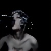
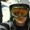
Yeah. Here it is: "Heartcore."• Made in Photoshop CS
• Took me about 4 Hours
Credits:
• Smashmethod's awesome Blood Brushes
• Stock Exchange for providing great Photos
Comments are highly appreciated. Enjoy! : )
Related content


Comments: 38


 (Smile)")


Es ist wirklich sehr gut geworden. Ich mag es sehr
👍: 0 ⏩: 0

Hey man,.. das is ja auch hammer,.. dein Style gefällt mir,.. mal ehrlich,..
MfG RAX
👍: 0 ⏩: 0


This is very cool. I like how we can just see a tiny bit of his face...
👍: 0 ⏩: 0
I like the elements you used here: the heart, the world and a person give a nice deepness to the piece, I like the choice of blue colour toning.
good job
👍: 0 ⏩: 0


Thank you very very much mate. : D
👍: 0 ⏩: 0

Irgendwie echt verdammt krass gemacht.
Das ist sone Mischung aus nem "grunge"igen Style, Vector ist im Menschen vertreten, dann die Schatten und das Weiche - echt verdammt krass ")

👍: 0 ⏩: 1
Vielen Dank. : )
Brushes: [url=[link]
👍: 0 ⏩: 1
die farbcombi is echt genial, die brushes auch. gefällt mir sehr gut
--
eales
👍: 0 ⏩: 1

omg verdammt geil. farben, shapes, brushes - alles sieht da gut aus, gefällt mir auch dementsprechend  (Wink)")

👍: 0 ⏩: 0

Thanks. You probably saw this on the depthCORE Forums?
I got that map from google and then edited it in Photoshop,
to get some clean edges. I can give it to you, but keep in
mind that it's not the real world, but kind of a remix of the
worldmap. : )
👍: 0 ⏩: 0

i seen this on a forum somewhere.. i remember it well.
awesome brushing and vectoring.. would love to know where you got that map from.. been looking for a clean edged one for a while.
👍: 0 ⏩: 0

Gefällt mir gut, das einzig zu bemängelnde sind die Farben, da hätte vielleicht noch eine andere hinein gepasst. ^^
Ansonsten gut.
👍: 0 ⏩: 1
Jau, der Secroit meinte auch ich sollte das Herz in 'ner andren Farbe
machen. An V2 wird gearbeitet. ; ) Vielen Dank für deinen Comment. : )
👍: 0 ⏩: 0

i find that are nice brushes and nice forms. it is a nice work.
👍: 0 ⏩: 0


i think its quite good! the main things that i dont like about it, however, are the face (i know tho - if it wasnt there it would look as if it was faceon rather than angled up) and how the character is right in the middle. off to the side maybe..? other than that, i like it
👍: 0 ⏩: 0

i really love how you used the brushes to create the look of a broken heart. it's awesome.

👍: 0 ⏩: 0