HOME | DD
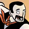
 KIRKparrish — Another Donatello

Published: 2010-01-12 00:20:15 +0000 UTC; Views: 5923; Favourites: 113; Downloads: 96
Redirect to original
Description
Here's an updated picture of Donatello. It's another collaboration between and myself. If you haven't been to his gallery go check it out!You may remember this Deadpool pic was our first team up.
did another outstanding job at giving my really flat lines some added weight and depth. A big kudos to him on this one.
Color:
Lines
Related content


Comments: 64

Really nice style on Donatello, your lines are great!
👍: 0 ⏩: 1

hey thanks a bunch man!

👍: 0 ⏩: 0

Wow Im loving the style you two have, it looks flat and chunky but with that 3d pop that sets it all off, nice job.
👍: 0 ⏩: 1
haha thanks. i think your right. did a solid job.
👍: 0 ⏩: 1
Hehe stop knocking your linework, No house is laid without foundations.
👍: 0 ⏩: 1

Really neat and original design with an amazing coloring job! I'm always impressed when people come up with new ways to draw the turtle boys (or any other well known character that can be drawn in only so many ways, at that matter.) And it's always great to see two talented people work together and do their magic, too. Great job.

👍: 0 ⏩: 1
hey thanks a bunch! yeah its fun to collaborate with other people and see what they come up with.
👍: 0 ⏩: 1
No prob!
Definitely! : D I think I may enjoy lineart collaborations the most personally. It's interesting to see how your and the other participant's styles mix together in one lineart.
👍: 0 ⏩: 0

Cool stuff...although the colors on this piece look like a direct rip-off of Mike Henry's style: Don't get me wrong, they're very well done, it just doesn't seem original to me. Then again, these days it's practically impossible to be original so maybe it's best to just ignore me because I might not have any clue what I'm talking about. I do love your lines though.
👍: 0 ⏩: 1
i checked out his work. there is a similarity, but saying "direct rip-off" is pretty harsh. And your right about "practically impossible to be original" with the internet and all. Everybody finds inspiration from one place or the other. I had an old art teacher who liked to say this "take other people ingredients but make your own soup."
👍: 0 ⏩: 1
Yeah, sorry, after re-reading it, it does sound harsh. It's just the first thing I noticed when I saw the piece, and I actually thought Mike was the one that colored it for you. And you're totally right mentioning the internet, because it really is nearly impossible to find a unique style these days because inspiration comes from so many places...not to mention the fact that most artists continue to evolve even after they've found "their" style.
What a wonderful and intriguing world we live in.
👍: 0 ⏩: 1

Rockin' style there ")
And the coloring job your partner did is pretty kickass too! I especially love the spots and the red blushes, they're a nice touch!
👍: 0 ⏩: 1
yeah he did a badass job. i guess since he's a ninja, he's gotta be fast. lol
👍: 0 ⏩: 0

A very well thought out piece and design. The colors blend in with the background. The added lighting brings out the depth of the pose, as well as the awesome work on the BO and Donatello himself.

👍: 0 ⏩: 1
Thanks! you should check out 's gallery he did all the coloring.
👍: 0 ⏩: 1
I'll have to check it out.
👍: 0 ⏩: 0
Wow, excellent work man! Great design and cool-lookin' wet turtle skin, haha!
👍: 0 ⏩: 1
thanks dude, i can't take all the credit for this one though. did a solid job colorin it up.
👍: 0 ⏩: 1


looking sweet bro, im loving all the colours, and the way u diid his hands is great style
👍: 0 ⏩: 1


The colours look like crap. Find someone else to do them in the future!! The guy shouldn't even be considered an "artist"
(Thanks for the opportunity to work on your stuff again man  (Smile)")
👍: 0 ⏩: 2

Good work on the colouring man
👍: 0 ⏩: 1
Thanks
👍: 0 ⏩: 1
hahaha. yeah you're right, the guy is a hack! j/k lol
No prob dude, always fun.
👍: 0 ⏩: 1
Haha definitely always fun. And you're not so wrong about the hack bit
👍: 0 ⏩: 1

thanks dude, i cant take credit for the colors but the lines are all me.
👍: 0 ⏩: 1
| Next =>