HOME | DD
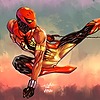
 knockmesilly — Hulk vs Surfer

Published: 2007-01-19 08:18:47 +0000 UTC; Views: 7486; Favourites: 121; Downloads: 264
Redirect to original
Description
...this is one of the hardest pages i've done for Carlo Pagulayan as his inker on Planet Hulk. I've had numerous negative comments on this one from some artists that slowed me down a bit but kept going anyway. Any comments on this one is very much appreciated (Smile)")
pencils :
inks:
Related content


Comments: 47


Whoever gave you bad comments are just jealous cos they're probably not good at anything. You however, are AWESOME!!!!
👍: 0 ⏩: 0

putang#$%^ if those critics think they can do better then they should show their work. If they can't do better then they should just f$&^%*k*& shut up! Galing ng trabaho mo! Walang katapat! well...maybe except a few choice legends in the comic industry your work is right up there collectors item padre!but sh$t ang galing galing! Ingit ako!
👍: 0 ⏩: 0


haha i like this one lol i bought the comic good work if this is bad work then i want to be as bad as this cuz im a pretty crappy inker lol
👍: 0 ⏩: 0

Im sorry, but you asked for it.
I think the little lines which were likely meant to act as shadings detract from the picture as a whole and dont help to effectively lead the eye around the drawing. I suspect thicker line work or solid blacks would do better, and help define fore and back grounds more consistantly. In effect "Less eaquals More."
The details make the indevidual things get lost in the ruckuss going on. Clearly color will help bring this piece back in line, how ever, it should not be viewed that way. the piece should be able to stand alone as black and white before color is ever added.
Thats My two cents.
- GM.
👍: 0 ⏩: 1

Tell that to the person who pencilled it
👍: 0 ⏩: 1
ahh, No lad.
I know you are pro, so you will understand when I say it is the inkers responsability to compensate and give the final details defining qualities.
You dont have to follow the picture Line for exact line.
In this case, it might be prudent for you to get ahold of the penciler, and ask him to lighten up on the details in a fashion that will allow you more freedom to do You job.
This will have 3 benefits.
The obvious one is that You will not feel so constrained by the pencils and can more apropriately flesh out the final product that will bare your good name whence published.
The second is that the penciler will be able to produce his works a little faster, increasing the time margines for available work to be done between deadlines.
Lastly, You will be able to show case More of Your personal talents in the art at hand.
(OK, but who the Fuck are YOU to think you can give Me advice!?)
Im no one my dear boy. those whom cannot do, Teach.
And you will take the advice on the merits of the logic inheirant to what was said, or you wont.
Either way, you do excellent work. and this critisism was meant to be constructive.
Be well.
- G.
👍: 0 ⏩: 1
You just answered your own question my friend
👍: 0 ⏩: 0

Dude, I aspire to do as well as this. So if this is considered a negative work, I look forward to being just as negative.
👍: 0 ⏩: 0


Good control on the lines and very energic inks!!! Congrats!
👍: 0 ⏩: 0


Hey thanks for dropping by :d
👍: 0 ⏩: 0
Well...it was my very first post here on deviant and was still tinkering around my pals PC at the time")
👍: 0 ⏩: 0
it's not a great scan is my biggest complaint...it looks like a bitmap file.
I like what you did as far as I ca tell but it is really hard to see the actual line work.
ricH.
👍: 0 ⏩: 0

The only thing i don't think made this run as successful as it could have been (cause it was REALLY good) was how sketchy it was, but the inking looks like it was done purposeful. Maybe a bit of your own thing over this work rather than following his lines so faithfully would make the difference (I looks like you were extremely faithful rather than doing YOUR thing, but thats just my assumption)
👍: 0 ⏩: 1
Yeah! I totally agree with you...but for some reason Carlo Pagulayan (aka guisadong gulay)wanted the inking true to his lines but I was a bit stubborn and got away with a bit of details he didn't like. He even said I messed it up. I almost quit during that run but I thought, what the hell!!! this is the biggest break of my career so I didn't just want to just let go of it. It even got bad reviews from other inkers as well. Anyway, I just put it to experience and this was just my second project under marvel comics after fantastic 4 and hey! thanks for the comment
👍: 0 ⏩: 1
dman, other inkers gave you a hard time too? what did they want you to do? I understand Carlo wanting his lines being handled the way he did them, that's a penciler for you sometimes, and thats cool, but other inkers? What was their issue?
👍: 0 ⏩: 0


amazing! iba ang pinoy! keep it up your an inspiration to us newbies!
👍: 0 ⏩: 0

this is an insane piece... is most of the ink after the pencils or did you add a lot (ex. the shine on hulk's armor as a penciler i know no one pencils in all those lines )
.....and im curious what kind of negative coments did you get...something liek "that sucks" or more along the lines of "that line shouldt go there or isnt thick enough".,...once again sick piece you should be proud
👍: 0 ⏩: 0

Oooh wow, this is pretty amazing. Well done, well done.
👍: 0 ⏩: 0
I ain't a pro but how can I find something bad in your ink work, it's pretty amazing! Your inkjob is neat and tight, and serves Carlo's lines very well!
I can't understand why you had bad comment on this!! Great job!!!
 (Wink)")
👍: 0 ⏩: 0

You can put amazing, incredible, and spectacular all together and still not not enough. Definite Favorite.
👍: 0 ⏩: 1
such kind words man...I really appreciate it")
👍: 0 ⏩: 1
It deserve it man. The most impactfull page in Black and white I've seen in a long time. And their not even my favorite characters. Extra awesome for the electric charge from surfer's mace. See? I can't stop praising this page.
👍: 0 ⏩: 0

I dont understand why anyone would talk this piece down let alone your work in general.
This is incredible & takes extreme talent to be an inker of this caliber.
After all inkers are artists too. I say kudos to you sir.
I can only hope to one day get an inker this true to my lines.
👍: 0 ⏩: 0

first look... there are soo many details to digest.. and i love it!!
👍: 0 ⏩: 0

ive seen this drawing a lot of times. O_O
ohmehgahd!!! y-y-yyouuu!!!
anakngtetengwalanaakongibangmasabi!!!!

👍: 0 ⏩: 0

I think that this is great work, but at first glance there is so much going on that I had to spend a few seconds "getting my bearings" and then I could see where everyone was. Once the color is added, all will be immediately clear. Very awesome piece of art!
👍: 0 ⏩: 1
hey thanks man! I've had a lot of bad comments on this piece fro other professional inkers. just glad to know that everyone who ever browsed this piece has positively commented on it. thanks again
👍: 0 ⏩: 0


Wow. What kinda negative comments did you get from this? I can't see anyhing wrong with it that would get you a bad grade on this.
dub
👍: 0 ⏩: 1
I tell you man...a lot!!! believe it or not...
👍: 0 ⏩: 0


great dinamics....
and this BW page is something...!!! WOWW

👍: 0 ⏩: 0

who ever gave you those negative comments are probably just jealous they weren't asked to ink this piece.
thats some great stuff.
hard or negative critizism is just gonna make you a better inker and artist.
👍: 0 ⏩: 1


wow!! idol ko yan si kuya carlo, tsaka si harvey!! ikaw rin! grabe ang gagaleng niyo talga.
👍: 0 ⏩: 0

It's a difficult and complex image, but I d'ont think that there are many people who can do better...it's amazing. Well done!
👍: 0 ⏩: 0