HOME | DD
 KwongBee-Arts — Come Fly With Me
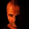

Published: 2012-09-17 18:47:51 +0000 UTC; Views: 2640; Favourites: 80; Downloads: 51
Redirect to original
Description
i've really been getting into the new techniques i had learned at the dragoncon i pulled out every trick i knew on this one and i think this one represents a style that is very much my own. this is superman in his new 52 costume reaching out to the viewer. i plan to color this but until then here i the line art what do you think of it?Related content


Comments: 38


 (Smile)")


I love the strength of the lines. They give a great contrast, but the cross-hatching also adds shadows to create depth. The perspective in the arm looks great as well.
👍: 0 ⏩: 0

I think you were mainly successful with his face, hand, and cape. These are where the inking styles were employed best, and definitely create a bold look. My main gripe is his shoulders. I know the new Supes isn't necessarily going the broad shouldered triangular shaped look he's usually had, but his right shoulder here is oddly small, and his arm and elbow look very flat. His other arm looks very stiff at his side as well, I've never seen arms dropped so rigidly, with no bend at the elbow unless deliberate. His torso too also looks a bit slanted towards the left. Also, his hair would much better fit your style here if it had more shape then it does here, more of a clear outline.
👍: 0 ⏩: 1

thank you for imput the funny thing is some of the things you liked best i inventive such as the cape. i directly referenced this pose from a photo of a real man so those things you don't like is exactly how he was positioned heh
👍: 0 ⏩: 1
Well then the photo must have been angled. Seriously, just because you used a reference doesn't mean it gave you 100% accuracy. If people had this ability, everyone would be a master artist from the get go. You are not I Robot, you are not a scanner, or a camera yourself. What you put down on the paper will not 100% match your photo reference.
Why in the world must you negate every piece of advice I give you out of spite? If you must do that, then stop posting your work in my threads. I will always do my best to give constructive criticism. If you don't want it, stay away.
👍: 0 ⏩: 1
no no i apreciate the advice i guess i shouldn't answer these when i'm sleepy an tired. you gave me some good things to work on thank you again sorry if i sounded harsh
👍: 0 ⏩: 0

this is very well done! I feel like you combined similar styles of traditional comics but made it your own style.
👍: 0 ⏩: 0


Wonderful drawing!
Absolutely amazing lines and patterns as well as great composition/dynamic through the drawing.
The only things I have to say about this would be on the skin and that triangular crosshatch-shadow at the right.
The first one is mostly the skin in his face. On the hands you have managed to make the skin look like skin, but somehow that gets a bit lost in the face. It's a very beautiful face, I'll have to give you that! But it looks a bit metallic because of the very hard line inside of the lineart.
Second thing was the triangular shape on the right. There's a very fine line between a crosshatch-shadow and a pattern, and I think that this is riiiight at brink of becoming more a pattern than a shadow. Maybe making the lines a bit closer to eachother would help making it more "shapy".
I hope that this was a bit useful! :3
It certainly was for me!
")
👍: 0 ⏩: 0
Let's fly, let's fly away!
Well done, good, precise technique.
You Superman looks a bit young, but the invite is tempting!
👍: 0 ⏩: 0

You must have used a lot of black ")
👍: 0 ⏩: 0

I think your new techniques are very good. I like this drawing very much, the lines, the shading are very good and precise, a clean work, also it looks very good. Congrats!
👍: 0 ⏩: 0

OMIGOSH!!! THE DETAILS ARE AMAZING!! Super awesome ^^
👍: 0 ⏩: 0
Nice work on the man of steel! Great on the hair, his shading, and his face.
👍: 0 ⏩: 0

Great lines. the shadding is very well done. The perspective looks good too. I like his face, and the dual expression on it. Great work.
👍: 0 ⏩: 0


oh wow! you improved so much from the last time i saw your work. pat yourself on the back if no one else can. i think eventually ill go to a con
👍: 0 ⏩: 0

daymn i love the marvel/classic comic book feel to this- the line work really has it, and i damn well love the look in his eyes. the perspective of his arm is very well done too, which is great bcause a lot of the time that angle is hard to accomplish.
nice work hun

👍: 0 ⏩: 0


wow... I wonder who made Clark having a big package? 
👍: 0 ⏩: 0

Nice work!I think you might overdone it tho,especially abs and cape,some of shadows on cape isnt logic to me.
The head and hand are very nice.
Hope you don't mind critique here.
👍: 0 ⏩: 1
wel i really drew this piece to be colored i think the colors will help make this look much better when its done
👍: 0 ⏩: 0

Brilliant work on the detail of the lineart! I love the pose as well.
👍: 0 ⏩: 0

thanks my friend i really enjoy your work as well
👍: 0 ⏩: 1

rather sexy, actually ; u ;
nice shading skills ; v ;
👍: 0 ⏩: 0

Amazing work here. I love the pose and shading especially! I'm enjoying the New 52 and the Superman family is my main read right now XD
👍: 0 ⏩: 1
thanks so much bud can always count on you for a good comment wait till u see it colored
👍: 0 ⏩: 1
Definitely looking forward to seeing it!
👍: 0 ⏩: 0

lol i love it i would too
 (Wink)")
👍: 0 ⏩: 1