HOME | DD
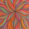 KyleWilcoxVisualArt — Linear Weaving #2

Published: 2013-11-09 04:31:16 +0000 UTC; Views: 1318; Favourites: 49; Downloads: 13
Redirect to original
Description
November 2013, Prismacolor, 18'' x 12''. If you like my artwork please check out my Facebook page. www.facebook.com/pages/Kyle-Wi…Related content
Comments: 14

* ¡Fantástico trabajo! Lo hemos destacado dentro de la carpeta "Featured nº5 o Destacados nº 5" en Special-Groups. (Es la carpeta donde se exhiben los mejores trabajos del grupo).
¡Por favor, queremos ver más trabajos tuyos en el grupo!.
* Fantastic work! Featured in Special-Groups in folder Featured nº 5. (Best works of the group).
Please, We want to see more works in the group of you!.
👍: 0 ⏩: 0

Someone will definitely get lost in all of that, and I'll bet you know the only way out of it.
I give it 2 thumbs up and 5 stars!
👍: 0 ⏩: 1

Thank you! There are a couple of hidden ways out!
👍: 0 ⏩: 1

very interesting and your welcome!
👍: 0 ⏩: 0

Thank you so much!
👍: 0 ⏩: 0

Thank you very much!
👍: 0 ⏩: 0

Thank you so much!
👍: 0 ⏩: 0

Good picture. Good color scheme. Most times when you have something on your picture plane dividing the page from one side to the other as you do, it can weaken the overall. It doesn't here (bottom left to top right). Not sure about the signature placement. Usually in abstract its better to let it be a whole cohesive thing. Nice job though.
👍: 0 ⏩: 1

Thank you so much!
👍: 0 ⏩: 0


