HOME | DD
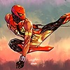
 leinilyu — X-men Legacy 241 cover

Published: 2010-07-25 18:48:38 +0000 UTC; Views: 34793; Favourites: 835; Downloads: 972
Redirect to original
Description
This cover really started off on the wrong foot and took forever to finish. Rushed the lineart, rushed watercolor wash, didn't do maskings and everything just got real frustrating. hours and hours of revisions that spanned a month.I could've started from scratch and I would've finished a whole new cover with the time I spent tweaking this. To make it worse, Rogue's pose is nearly identical to the previous cover.
the saddest part is, it doesn't look any better than the Magneto (238) and the Rogue (239) cover that only took me 2 hours each to color in ps.
Oh, well. bad luck.
Edit: typos. Proofreading is not my thing.
Related content


Comments: 47

 (Smile)")

Great! I bought this issue last moth, here in Brazil X-men 120 ^_^
👍: 0 ⏩: 0


")

Wow. Wow! I don't care how much time you spent on this, this is still a breathtaking cover - and I can't believe it was drawn with pencil and watercolors!!
👍: 0 ⏩: 0


despite the flaws you pointed out mr yu i still think this cover looks great. i would have liked to see more of a background but its defo better than most artists stuff nowadays. good work.
👍: 0 ⏩: 0

 (Wink)")

...as if anyone would've really noticed had u not typed any of that...if only my worst was half as good as this.
👍: 0 ⏩: 0

I'm no expert in art, but I love the motion in this one. And-- Anole! \o Amazing work.
👍: 0 ⏩: 0


Man I had to create an account to say your work is truly stunning. You would release a gnomon dvd or something. great work!
👍: 0 ⏩: 0

It's always the way... when you don't get things right from the start, all the tweaks become a chore, and they never seem to help much either.
The final piece turned out out pretty good though, even if it was a bit of a struggle for you.
👍: 0 ⏩: 0

You're a great artist with a lot of self-criticism and a very honest vision of your art.
Congrats, Leinil!
👍: 0 ⏩: 0

Whos the guy in the middle with the helmet? he's cool!
👍: 0 ⏩: 0


it looks just fine to me ^^
i'm curious, what is the big armor thing with the sword?
👍: 0 ⏩: 0

I know everyone always give you crap on how your women look but they look great in this Pic. Great job! I think it came out well.
👍: 0 ⏩: 0

There's something counter intuitive about how it works, but I absolutely know what you mean. My worst illustrations always take 5 times as long as my best. Luckily for you, your worst is pretty awesome.
👍: 0 ⏩: 0


There is just something so awesome about how you manage to have such a tight style that retains so much textue and personality. I just love the look on Rogue's face in this one so much!
👍: 0 ⏩: 0

Great composition, and great style. I love it!
👍: 0 ⏩: 0


Bad-ass. I'm not even familiar with the knight guy but he's amazing, my fault for not following any X-Men comics.
👍: 0 ⏩: 0

Love the honesty - and who hasn't gone through it too
👍: 0 ⏩: 0

Thanks for the comments folks. I'm pretty satisfied with the outcome, learned a lot of lessons making it tho.
Edited the description for some glaring typos.
👍: 0 ⏩: 0
S!@#% Happens Dude. You win some. You lose some. You can always come up with something more Challenging to be prod of. Just continue to Rock and all will work it self out.
RoCc On !
👍: 0 ⏩: 0

I'm impressed that you still managed to finish this cover despite the time you spent for it just to make it look really good with such errors! Now that's determination!
👍: 0 ⏩: 0


It's still millions of time better than anything I've done. I'd like to blame the differences on style but the truth is you're freaking awesome at this. I especially like the faces. sure the figures have mass but the faces are just so... i dunno. they've got details to them that stand out, like the eyes. very cool.
👍: 0 ⏩: 0


I like it.
Who's the armored character with the sword?
👍: 0 ⏩: 0

I suppose it kinda says something when even a cover that didn't turn out how you wanted is beautiful.
Stuff like this is why you're one of my favorite modern comic artists.
👍: 0 ⏩: 1
Hello Monty,
Actually, I may be coming off as someone who is faking modesty. I am pretty happy with the current outcome of this cover.... I just hated the experience. I have a lot of versions of this cover and I edited this a lot. It was just unpleasant.
turned out ok but it wasn't worth all the time I put in.
👍: 0 ⏩: 0


Any change you could post the pencil version just so we can see the "rush" version? I'd love to try and ink that one.
👍: 0 ⏩: 1
Hey man. It's rough and not fit for inking
👍: 0 ⏩: 0
It's unnerving how so talented and humble you are, that's damn terrific what you achieved here!!!
")
👍: 0 ⏩: 0

why DIDN'T you start over? Sometimes you have to let some art go bro.....
👍: 0 ⏩: 0

No one here is going to see the flaws you see. That's with any artist of course. You saw it through to the end and that's important in it's own right.
👍: 0 ⏩: 0

I like this one the most out of the three personally. It's got a nice Struzan quality to it.
👍: 0 ⏩: 0

Despite it's (perceived) flaws, this is still a good cover.
I'd certainly stop dead in my tracks to figure out what this story was about.
👍: 0 ⏩: 0