HOME | DD
 LemmyKoopas1FanGirl — The GODS of Universe 8

#dbs #supremekai #god_of_destruction #dragonballsuper #universe_8 #godofdestructionliquiir #supremekaiiru #supreme_kai_iru #lordliquiir #god_of_destruction_liquiir #lord_liquiir #angleattentantkorn #angle_attendant_korn #godofdestruction #supreme_kai
Published: 2019-12-19 12:50:06 +0000 UTC; Views: 892; Favourites: 19; Downloads: 1
Redirect to original
Description
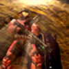
Yay, finally got this done :3. So these guys are the divine beings from Universe 8 in Dragon Ball Super. They have the 4th highest mortal ranking ( meaning that their galaxies/planets are well developed than the other 6 universes below them). In addition each universe has a Supreme Kai: The being that creates galaxies/planets and observes their development, a God of Destruction: A being that destroys anything they see as unfit, whether its overpopulation in a galaxy, a threat to their universe or a planet that isn't developing as it should, you name it and they'll destroy it. Finally the Angle attendant: Normally seen with their God of Destruction, their role is to teach their Gods of Destruction their destructive capabilities while also serving them as personal attendants. So from right to left:Iru: The supreme kai of Universe 8. A kai that loves to make plans ahead of time and seeing those plans come together
Liquiir: The God of Destruction of Universe 8. Although he has a rough looking apperance, Liquiir is quite a jovial as he asks Arak and Iwne to a friendly match at the Tournament of Power's arena. However he will destroy any defects in his Supreme Kai's plans and eliminate anything that anyone that lowers his universes standards.
Korn: An angle that respects his peers. He is a very assertive angle and is not shy on sharing his high opinion about himself.
Korn, Lord Liquiir and Iru (c) Akira Toriyama
Related content


Comments: 11

Hello and merry CRITmas! Not a typo - my mates and I are on the prowl, writing critiques where we are able! I hope you don't mind being visited by a little critique fairy today?
First I want to share what I like about this drawing. For one, I like the expressions very much! There's just so much to glean about these characters' personalities before I have even heard of them. I also like your vivid colours and eye for detail.
Where I think you can improve on, in this particular case is maybe stopping a moment to think about the kind of proportions you want for your characters' heads. I know proportions are very much part of style (and that's hard to argue with), but here the proportions of the heads relative to the bodies are very similar to what you'd see in children, and that might not be what you wanted for these three. If you are going for a chibi vibe, however, it's not so much the heads but the limbs which are the problem: by far all the chibis I've seen have short arms and legs.
Talking of legs, what follows is a bit advanced but very much worth looking into: the plane (not an aeroplane, ha) on which the feet stand. I notice these characters have a foot, sometimes two even turned towards the viewer, and it looks rather convincing but with the other foot seen 100% from the side, it looks a bit as if they're balancing at the top of a steep decline. If you were to draw that sideways foot as if it was seen sliiightly from above (seeing as we're supposed to be at eye-level with the characters), that would place all the feet on the same plane and look more natural. If that makes sense. We'd see a bit of the top side of the foot, so to speak, even if it's turned away from us.
... That's all for today! I hope you didn't mind my rambling, and that the New Year will give you lots of inspiration and opportunity.
Have a good one!
This critique was brought to you by team REINDETH. Merry Critmas! www.deviantart.com/jessamar/jo…
👍: 0 ⏩: 1

Thank you for the critique. Thanks for pointing out the feet, it wasn't until I uploaded that something was off about them but didn't know what. I never knew I was drawing the heads as big as they are. Maybe I do because I don't want the heads to look so tiny on the body maybe???
But thanks again for taking the time to critique
")
👍: 0 ⏩: 1

Hi there! I'm from and i'm here to critique this piece of yours!
I first want to start off by saying that I think you did a pretty good job with this! The coloring looks neat, and the postures a pretty nice and simple^^ Furthermore, the line art seems pretty decent (Especially the area of Liquiir's tail).
As for the critique, i'd like to point out that the proportion of these characters seem a bit off. Both Iru and Korn's legs looks a bit too small. Also, they both Korn and Iru's feet that's facing forward seems a little too low. I know it's supposed to make it look like one foot is supposed to be more forward than the other, but this seems a bit too low in my opinion. Furthermore, Liquirr's hands also seem to be a bit too small as well. Liquiir's left arm (His left) looks a bit off too. The wrist on the other side is too low, and his hand looks a bit weird. Specifically his pinkey finger and his index. ALthough the line art looks good, there are a some parts where the line is a bit off (Like Korn's ring thing around his neck in the lower part). I would mention something like style accuracy such as Iru's head that needs to look longer, but i'm assuming this is just your style of drawing and you chose to make it this way. Overall, minor flaws that needs a bit of practice, but it looks pretty nice nonetheless. Well done on this, bud! Keep it up! ^w^
I hope this critique could help you in some way in terms of improvement! I wish you a pleasant day!
👍: 0 ⏩: 1
Thank you for your critique. Hands are either a hit of a miss for me. Also thank for pointing out the line art as well. I can see what you mean with Korn's Halo. Anyways, thank you so much for the critique, I sure it will help me in the future.
👍: 0 ⏩: 1
You're welcome ^w^ Hands aren't really my strong suit either XD. They can easily become obviously out of place unfortunately :/
That's good to hear! Have a wonderful day!
👍: 0 ⏩: 0

Absolutely beautiful! I adore the colours you've used.
Wonderful job!
👍: 0 ⏩: 1